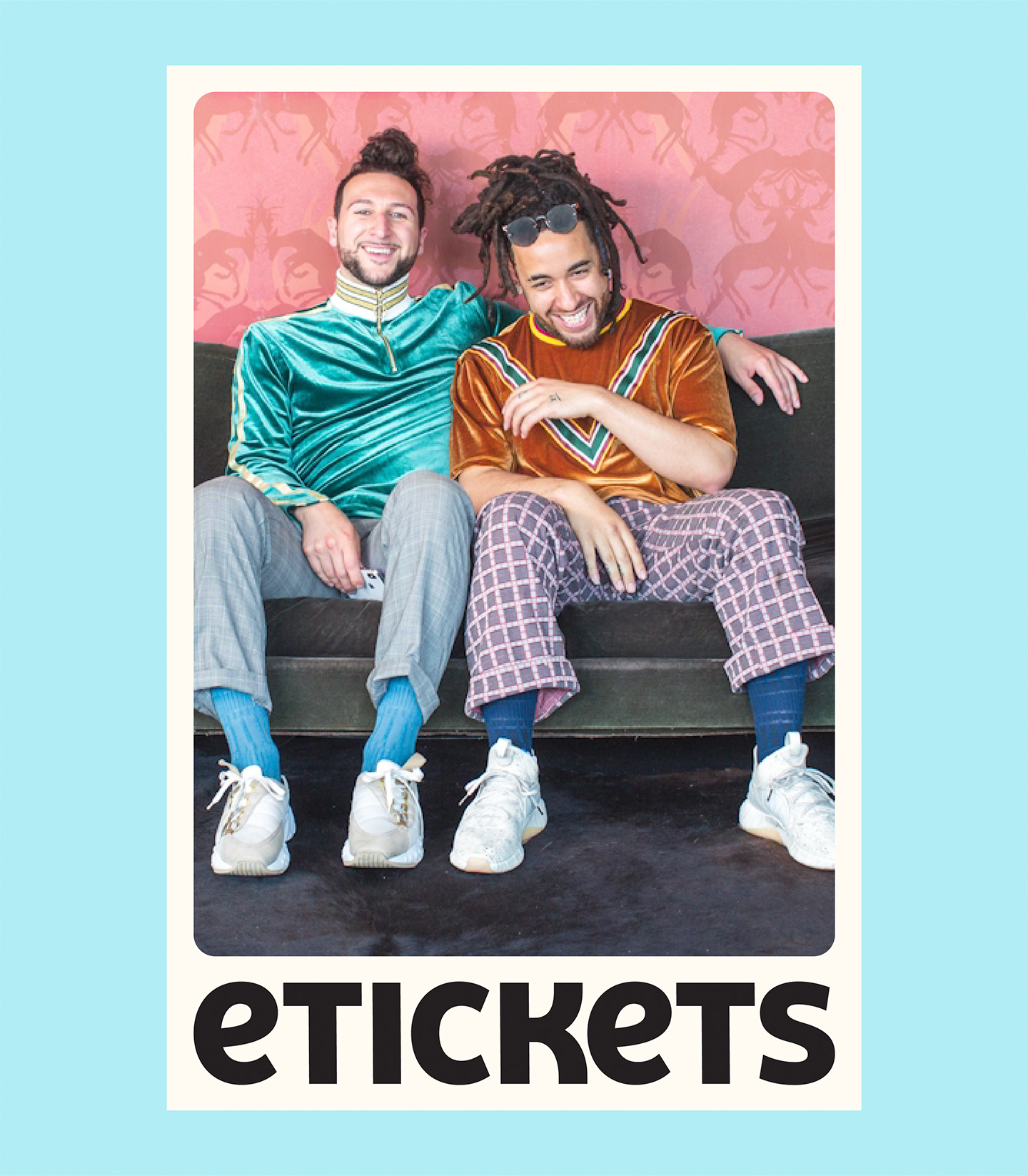
eTickets
eTickets provides a safe, secure, and trustworthy marketplace to purchase tickets to your favorite live events. Simply put, they want to bring people together over a shared love for sports, concerts, theater, and more.* They are committed to getting fans to their favorite live events, headache-free. *More being badassery like Monster Jam and Disney on Ice.
Visual Identity, Art Direction, 3D, UX/UI Design


A recent study shows that 25% of Americans would take on an additional part-time job just to support their concert and sports ticket costs. People are thirsty for memorable event experiences, and they'll spend a pretty penny in doing so. When we think about the ticket buying experience, there really isn't one. You look for the seller that won't gouge the living daylights out of you and scramble to get through the checkout before you lose the tickets. And sometimes you happily let them charge you 5x box office rates, depending on how bad you want to go to the show. We've all been there, don't ya worry. But does the ticket purchasing experience have to suck?
eTickets had gathered some juicy insights and customer feedback, and in return, they wanted to pivot the company to better serve their market. That's when they rang us, or something like that. We distilled the problem down into one clear question that would guide all of our brand and product work. How do we take a business that is viewed as purely transactional, and morph it into the #1 ticket platform for Millennials?
Through our research and loads of previous concert ticket purchases, we knew the market was fairly saturated with big players. Take the money n' runners, if you will. The big guys felt like big guys - you show up to get what you need and you bounce. You might even feel slightly slimy as you hit the final checkout button to charge your card. "Who are these people?" We knew we could flip this experience on its head to share with the ticket-hungry world what eTickets is really about. Hint: You can pick up the phone and call a (human) eTickets customer service rep who will virtually hold your hand through issues that may arise during your purchase.


We started by reworking the eTickets wordmark, using a lowercase "e" to better visualize the pronunciation, from the previous all-caps logo. We built a bespoke unicase wordmark with a charming quirk. We wanted it to feel trusty and familiar, without trying too hard.
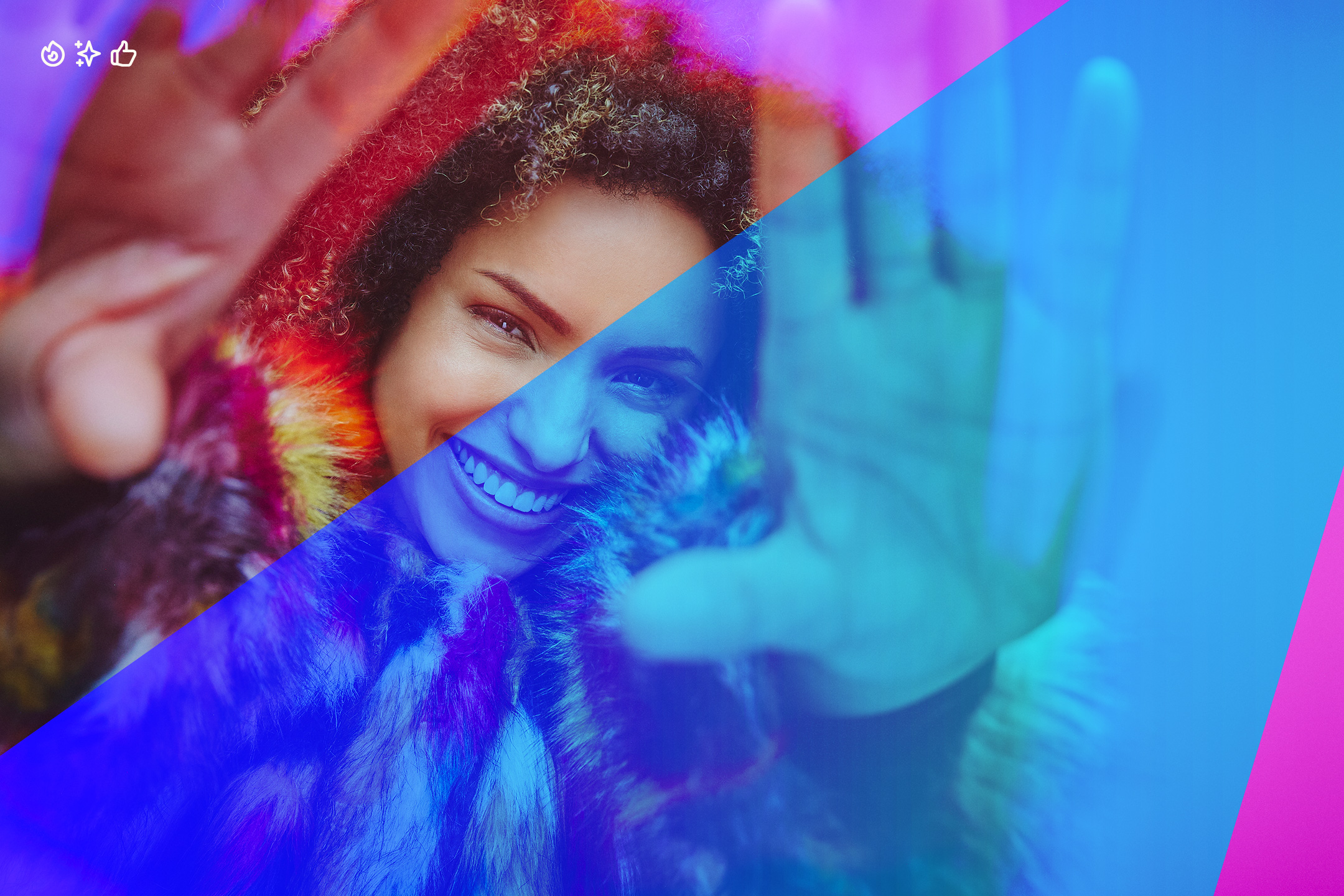
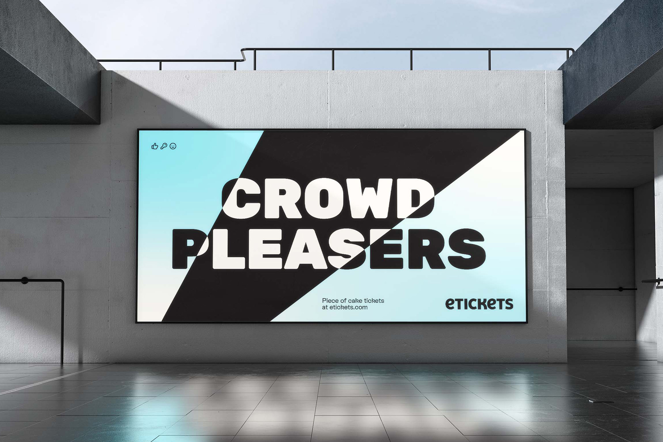
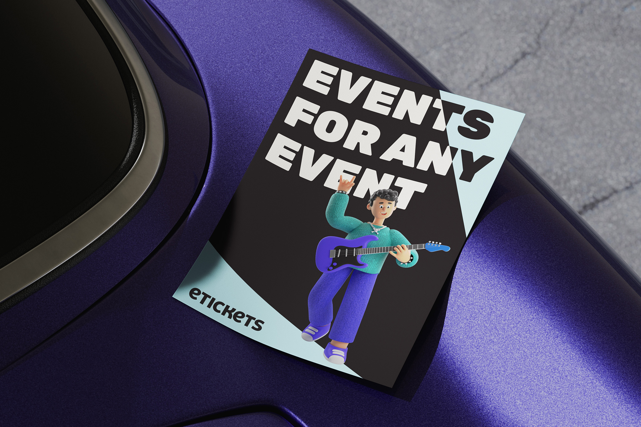
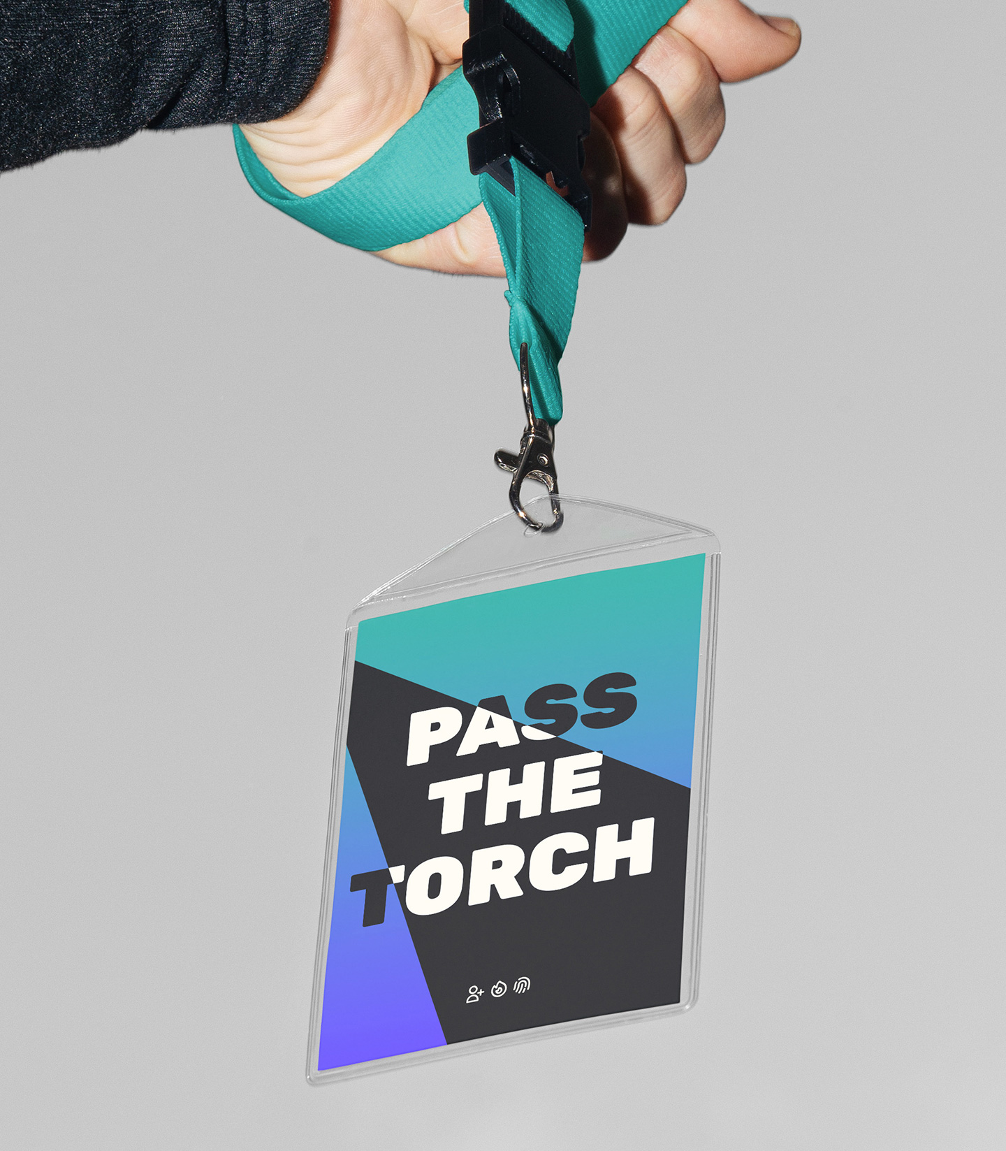
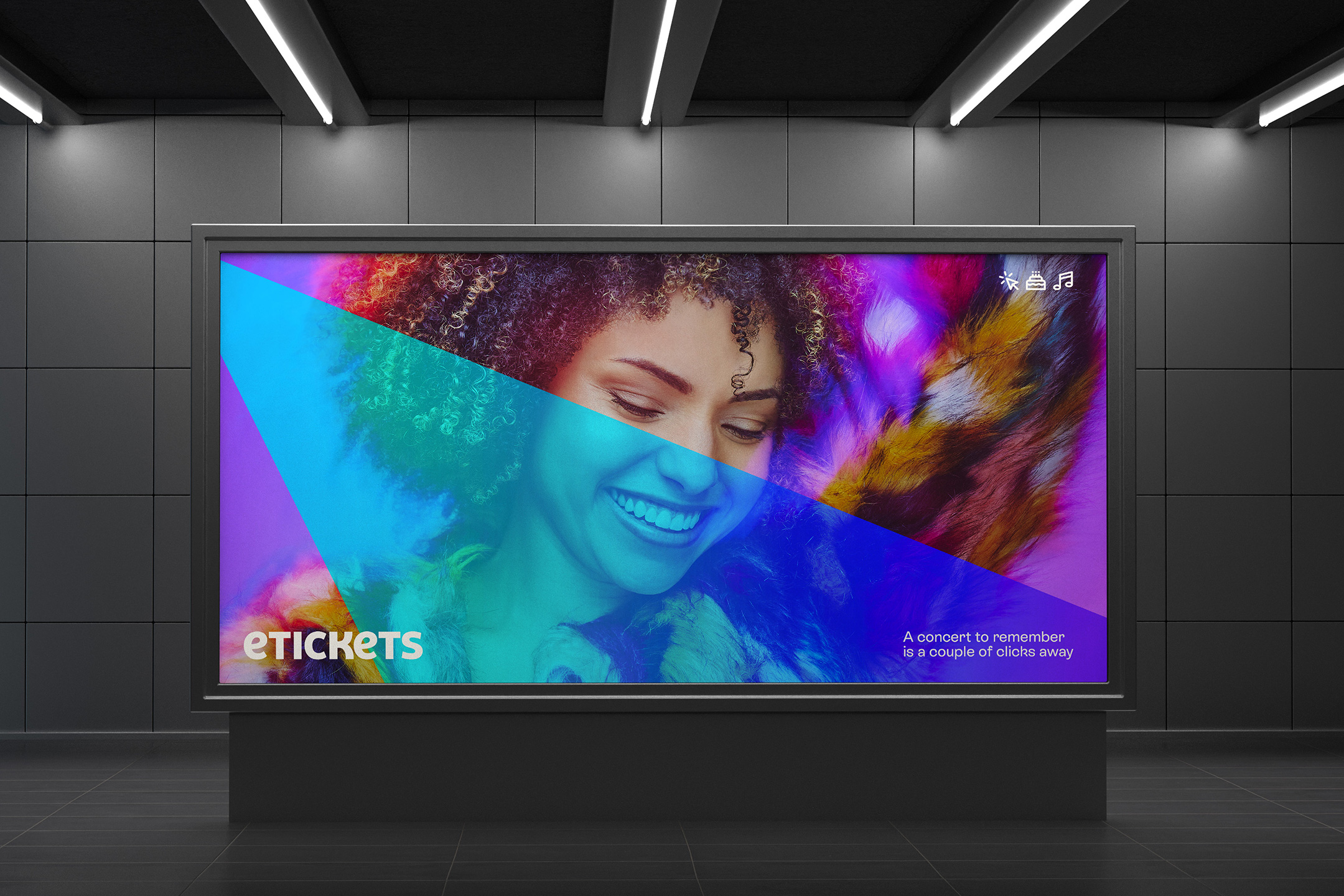
As we developed the new brand mark, we landed on a concept that used converging spotlight beams that carve negative space into a square. The dynamic spotlight concept from the logo was then carried throughout the rest of the identity as a graphic device, cutting through type, illuminating images, and masking photography.
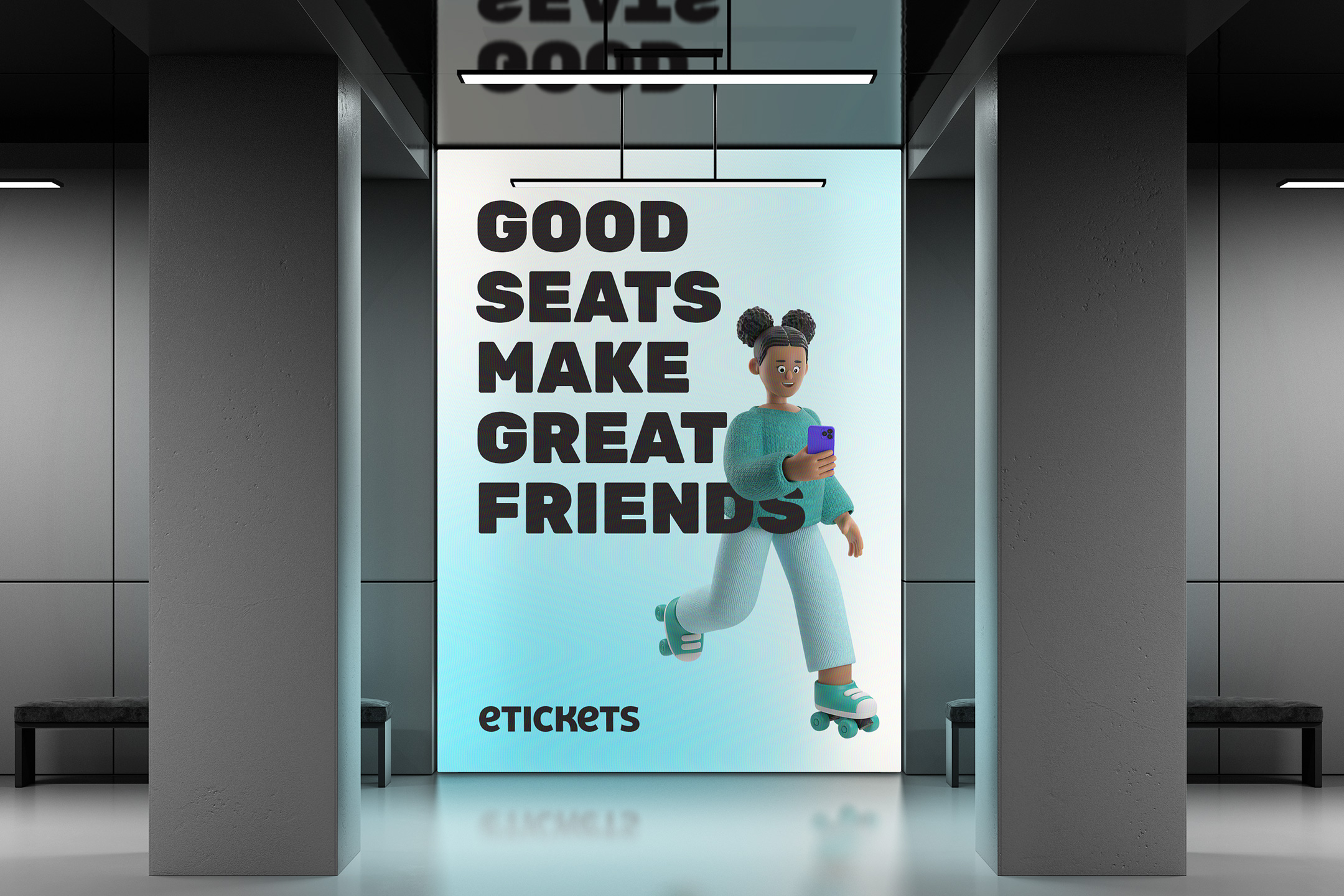
The typographic system means business. We chose Rubik Black set in all-caps as the headline typeface, taking charge with its funkiness, but still soft around the edges. To compliment Rubik we paired it with Rebond Grotesk for all support copy, which allowed us to maintain our dedication to flair, even in the body copy. Look closely, it will make you happy.
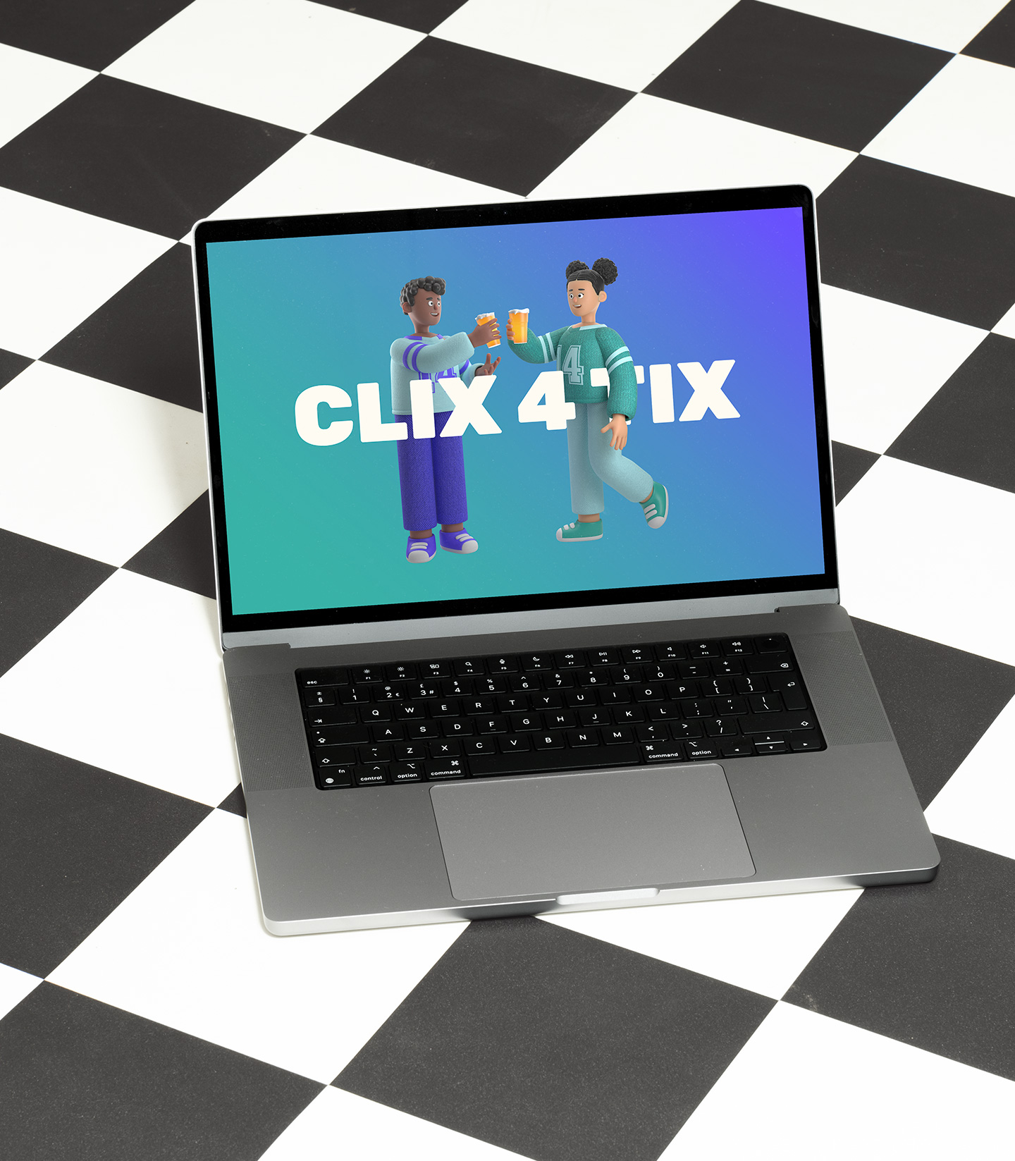
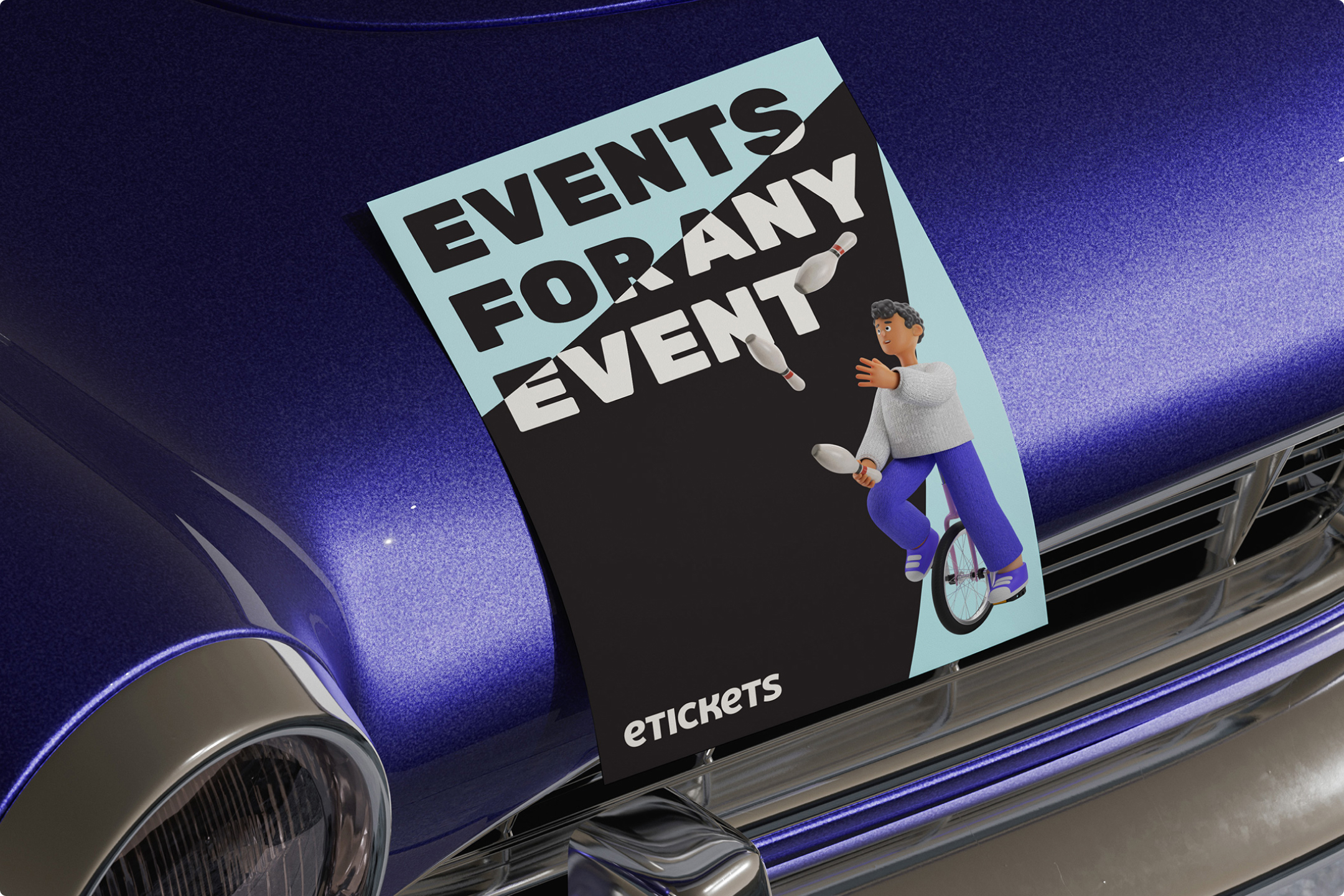
Finally, we commissioned a set of 3D characters perusing their favorite events, which are layered throughout the brand experience.
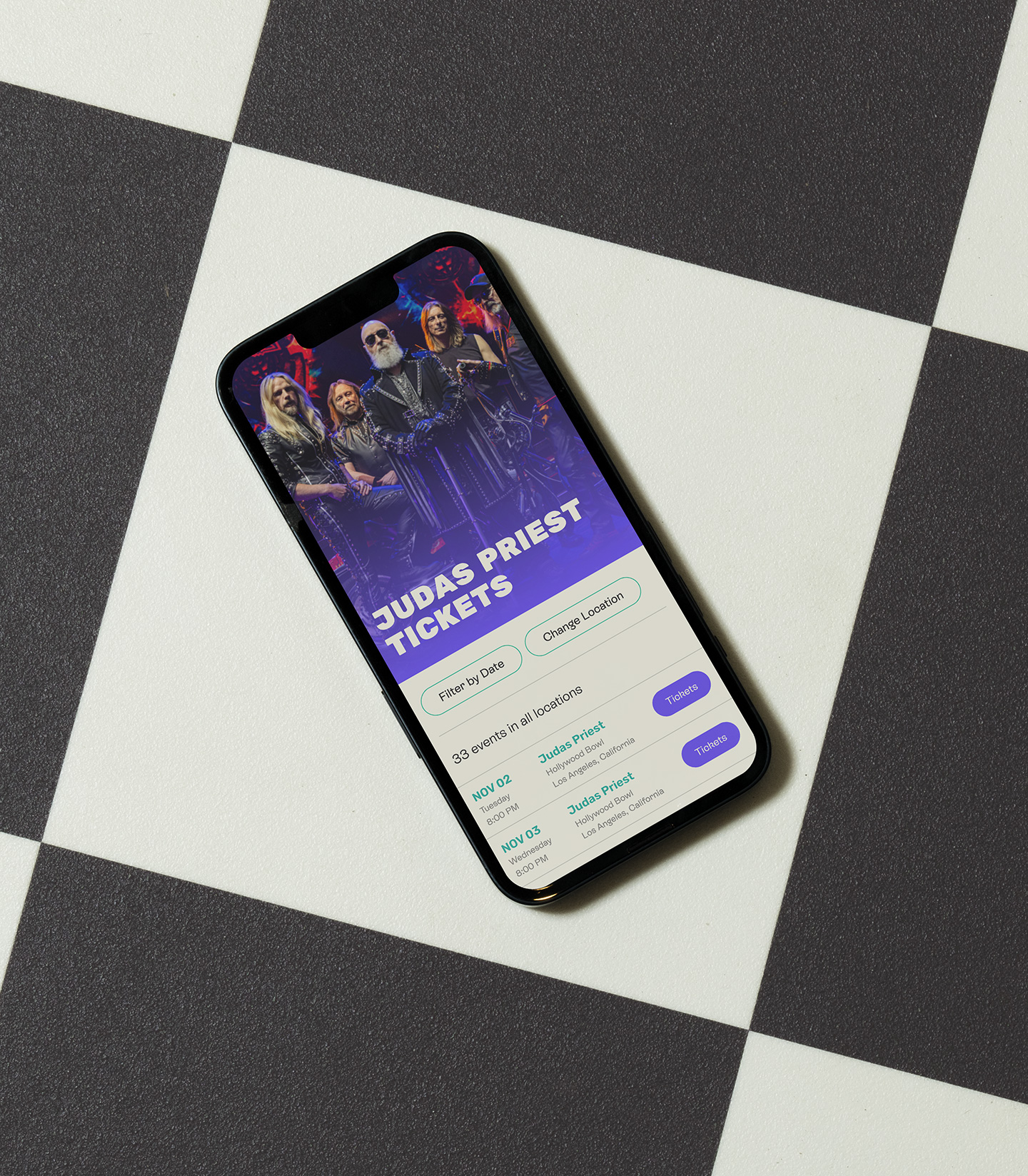
After refreshing the eTickets visual system to better align with their target market, we developed a simplified user experience that allows fans to quickly filter, find, and discover their favorite events, and then purchase those tickets at speed. Every click counts. Our approach focused on high-conversion UX/UI choices, while making the site experience engaging and easy to use. We brought in social proof from previous ticket sales, encouraging user-summited photo testimonials. Furthermore, with a goal to build more community around the brand, we designed functionality that allows for UGC uploads, adding credibility, boosting SEO, and bringing fans into the conversation.


Client testimonial

