AMP
Andrew Maguire is an award-winning photographer and videographer sharing his passion for the outdoors with a global roster of clients. With Andrew's business reaching new heights, he approached us to reimagine and realign his brand. His mission remained the same, but his vision had expanded. With that, AMP was born.
Brand Strategy, Brand Identity, Tone of Voice, Art Direction, Collateral Design, UX/UI Design, Website Development


For AMP, our goal was to conceptualize a leveled-up brand system that captured the essence that makes Andrew's studio unrivaled. While doubling down on the refreshed brand personality, our approach needed to communicate Andrew's recent growth-fueled pivot to the full-service content and storytelling studio we now know as AMP. As we repositioned Andrew's studio, we knew the rich history, inspiration, and experience behind his brand had to shine.
Naturally, our strategy took us back to Andrew's roots. As fellow Michiganders who now call the Colorado Rocky Mountains home, we wanted to use that Midwest grit as a grounding force throughout the reimagined AMP brand. We balanced that tenacity with the natural sophistication of his work to create the perfect tension within the design system. AMP is a lean and mean team, known to deliver groundbreaking creative for everyone's favorite outdoor and adventure-focused brands. With the evolution to AMP, Andrew's studio is venturing into other inspiring areas of business, so it was essential that we build a brand that could adapt and grow with the studio.


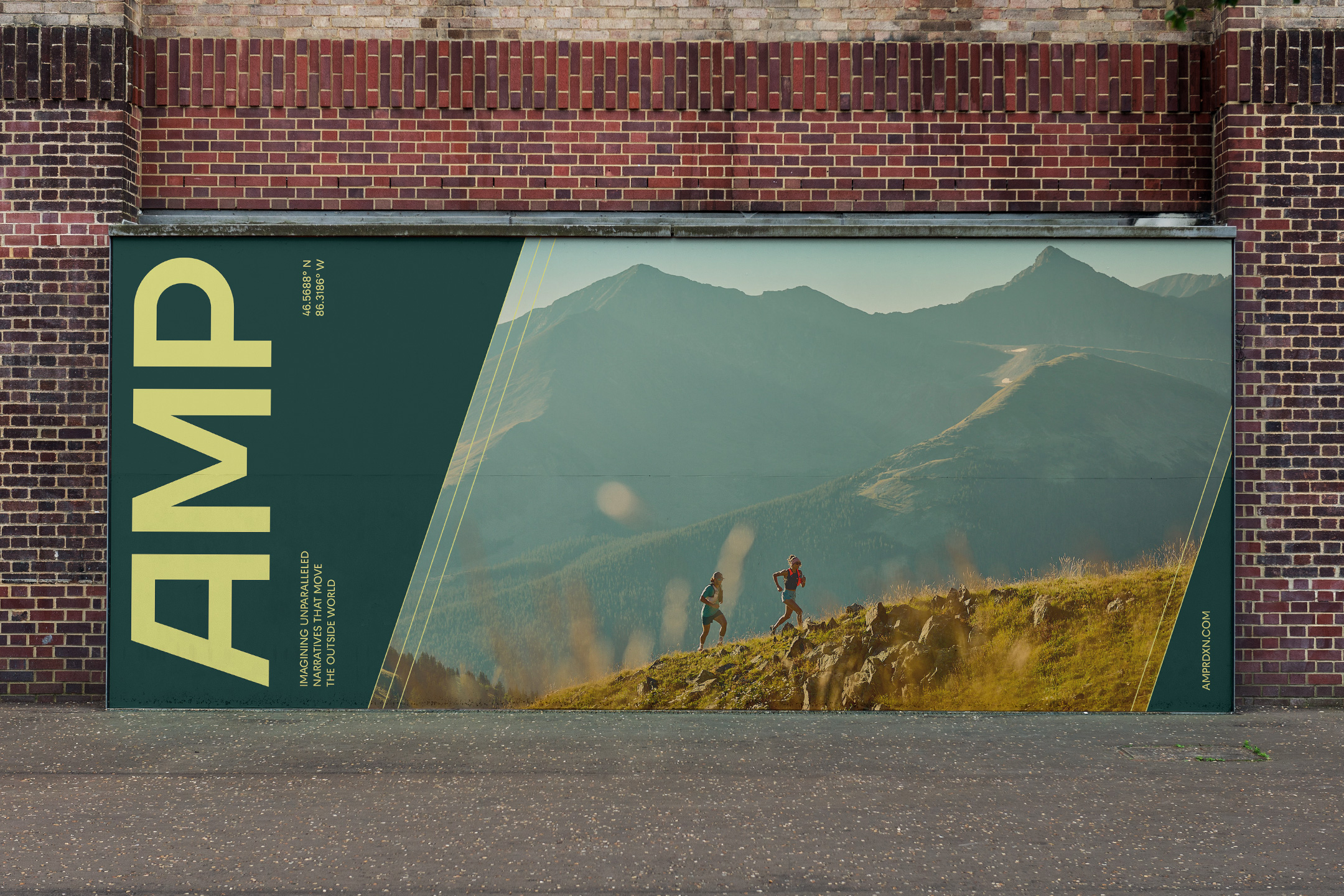
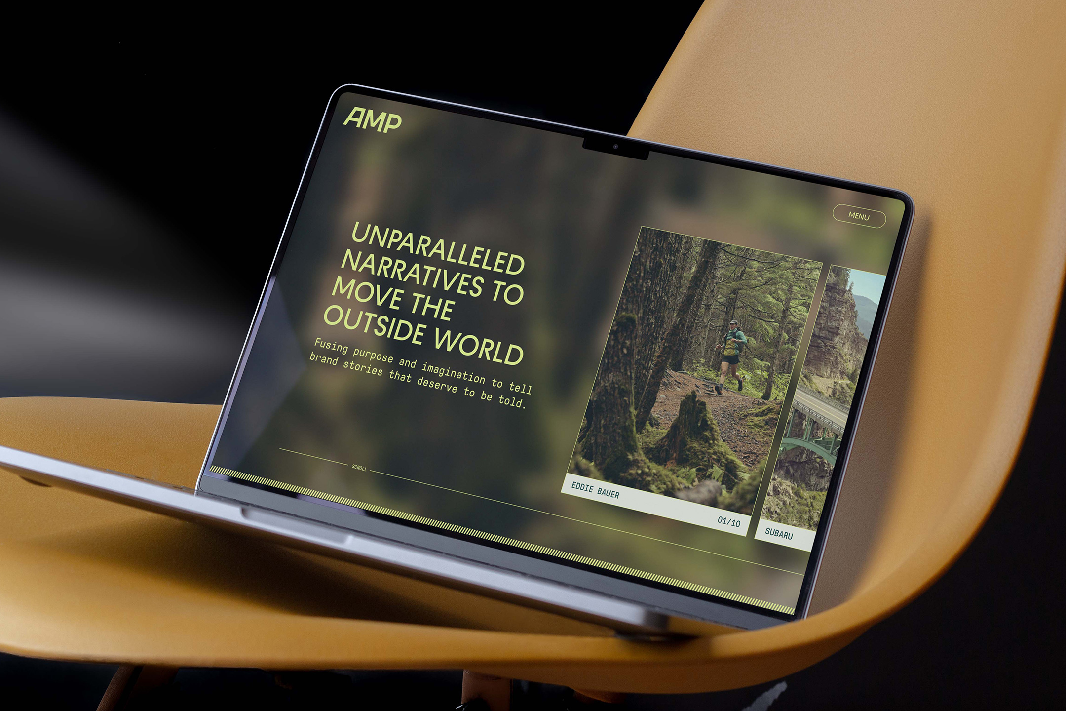
After digging deep into the competitive set, we knew the industry standard black and white color palettes and basic website experiences weren't a consideration. The new narrative-driven production studio is a force to be reckoned with — a little giant. The brand world we developed breaks the mold, highlighting the personality and work ethic that has pushed AMP to evolve and progress, relentlessly refining their craft over the years.
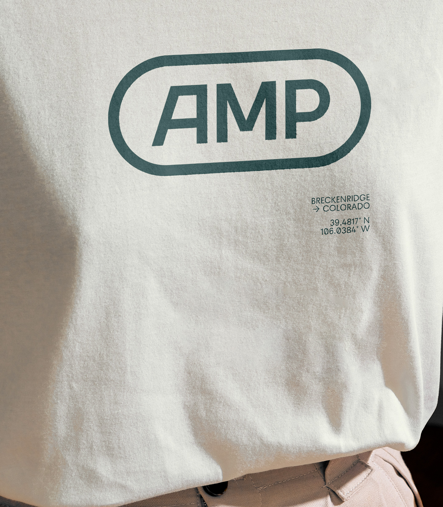
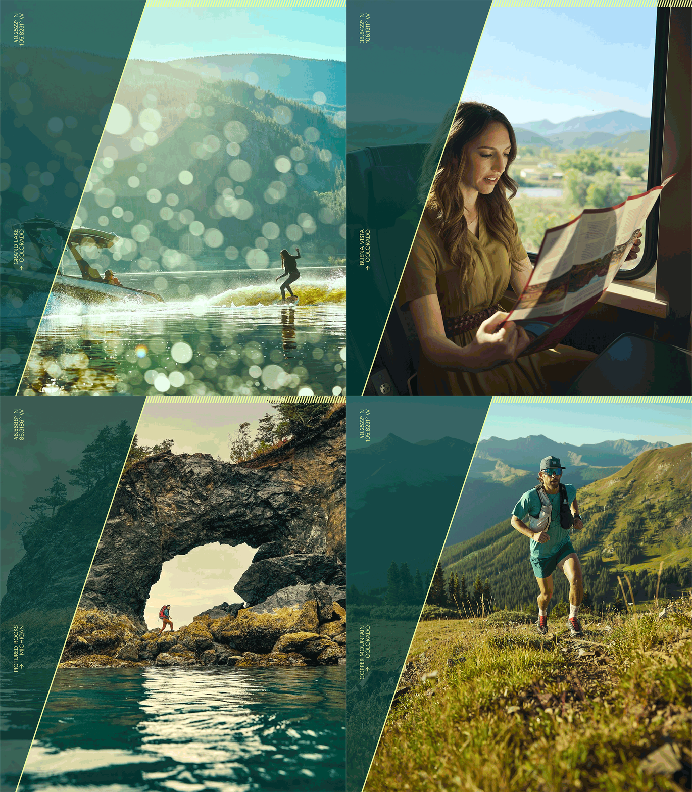
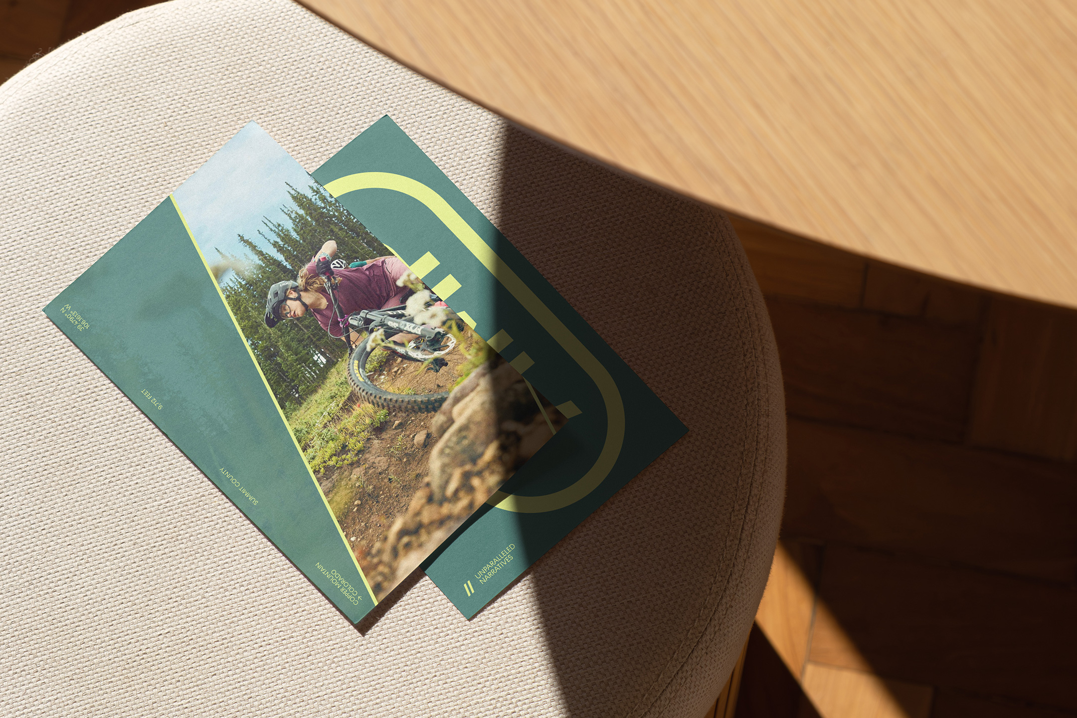
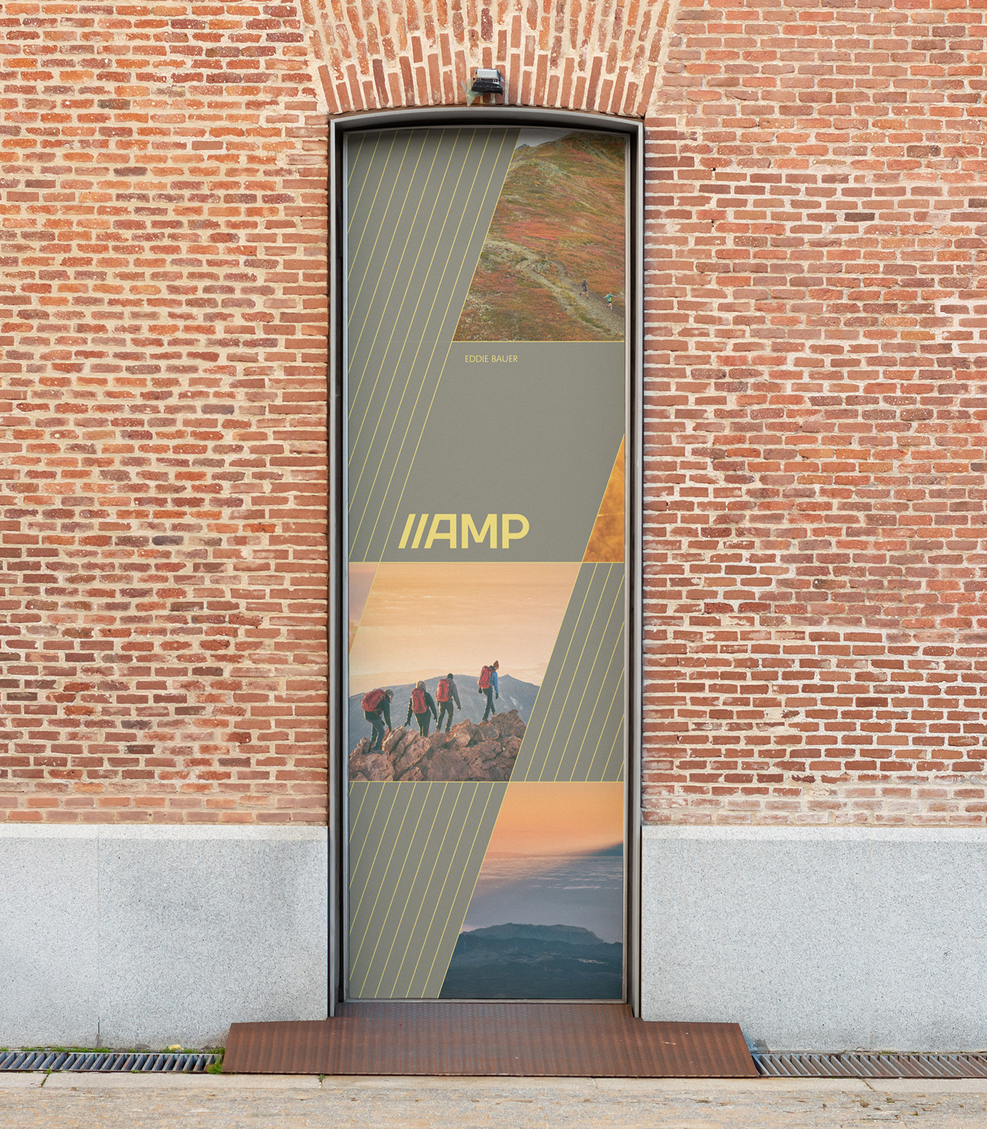
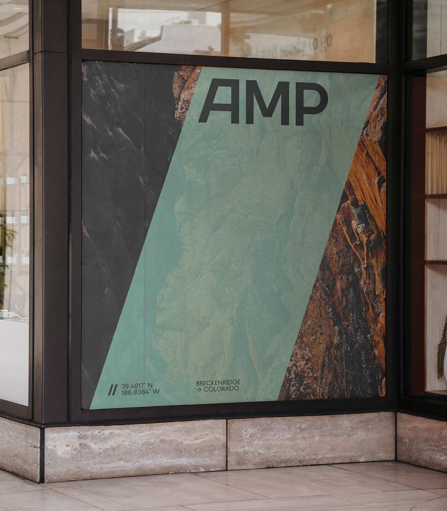
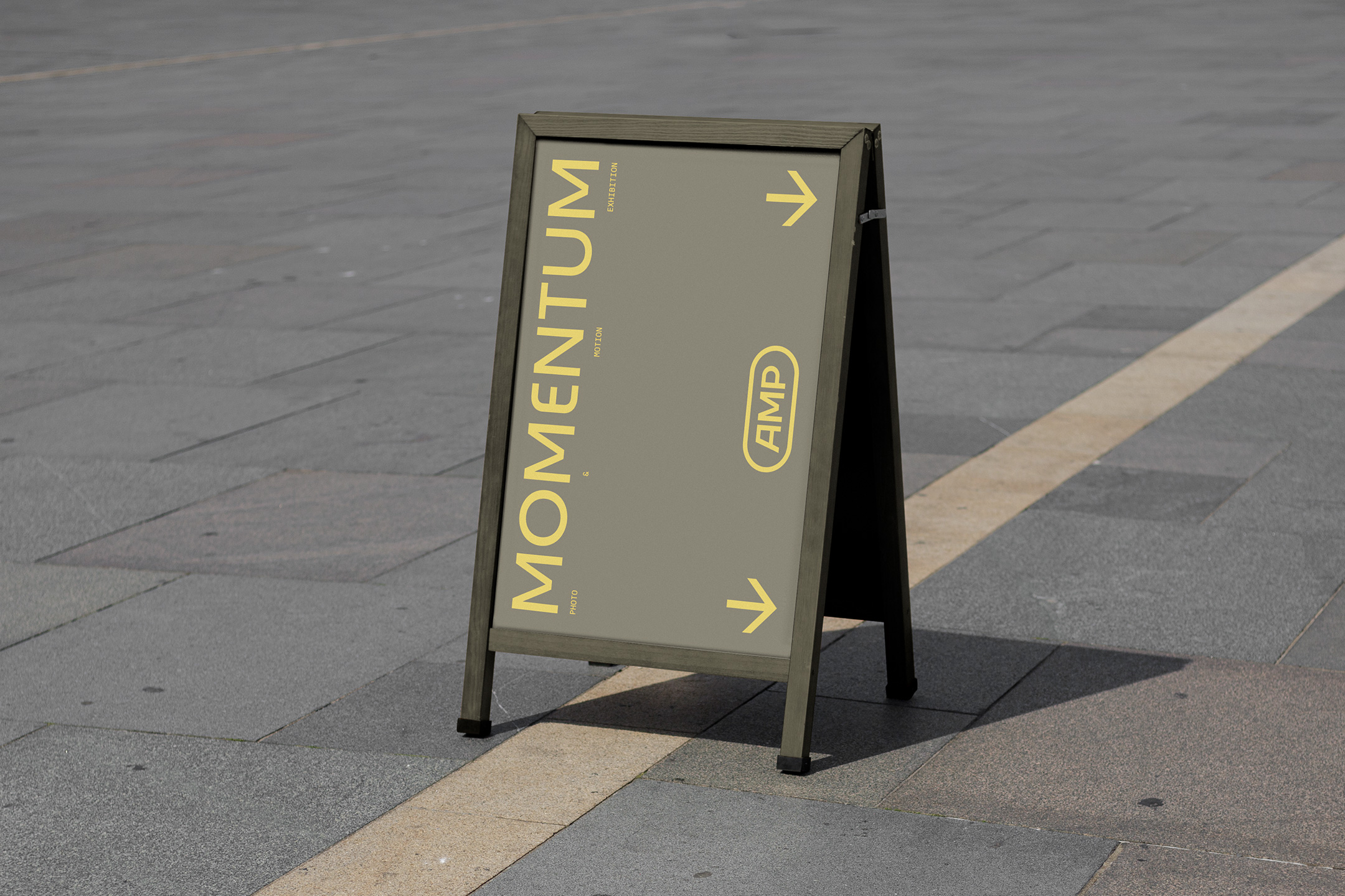
Sturdy, future-focused, and supercharged, our new logo sets the stage for the rest of the design system. The bespoke AMP wordmark captures the essence of the studio, locked and loaded for whatever is next. Taking nods from the angle of the wordmark, we developed a slash-influenced graphic device that would lock-up with the "A" to serve as the standalone mark. It's also used throughout the entire visual language as a connective tissue throughout touchpoints.
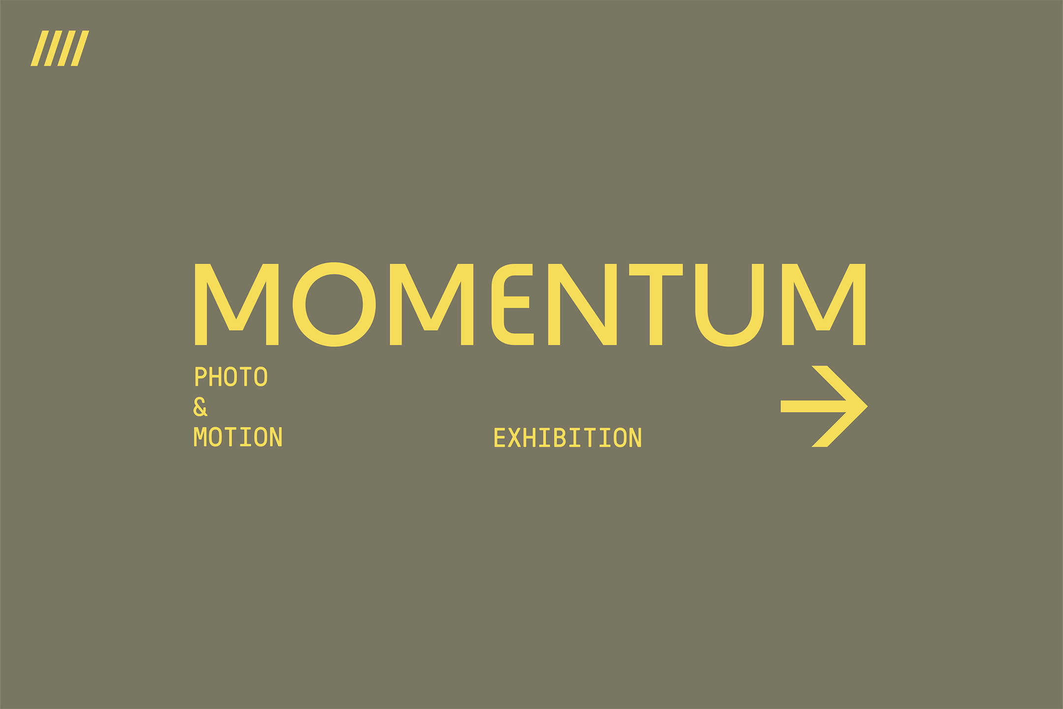
Our headline typeface, Raptor, features unique cuts and unexpected alternates making it the perfect statement piece for AMP communications. We use Pressura Mono for subheadings, a monospaced typeface inspired by early metal type printing, which made it the perfect candidate for the Midwest attitude that flows through AMP. Bringing Raptor back in for body copy, we established a workhorse type system sprinkled with just the right amount of attitude.
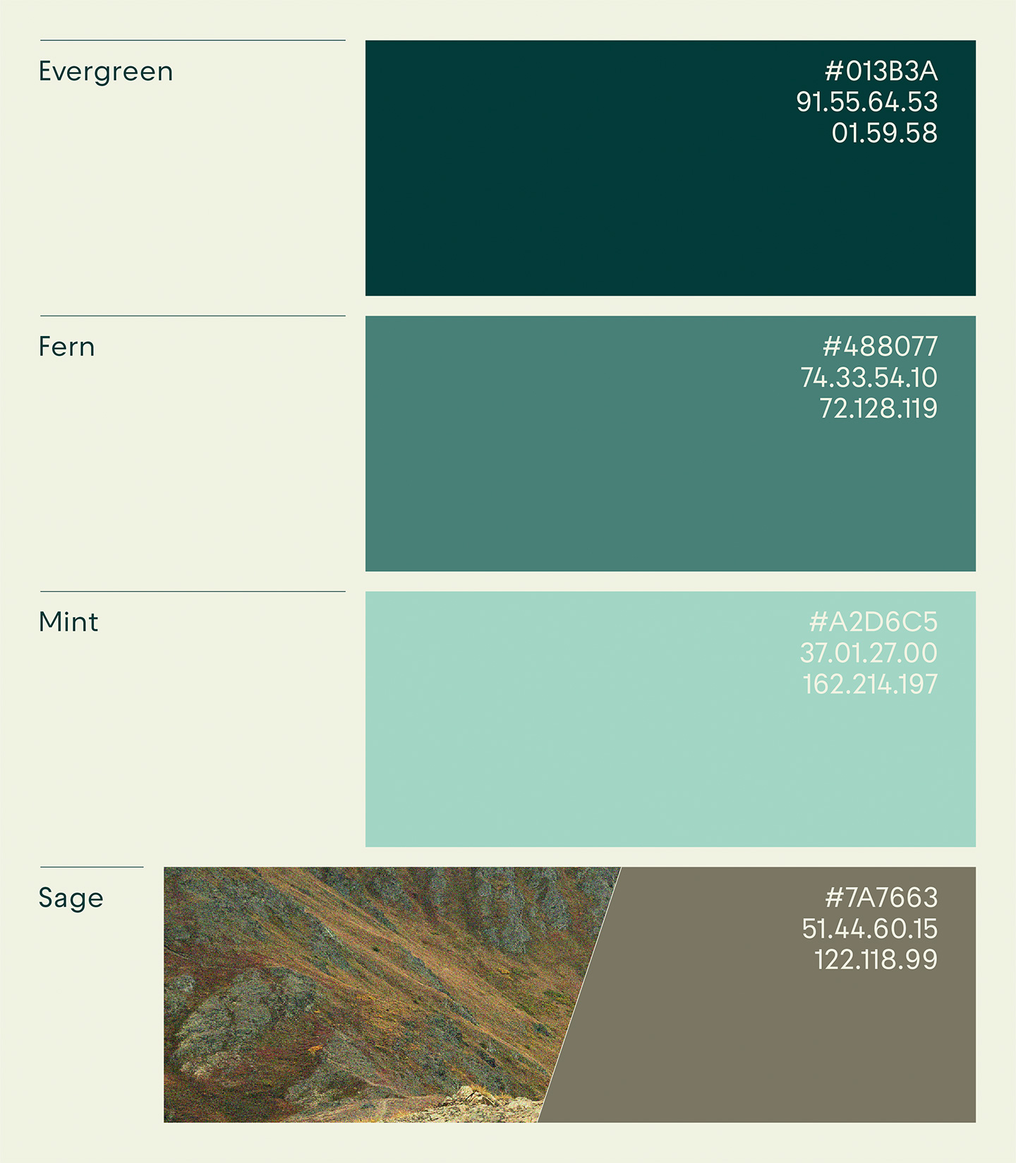
With the majority of AMP's inspiration and client work coming from the outdoor industry, it was important that we paid homage to the brand heritage through a natural and authentic color palette. Each color in the system is pulled from hues present in AMP's outdoor lifestyle photography. The result is a spirited color story that compliments the photography, adding energy to the visual experience.
We had a killer time working with AMP on this project, and can't thank them enough for their trust, bravery, and collaboration along the way.


Client testimonial
