RIP Cold Brew
Rest when you're dead. RIP Cold Brew awakens the mind and body with unique high-caffeine flavor profiles that are canned and ready to pound. RIP goes best with the adrenaline-inducing activites that get your blood pumping. Whether you're catching some waves before work or white knuckling a single track at dusk, RIP is the extra kick your session is missing.
Visual Identity, Art Direction, Packaging


Simply put, the coffee market is flooded with competition. Quality coffee is more accessible than ever, and it's not going anywhere. RIP is a non-pretentious RTD can of cold brew with a kick, built for on-the-go consumption by people push their limits. The founders have a mean passion for coffee, but they don't identify with traditional coffeehouse brands and barista culture. RIP is born from the streets and the trails, and we needed to develop an identity system that doesn't flinch.
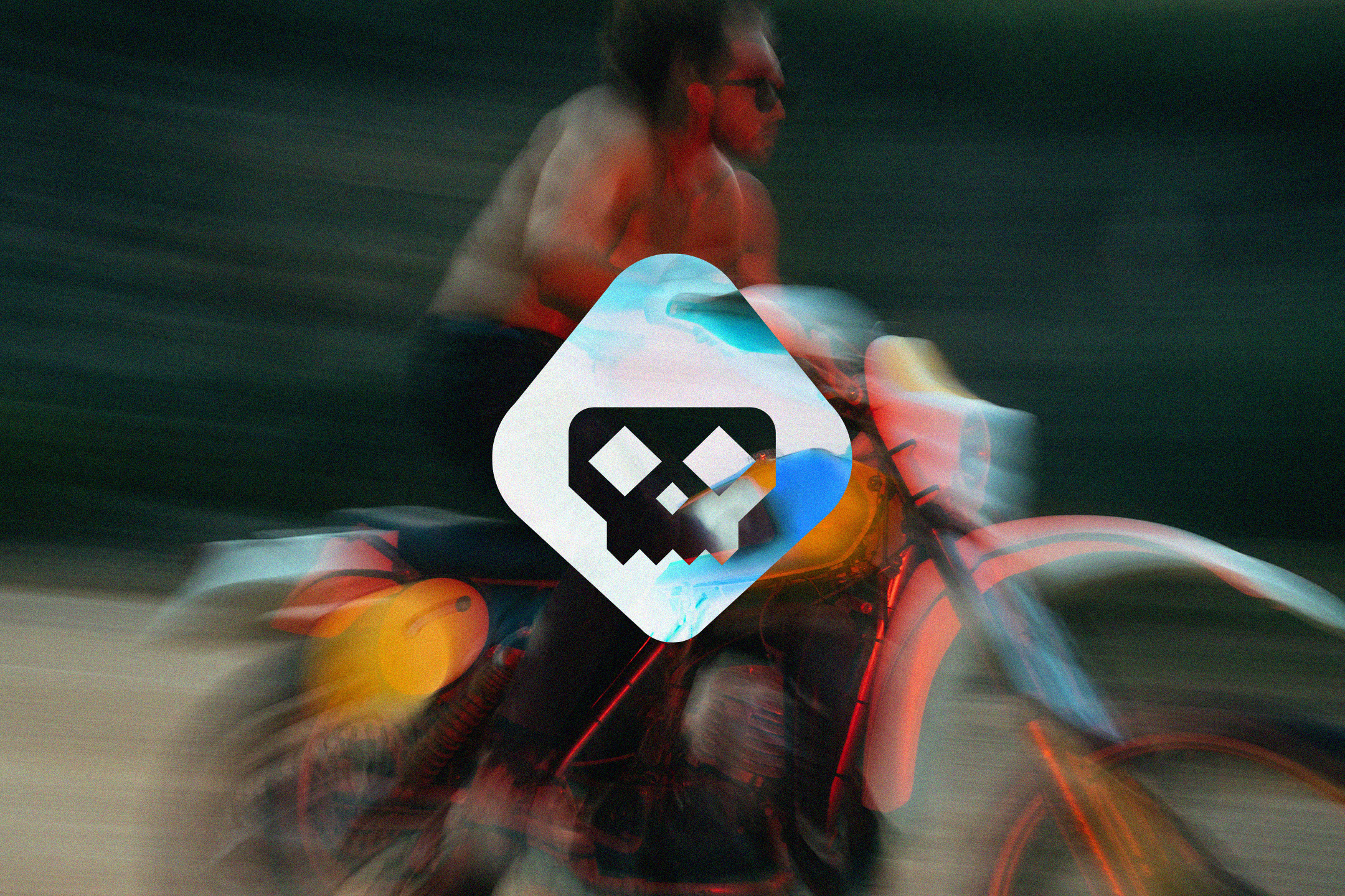
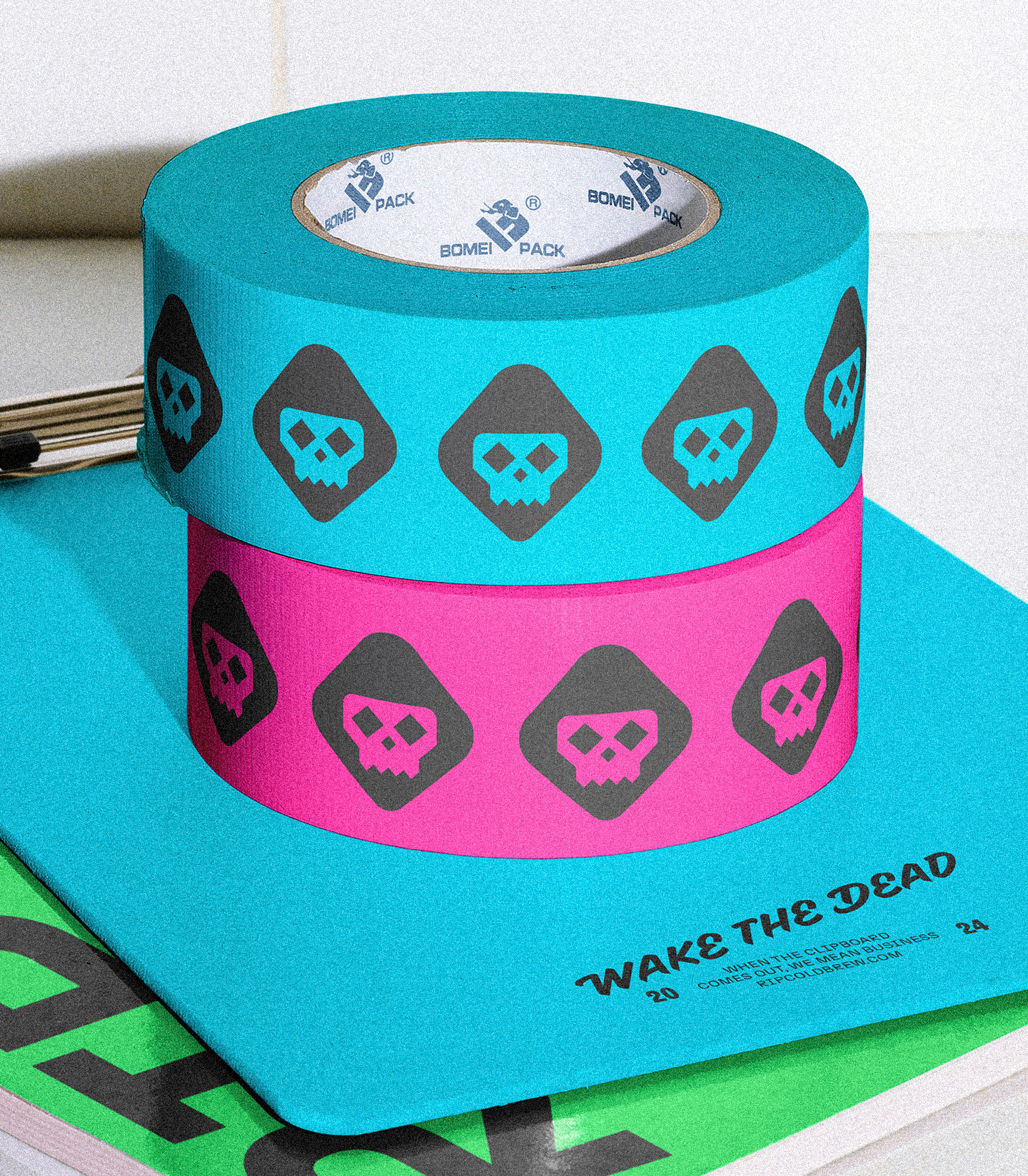
30 years of skateboarding influences so much of what we do as a studio, so when the dudes at RIP approached us to work on this project with them, we were pumped. A brand like RIP needed a brand platform that lived up to its ethos and empowered extreme sports athletes alike. No fluffy typefaces, brown color palettes, or traditional coffee flavor cues — RIP lives in a category of its own. Working closely with our bud Bennett Wantz, we formed the brand symbol to intimidate any shelf it sits on. The reaper is reminiscent of late 70's and early 80's skate culture in Southern California, borrowing some 8-bit characteristics that marry it to the logotype we created.
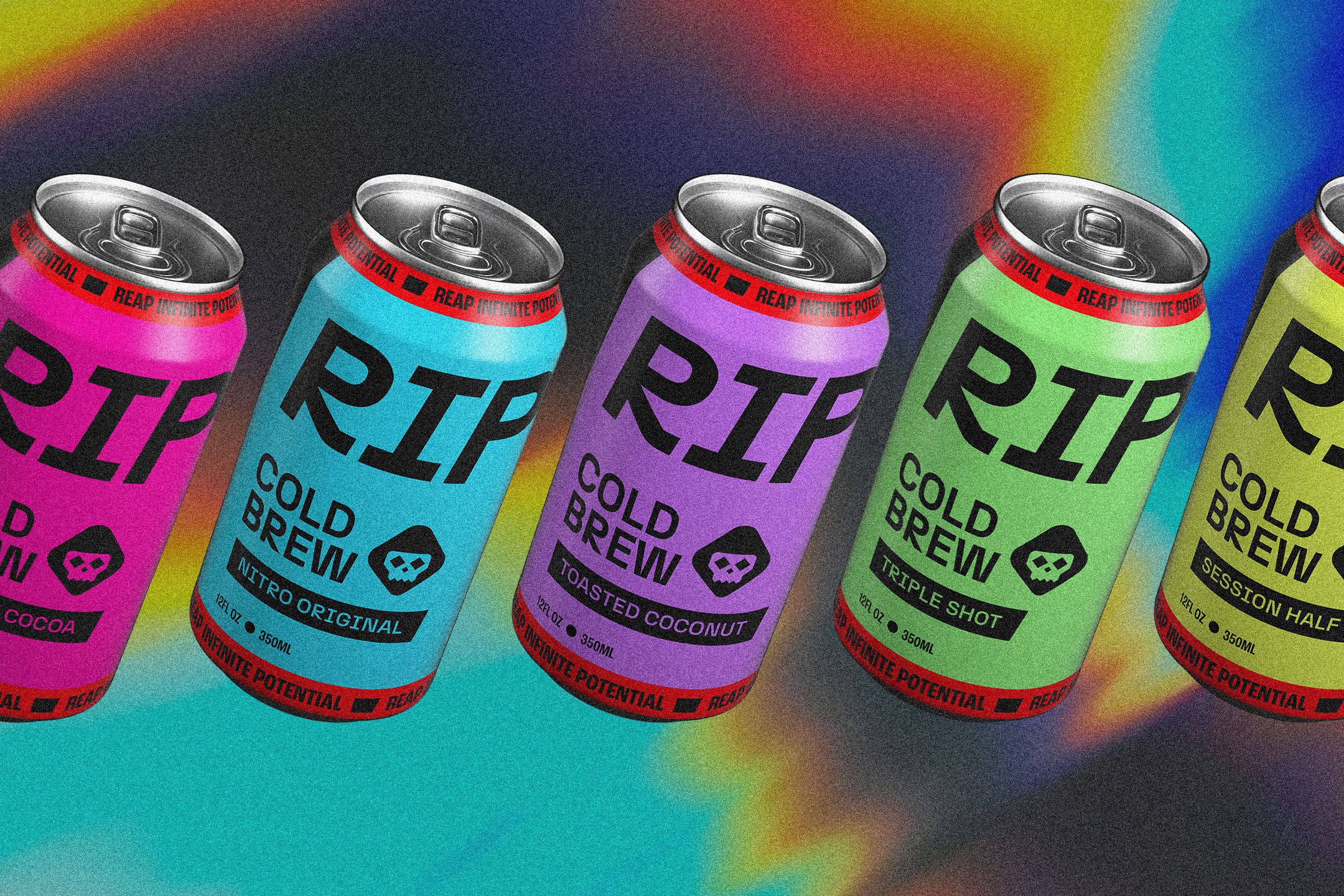
Our color story harkens back to the 80's — nostalgic neon. Bright and unapologetic. To avoid feeling too soft and dated, neon colors are never combined. It's always black on top of a neon, or the reverse. The constraints are what modernizes the color palette, establishing the foundation for our packaging system.
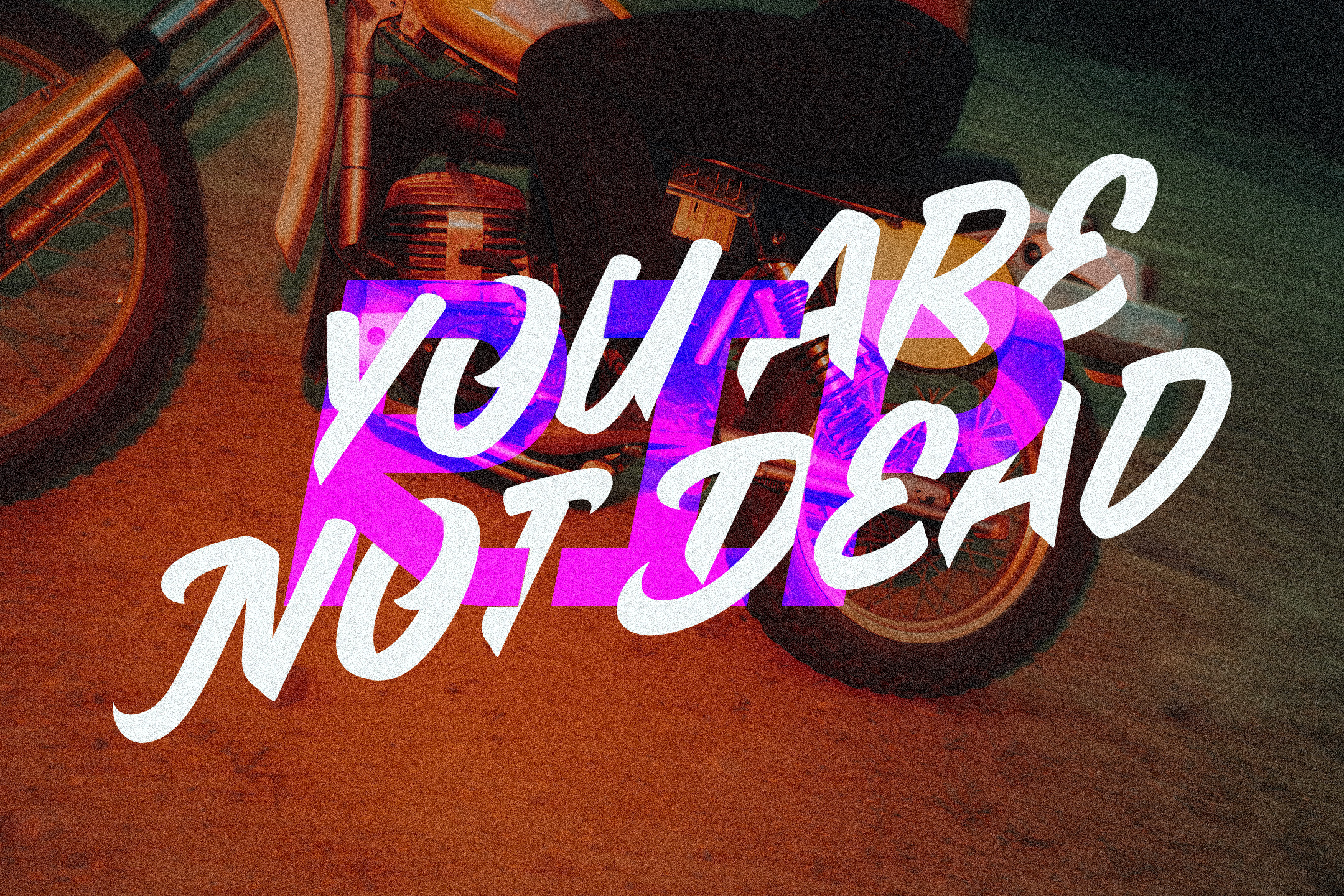
The type system is dynamic, set on top of the psychedelic neons that light up the color palette. N27 is the core typeface used in most headlines and body copy. We use Roc Grotesk Condensed to call out functional information throughout the packaging and clothing. RIP was screaming for some organic flair, so we dialed in a speed stroke typeface (ZC Casual of course) with soft entries and sharp exit strokes, capturing the authentic feel of hand-lettered signage.


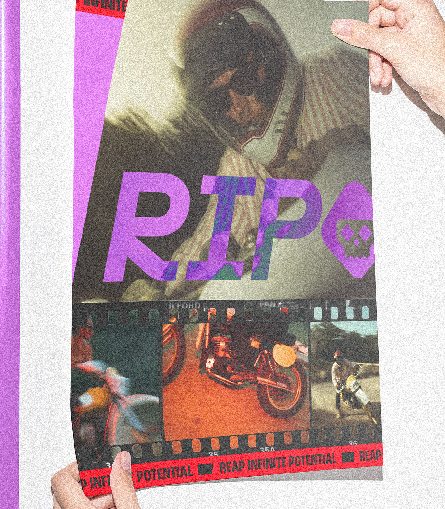
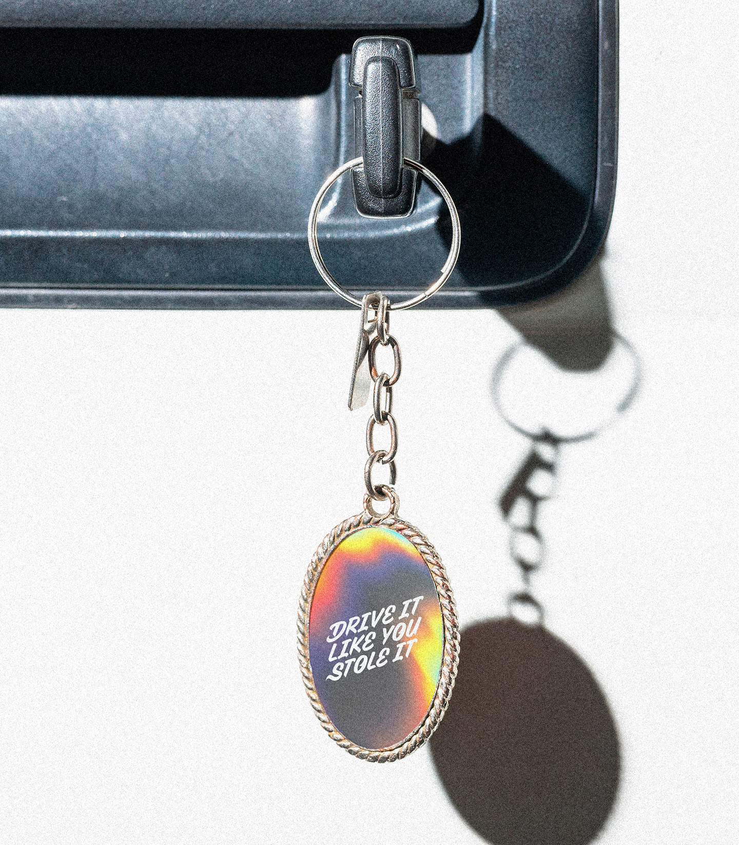
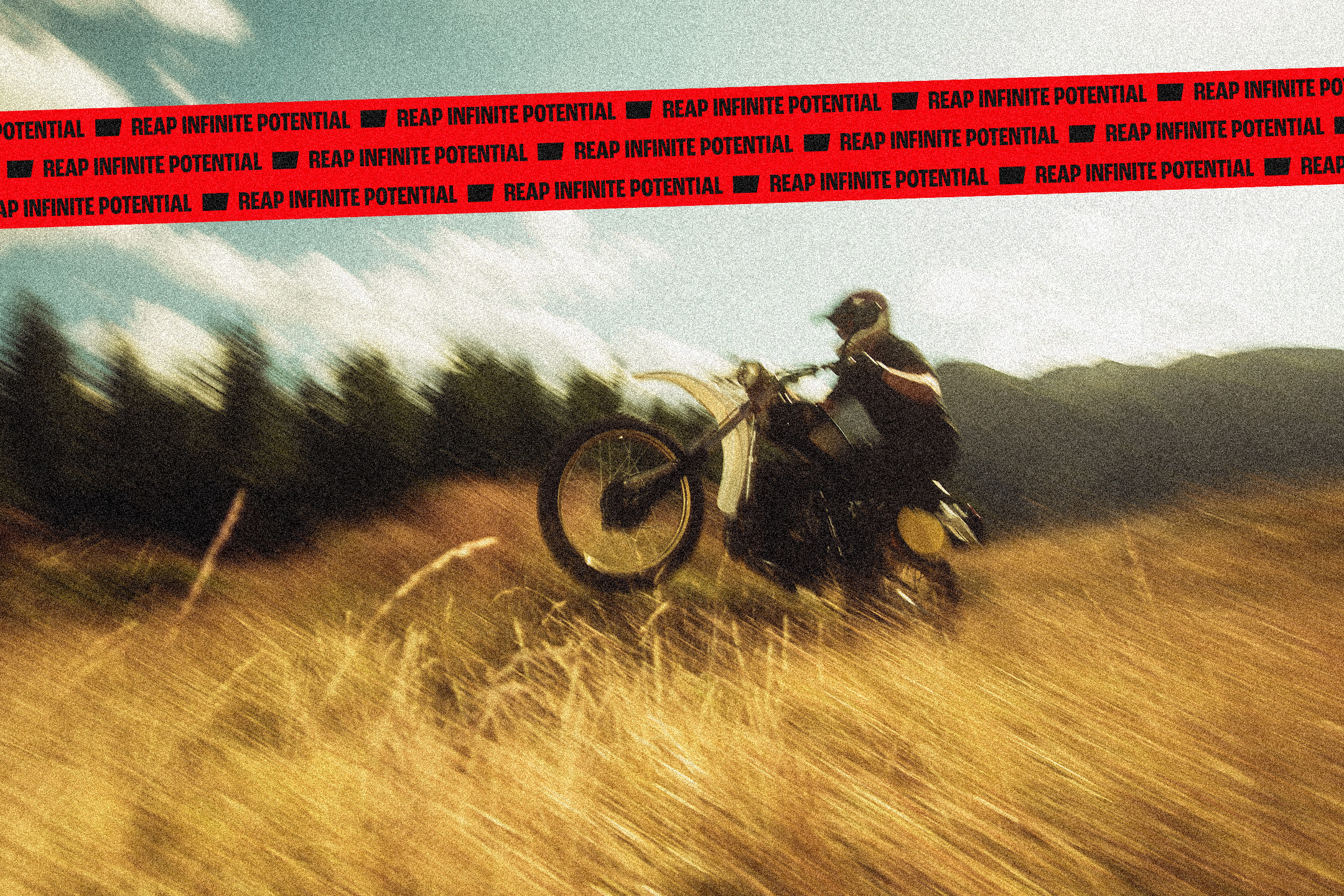
We then took the core pieces of the visual system and began expanding on them, adding a red tape graphic device that is used in packaging, clothing, and to break the grid in other layouts. Film negatives are used to clip photos and add texture in minimal ways throughout the system.
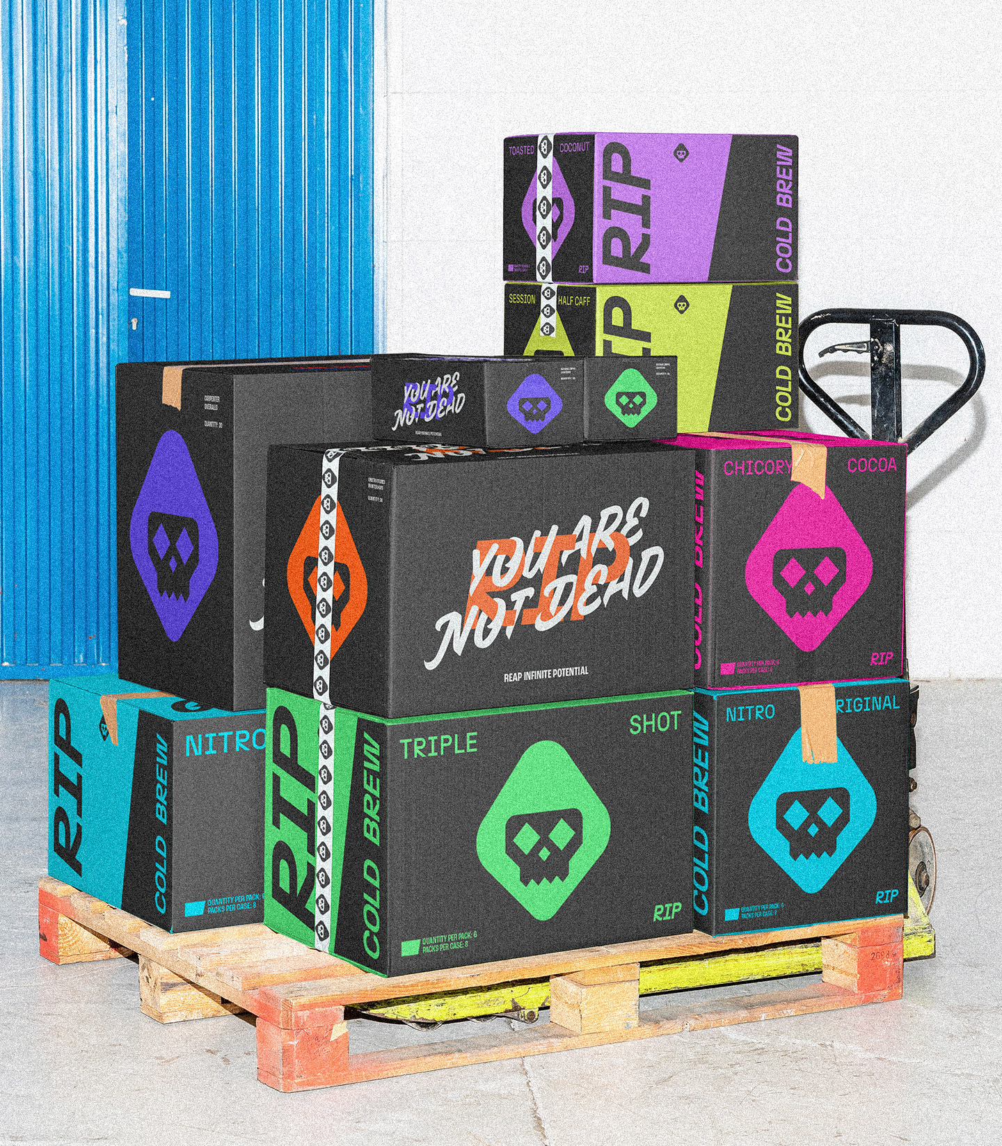
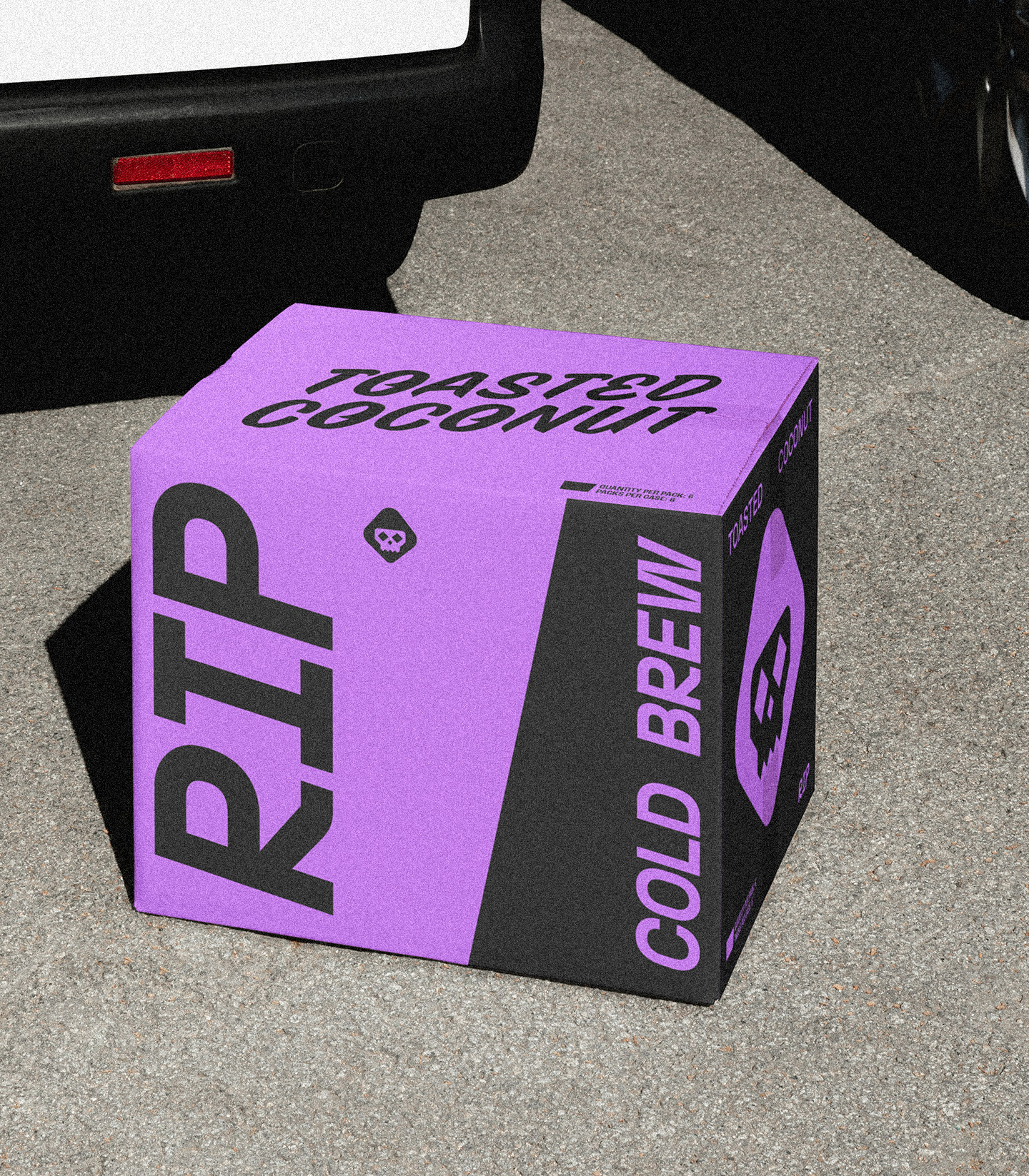
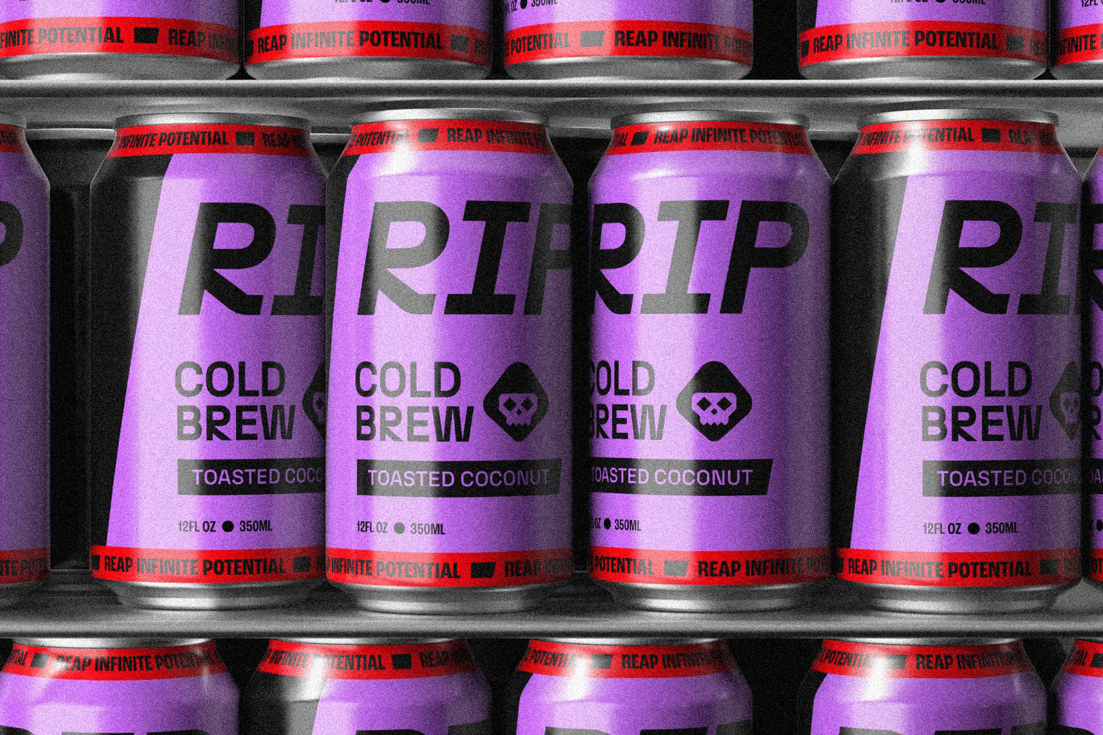
Finally, after researching the competitive set and shelf presence within it, we came up with the packaging system that would resurrect any sleepy shopper from the grave. We use the wordmark large across the top of the can to drive brand awareness and recognition, which is crucial in the early days. The can is dynamic but simple, with a black graphic element that pulls the angle from the logo to connect the front and back of the can, housing all of the nitty gritty product details on the behind.
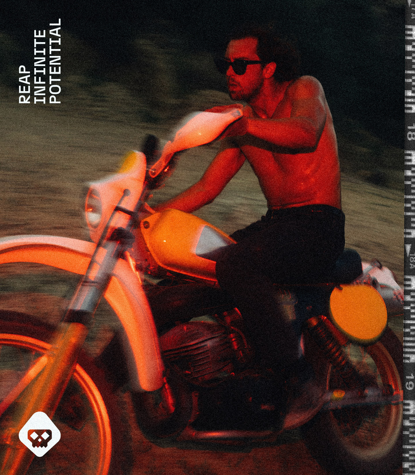
We knew that RIP as brand and product wouldn't act or feel like anything else out there, so we created a brand world that did just that. RIP feels fast. Grip it. Rip it. Reap Infinite Potential.


Client testimonial
"MHD's startup sprint process gave us the exact flexibility we needed, without any trade off. A really professional and polished feel, so much so that we're getting some press from publications like Dieline, which is actually helping us have conversations with retailers. Bottom line is if you're a startup trying to get your branding dialed early on, go with Powerbomb. Period."
Brendan Flannery - Co-Founder
