Carryingmate
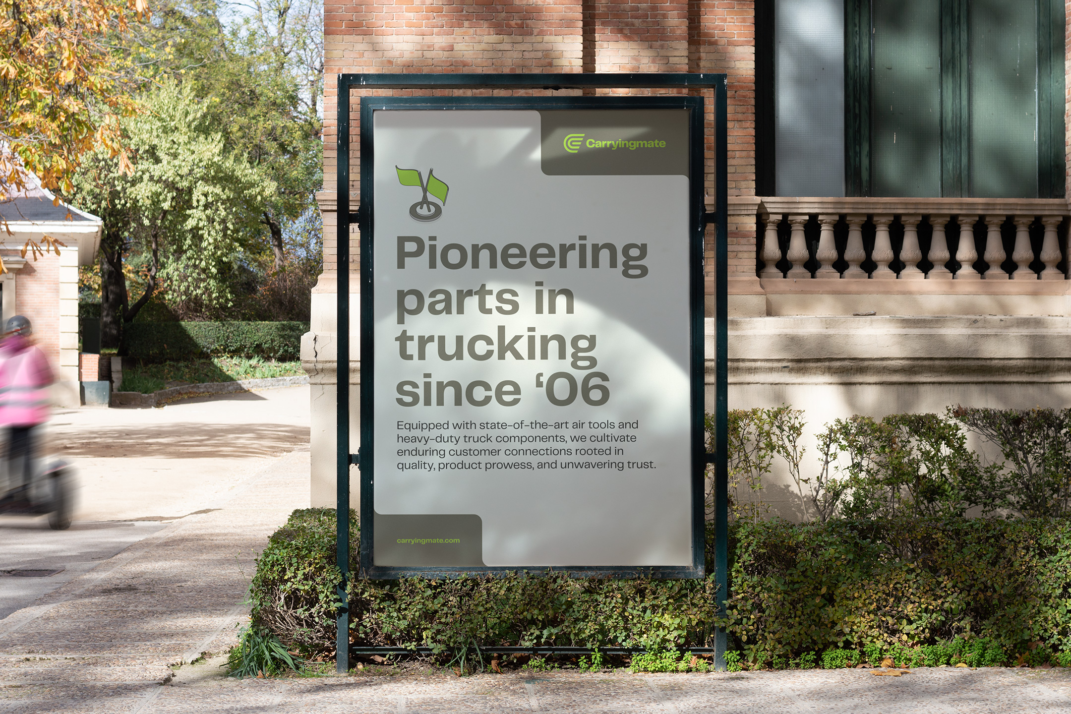
Established in 2007, Carryingmate stands as the ultimate destination for cutting-edge truck and trailer parts. Their clientele includes globally acclaimed enterprises like Volvo and Philips, which have become long-term business relationships. Equipped with state-of-the-art air tools and heavy-duty truck components, they cultivate enduring customer connections that are rooted in quality, product prowess, and unwavering trust.
Brand Identity, Art Direction, Collateral Design, UX/UI Design, Website Development
The vast majority of the trucking industry has neglected the modernization of their brand experience, as technology and innovation have rapidly shifted the world we live in and how people interact with companies. The Carryingmate brand lacked verbal and visual communication that aligned with their unparalleled global operation. With longstanding relationships built among industry giants, it was imperative to set the record straight for future endeavors and opportunities. A streamlined communication strategy was vital, with the tone and voice seamlessly guiding the new visual identity.


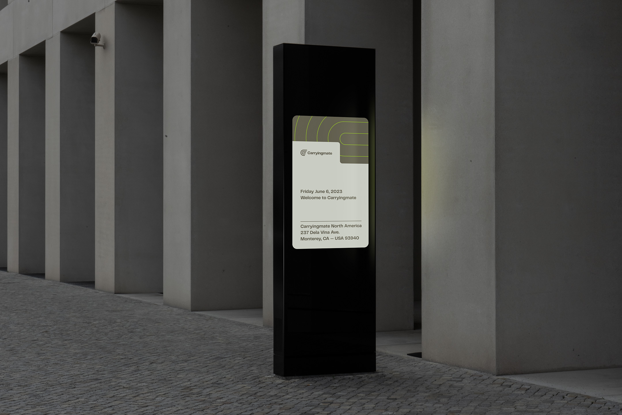

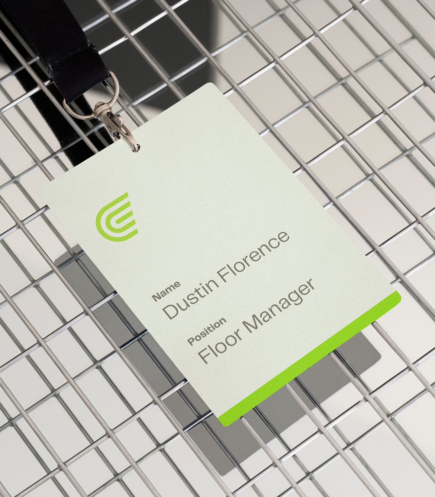
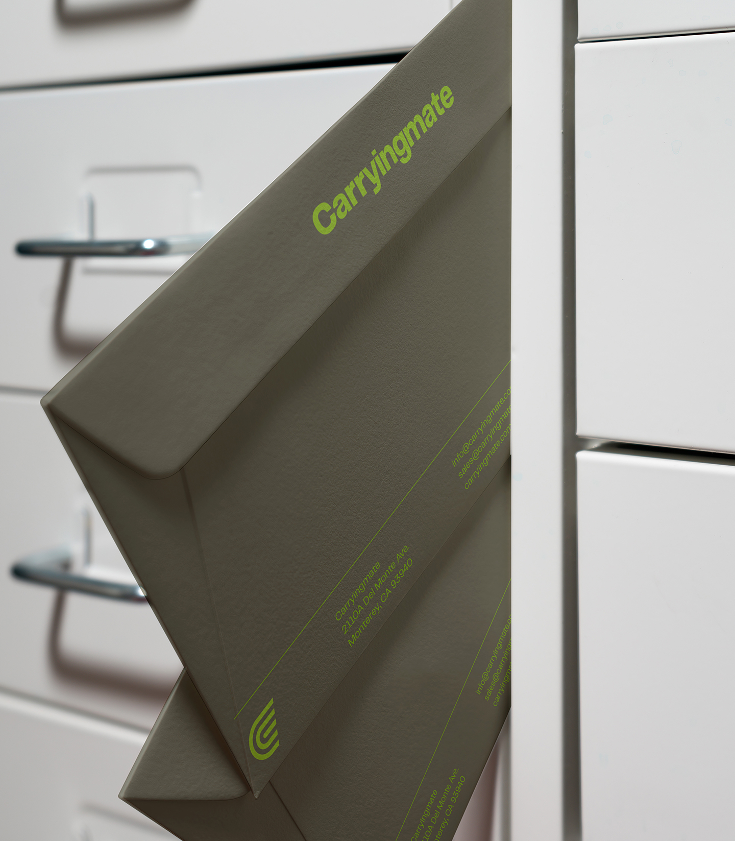
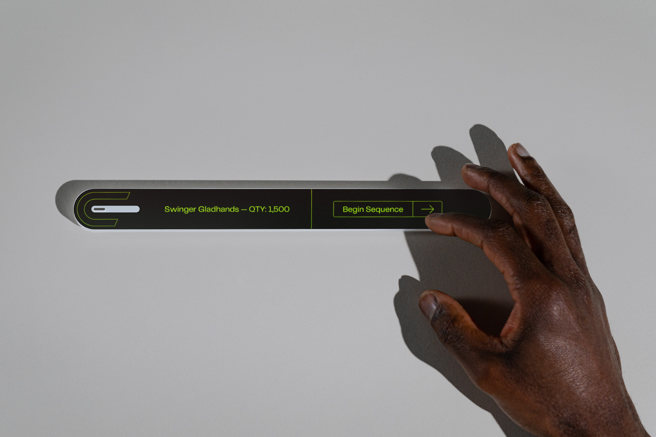
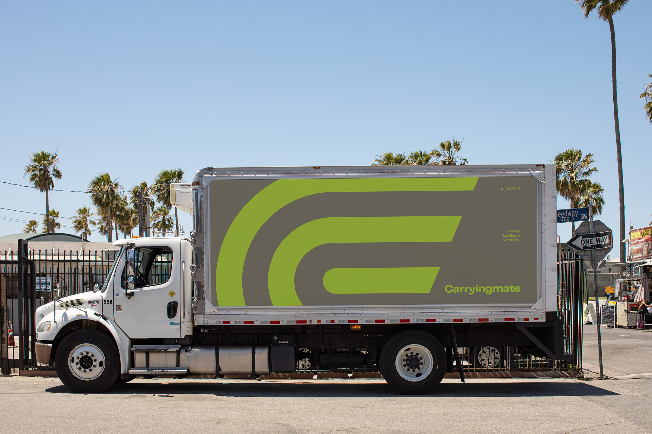
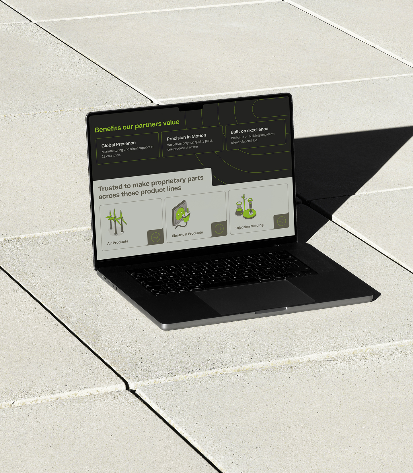
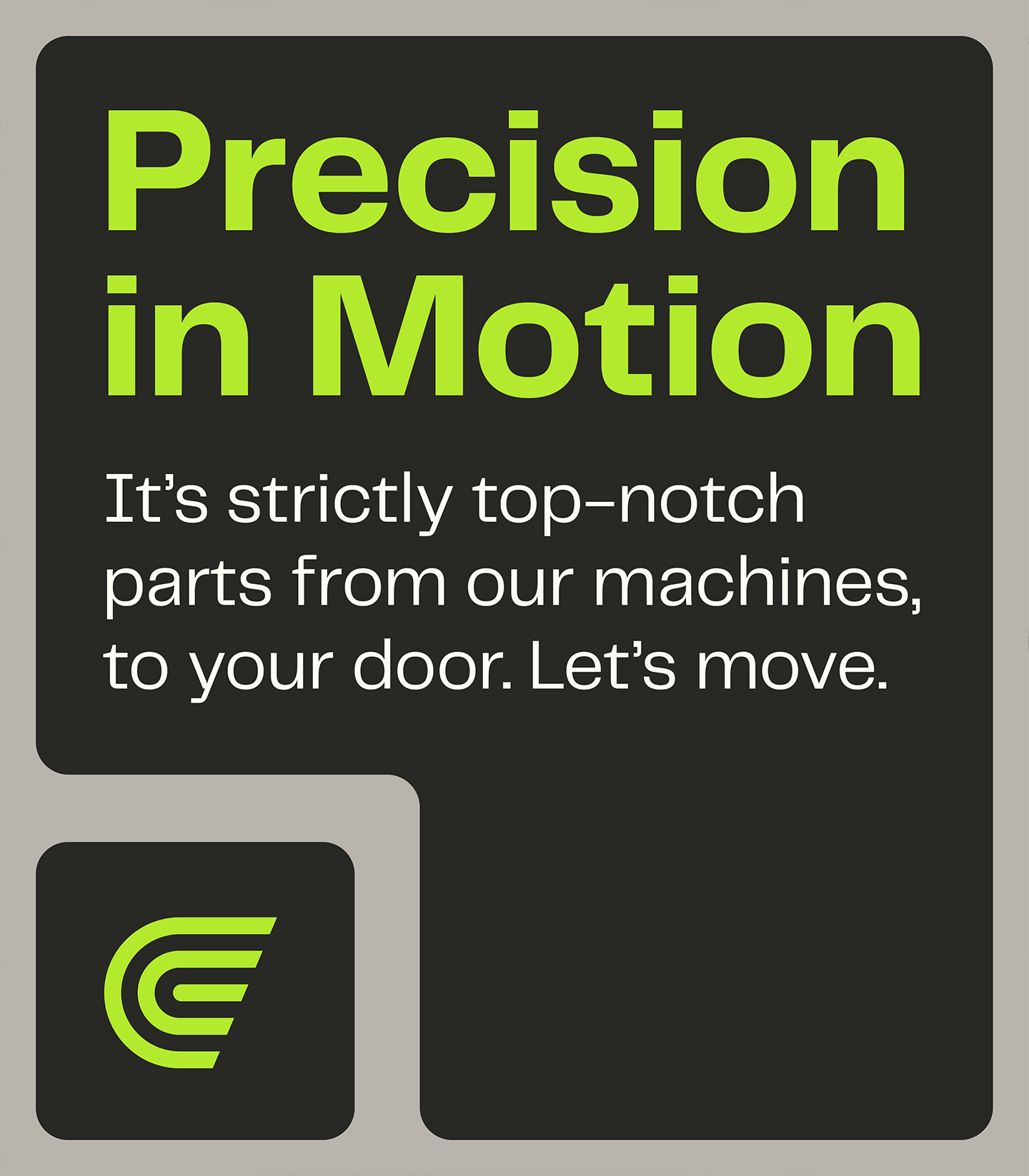


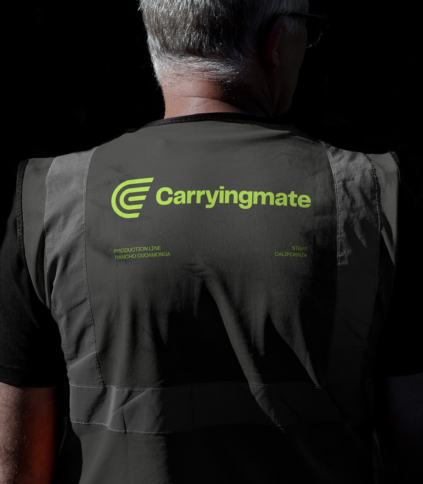
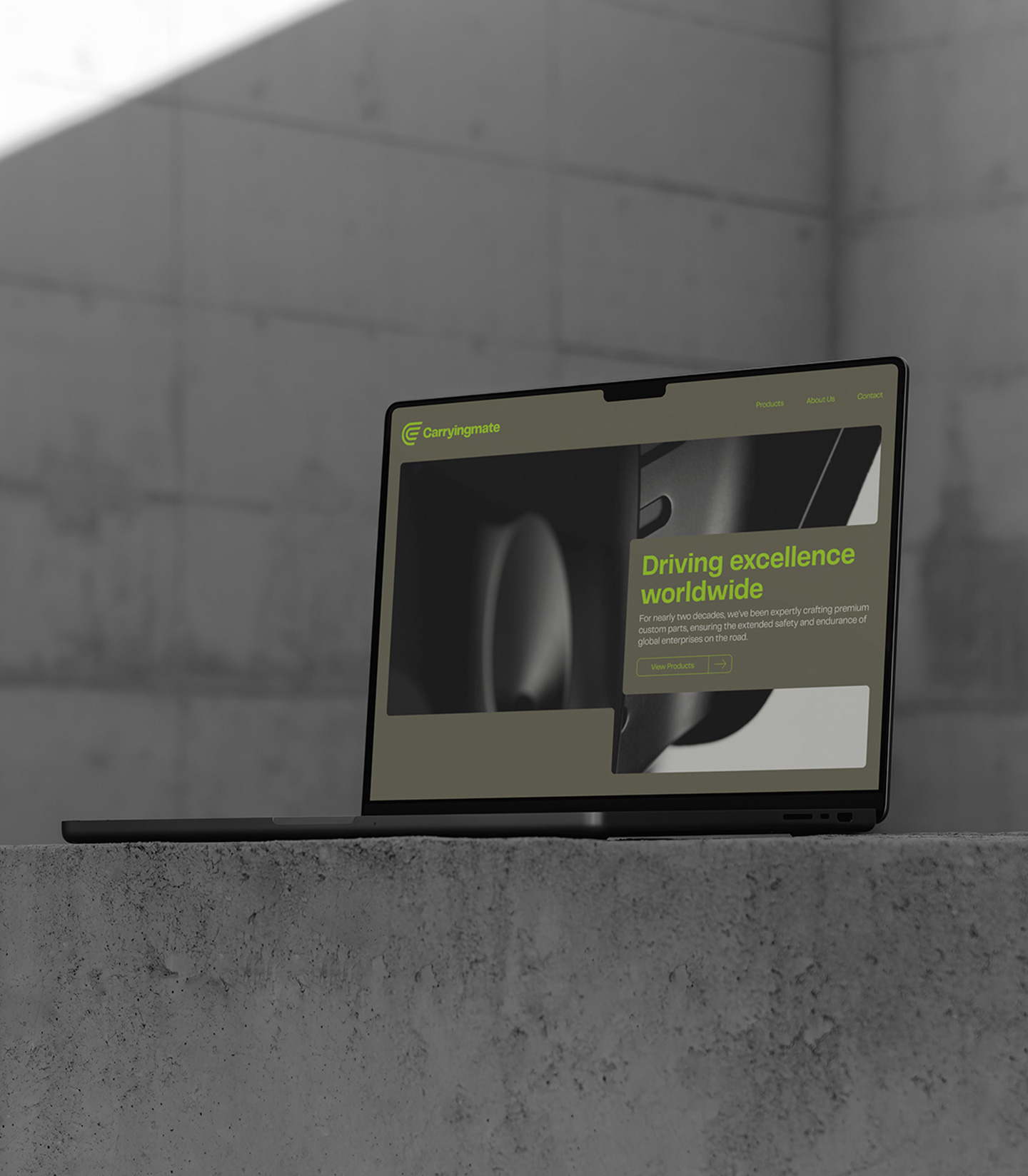
Working with UX strategist Kristen Wavryk, we created an entirely new ecosystem for Carryingmate. The days of playing it safe were over. Our research and strategy helped us shape a brave new approach to color, which refused to blend in with the rest.
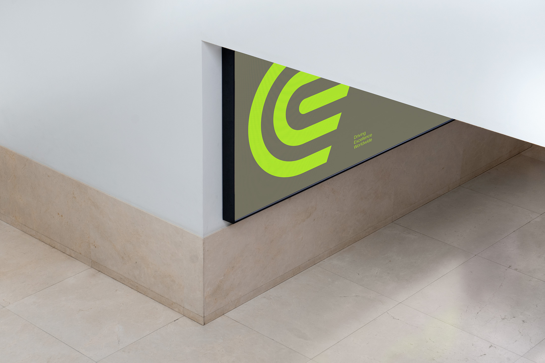
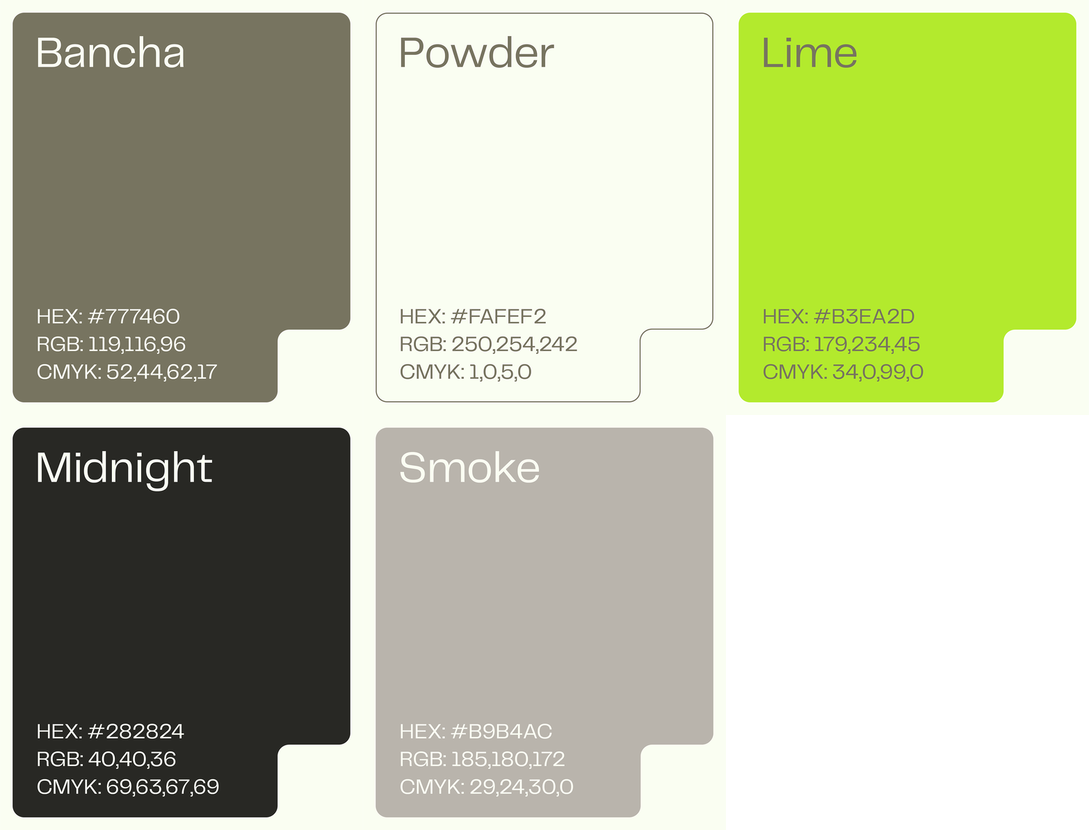
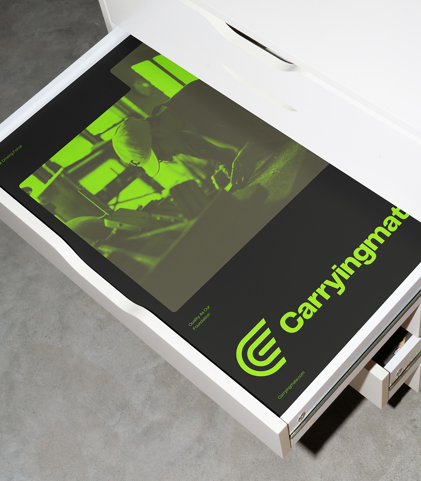
An in-depth competitive analysis surfaced opportunistic areas of positioning through color, moving away from the endlessly vast corporate ocean that we call navy blue. The color system we established blends earthy base colors with a signature electrifying lime, providing an unforgettable energy hell-bent on building brand recognition. Our logomark captures the lightning speed and momentum that has powered Carryingmate for 2 decades, with a winged "C" as the mainstay.
We approached the type system with a need for function and versatility, without feeling too rigid and dehumanized. Telegraf fit the bill - a workhorse sans serif family with some serious attitude. Our layout system is anchored by rounded and notched components to visually represent parts fitting together. Bringing dimension into a fairly flat design system, we use an isometric illustration set which shows up throughout digital and print touchpoints. Carryingmate has entered a new chapter of category disruption, and we are pumped to see what comes next.


Client testimonial
Max Hofert Design did branding, website design, and website development for our company Carryingmate, and it turned out fantastic. They were very easy to work with and did a great job in understanding our needs. I would highly recommend them to anyone looking for this type of work!
Tony Cartelli | Co-Founder


Credits
Kristen Wavryk - UX Strategy
