Kince
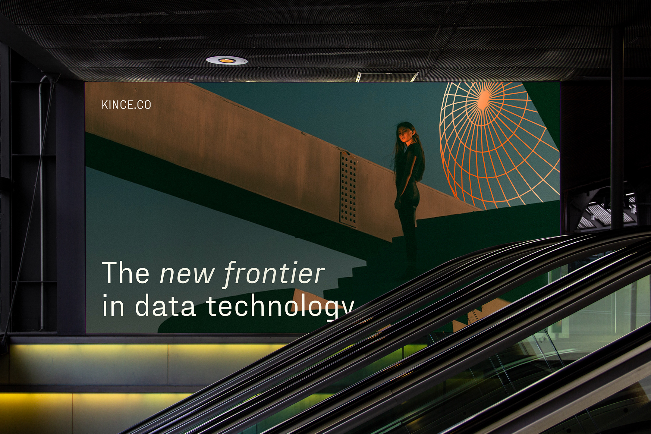
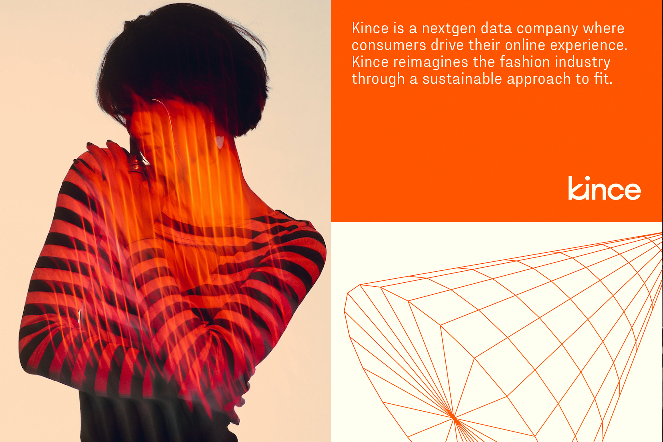
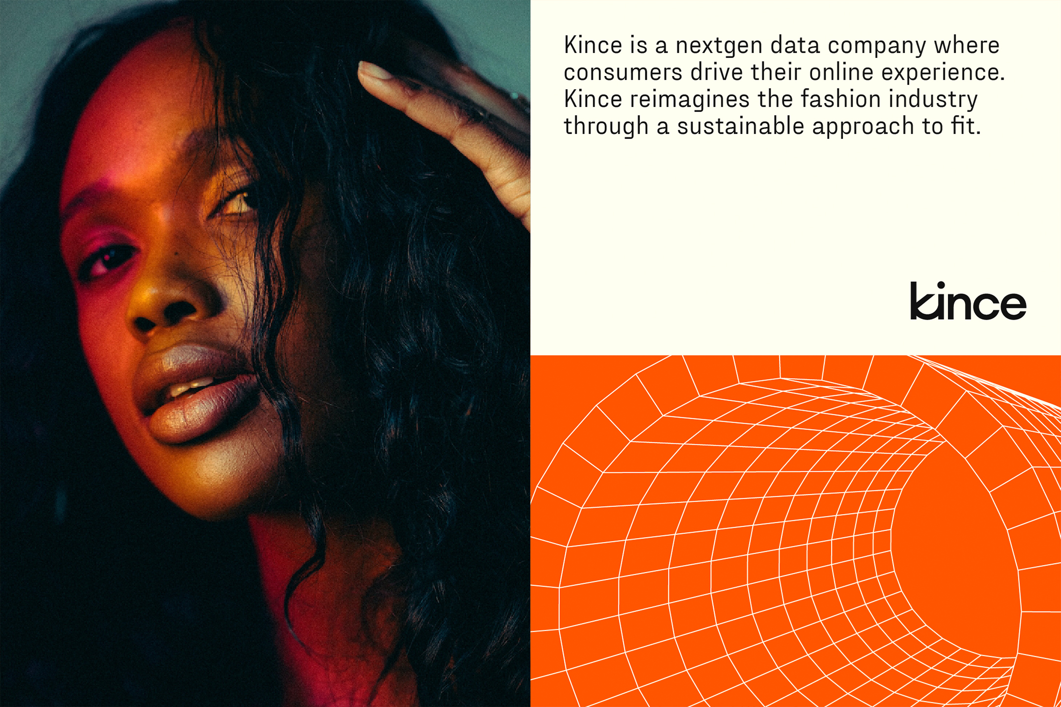
Kince is a nextgen data company where consumers drive their online experience. Kince set out to reimagine the fashion industry by offering a sustainable, personalized, and data-driven approach to fit, minimizing clothing returns and material waste. We worked alongside Kince to translate their mission into the strategic and visual brand foundation that will bring their new technology and product to market.
Brand Strategy, Brand Identity, Tone & Voice, Art Direction, Product Design, Collateral Design


With a whopping 30-40% of clothing bought online being returned, the waste and environmental impact is immense. This is not a problem that can be solved overnight, but there are ways to drastically reduce clothing waste in the fashion industry. Kince set out to create a new technology-based standard for fit. One that uses your stored and learned fit data to recommend how products will fit your specific body. With a user-centric data system built around fit, more customers will receive clothing that accentuates their body, resulting in less returned items. With an incredible technology like this, we needed to develop a strategy and identity that matched the remarkable product technology. The brand needed to put forth a sense of authority and intelligence, while guiding the user through an empathy and human-centered experience.
An integral piece of the business model and product was to attract brand partners to the app. We kept this objective close during the discovery and design process, without straying from the core goal of the platform - humanizing data to save the planet. We formed pillars around intelligence and humanity to form a futuristic identity with a warm human touch.


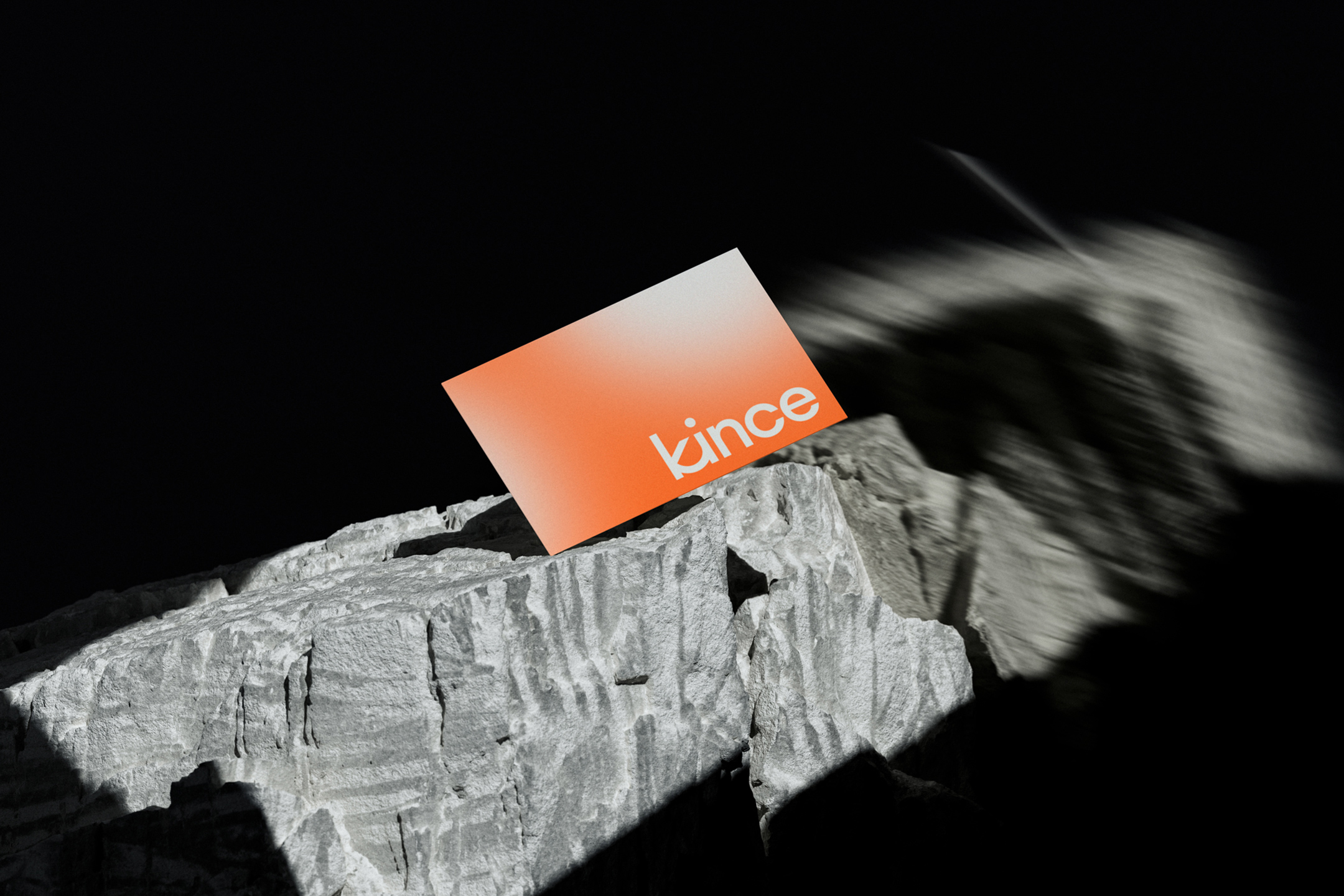
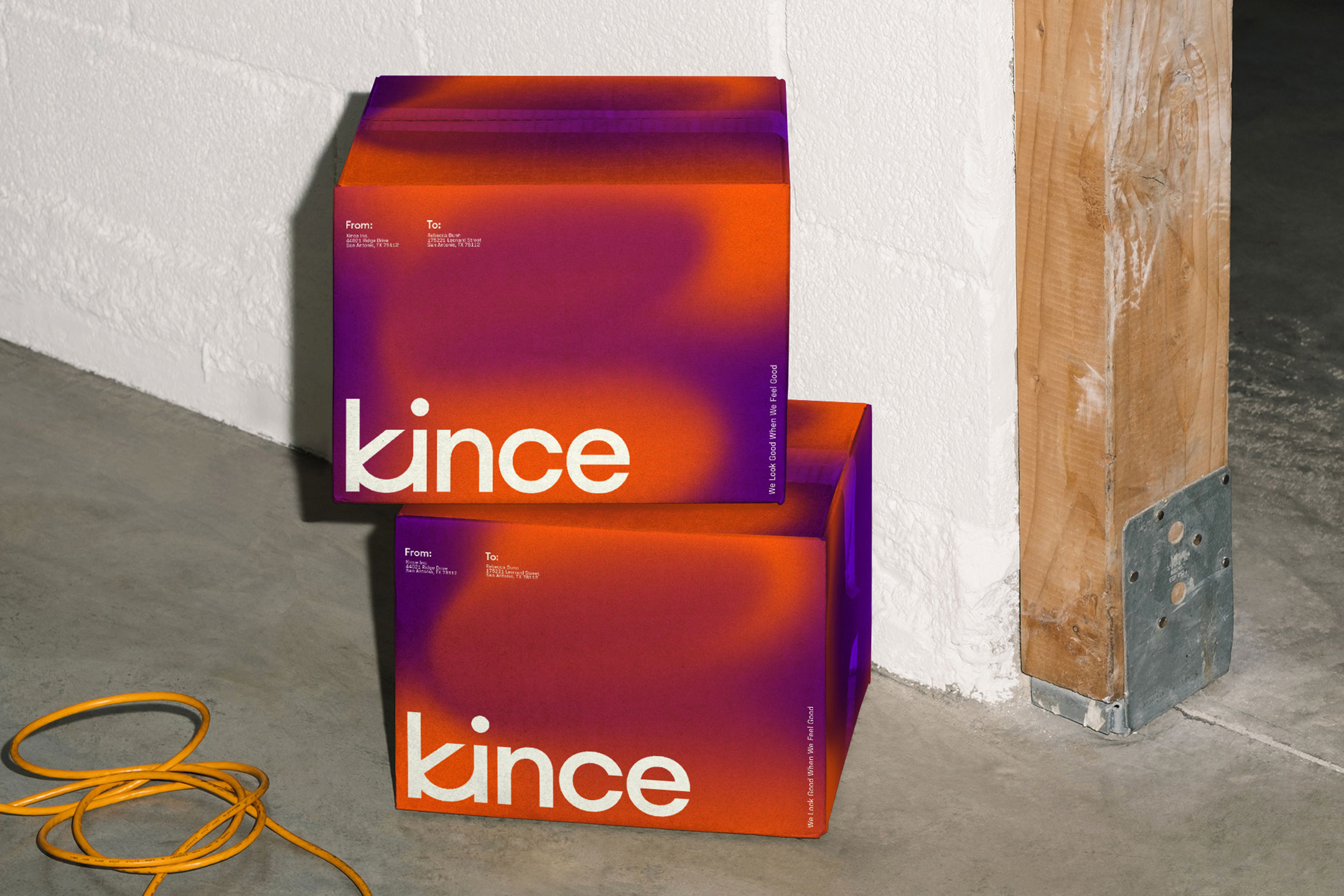
We built a custom logotype that formed a ligature between the “k” and “i” which became the name of the driving technology behind the product—Ki. The logo represents connection - bridging the gap between you and your online shopping experience.
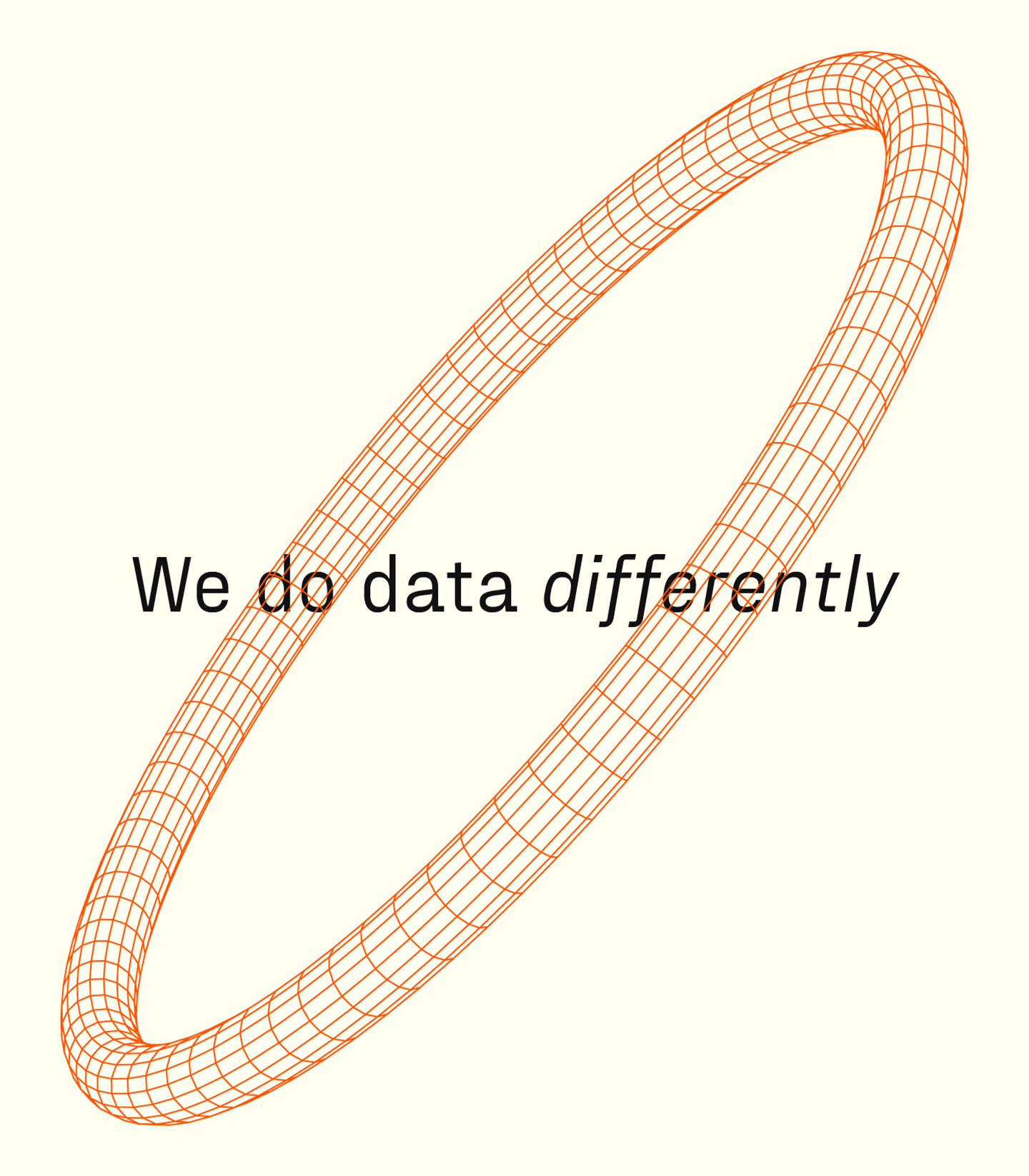
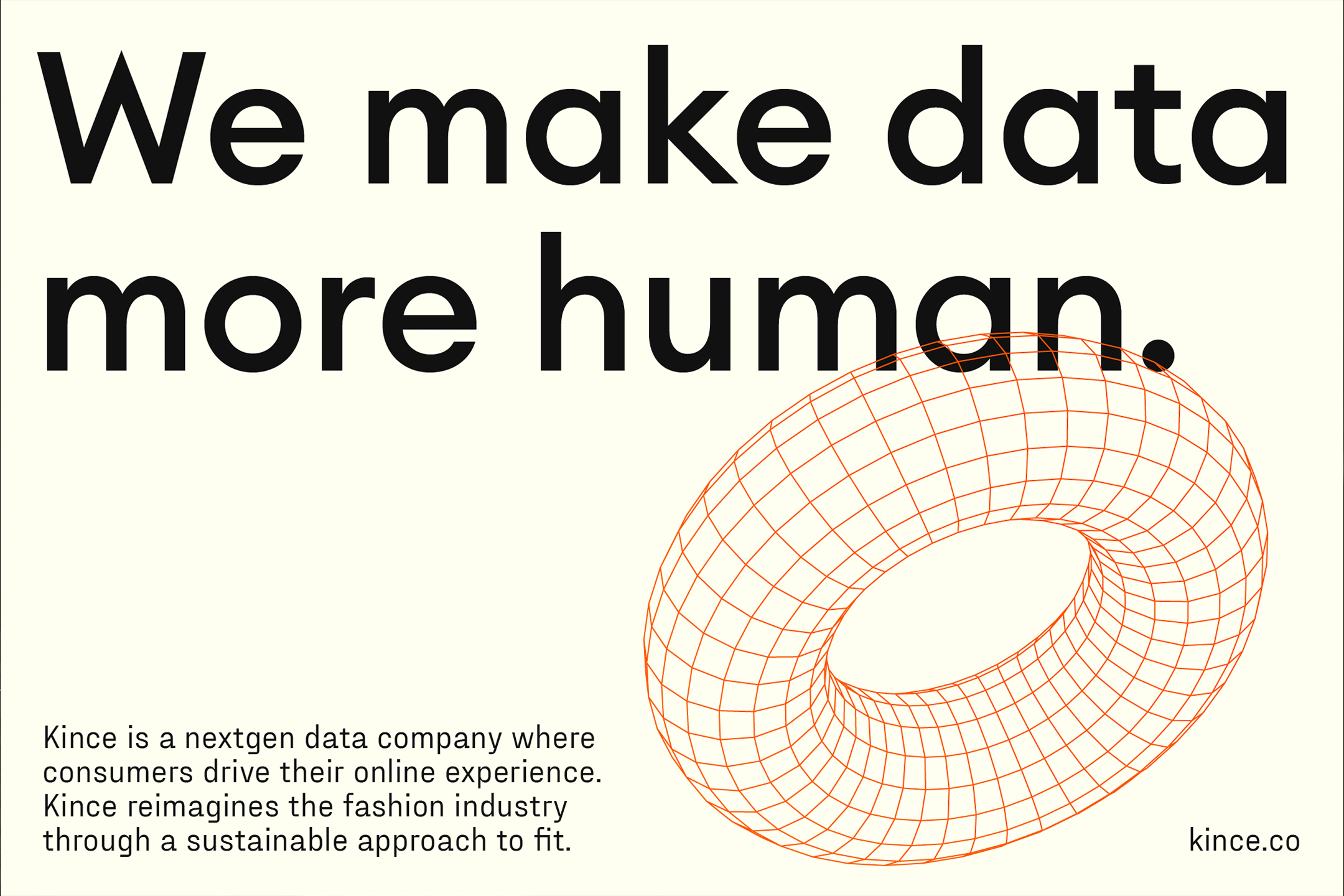
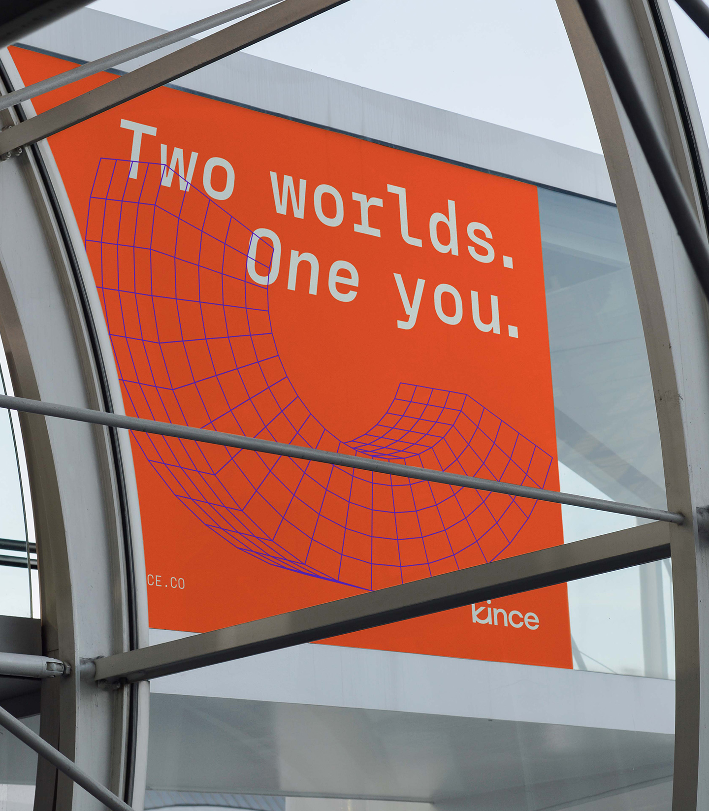
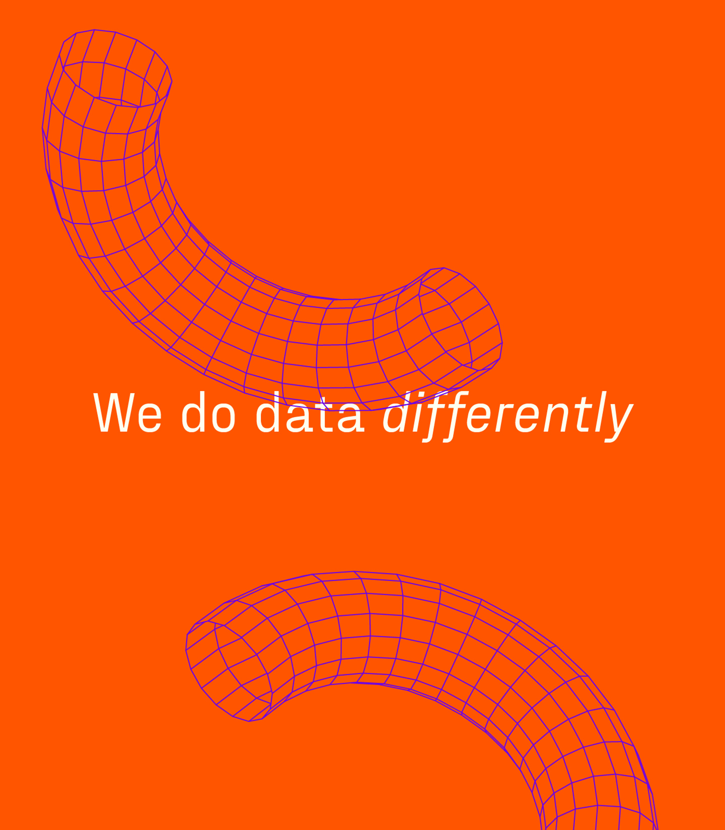
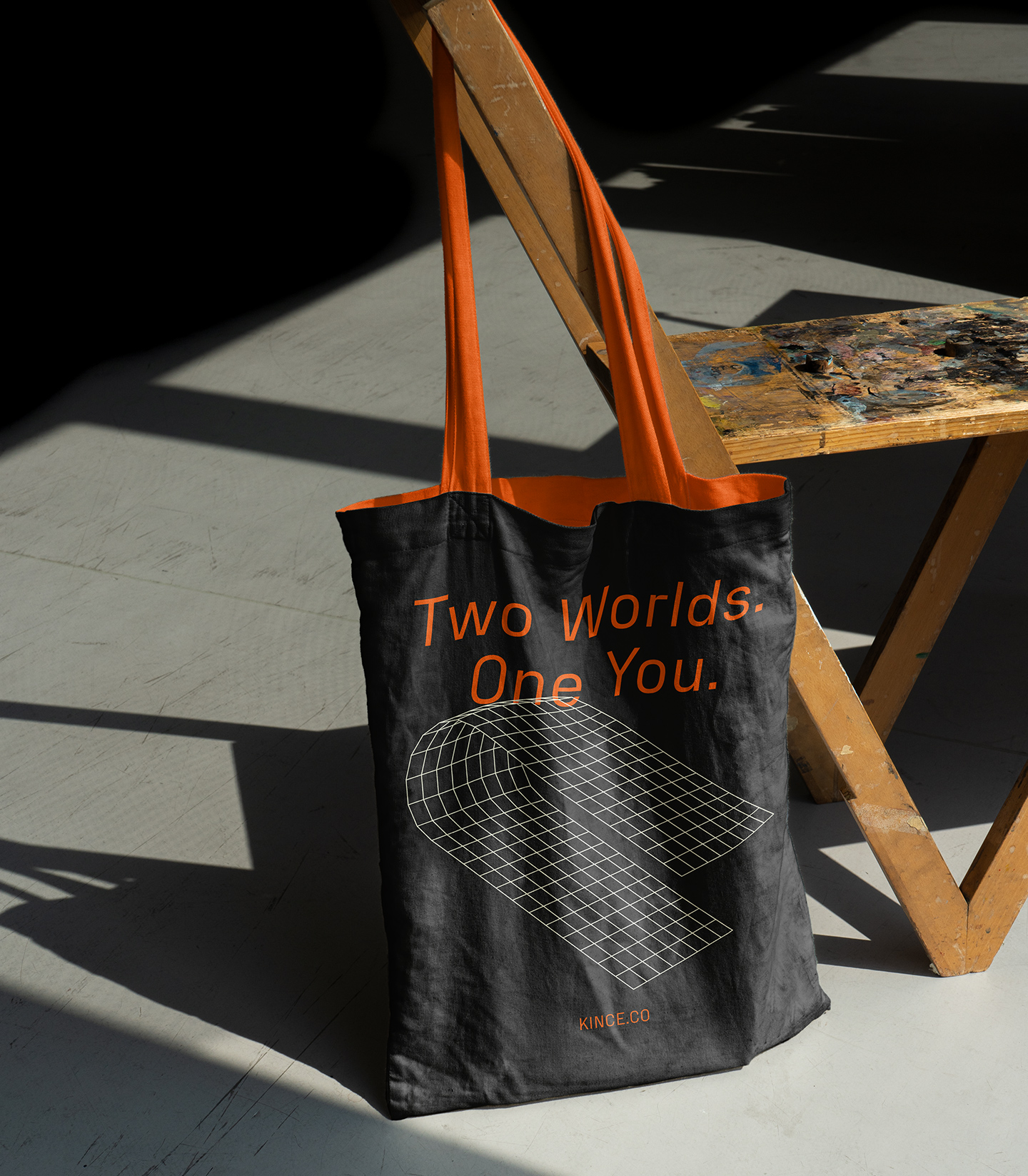
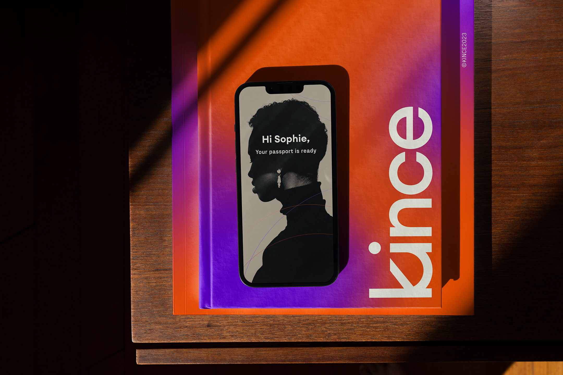
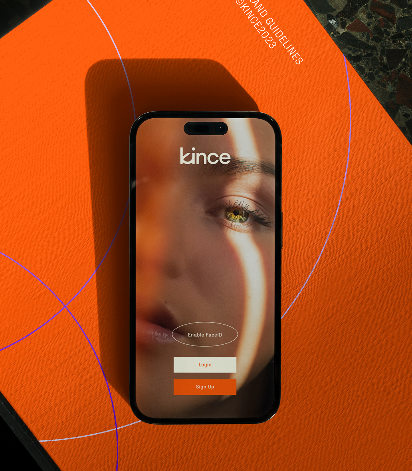
Orange is the driving force behind the Kince color palette. Energy flows through the system with punches of orange and a secondary purple. The illustration set for Kince features wireframe shapes that serve as data pieces that move in and out of the system.
Kince is a next generation data company and we built an identity to support that now, and well into the future.


Client testimonial

