
Mendly
Mendly (previously called Home Strategy Pro) is a home maintenance membership service based in Boulder, Colorado. Mendly handles everything from household to-do lists to home remodels. There’s no job too big, or small for your friendly neighborhood home maintenance company. Mendly reached out with a need to rebrand in order to better communicate the 25+ years of craftsmanship and exceptional customer service they pride themselves on.
Brand Strategy, Naming, Brand Identity, Tone of Voice, Art Direction, Illustration, UI Design, Website Development
The Challenge
Mendly's founders felt that their current brand had a disconnect with their values, level of service, and personality. They needed to start from scratch. Mendly primarily serves homeowners in the city of Boulder. Their service in these homes is nothing short of exceptional. We all hold our homes near and dear to our hearts. Mendly approaches every home with the objective to create meaningful, trustworthy, and long-lasting relationships with homes, and homeowners. Their brand needed to echo their purpose, while remaining the friendly and outgoing folks that their clients have grown to love. Their current branding was dated, overly complex, and misaligned with their target. We came in, shook things up, and rebuilt a completely new visual and verbal identity.

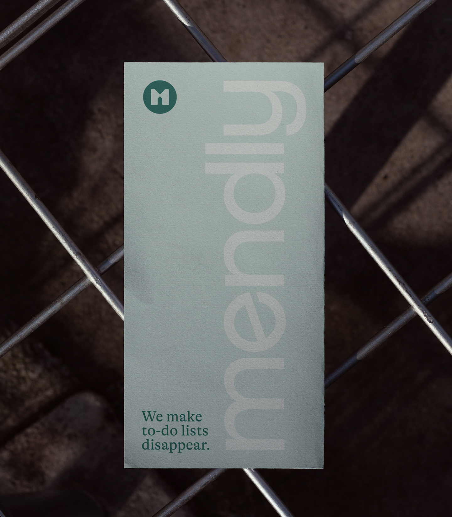

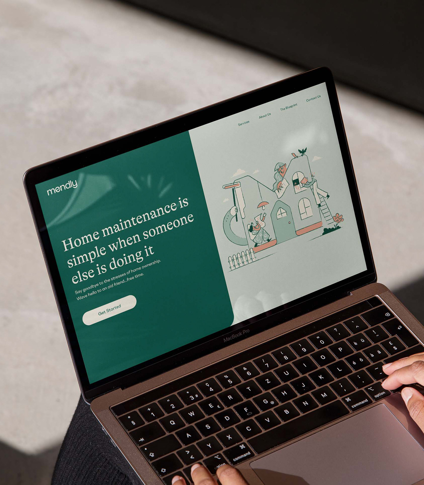
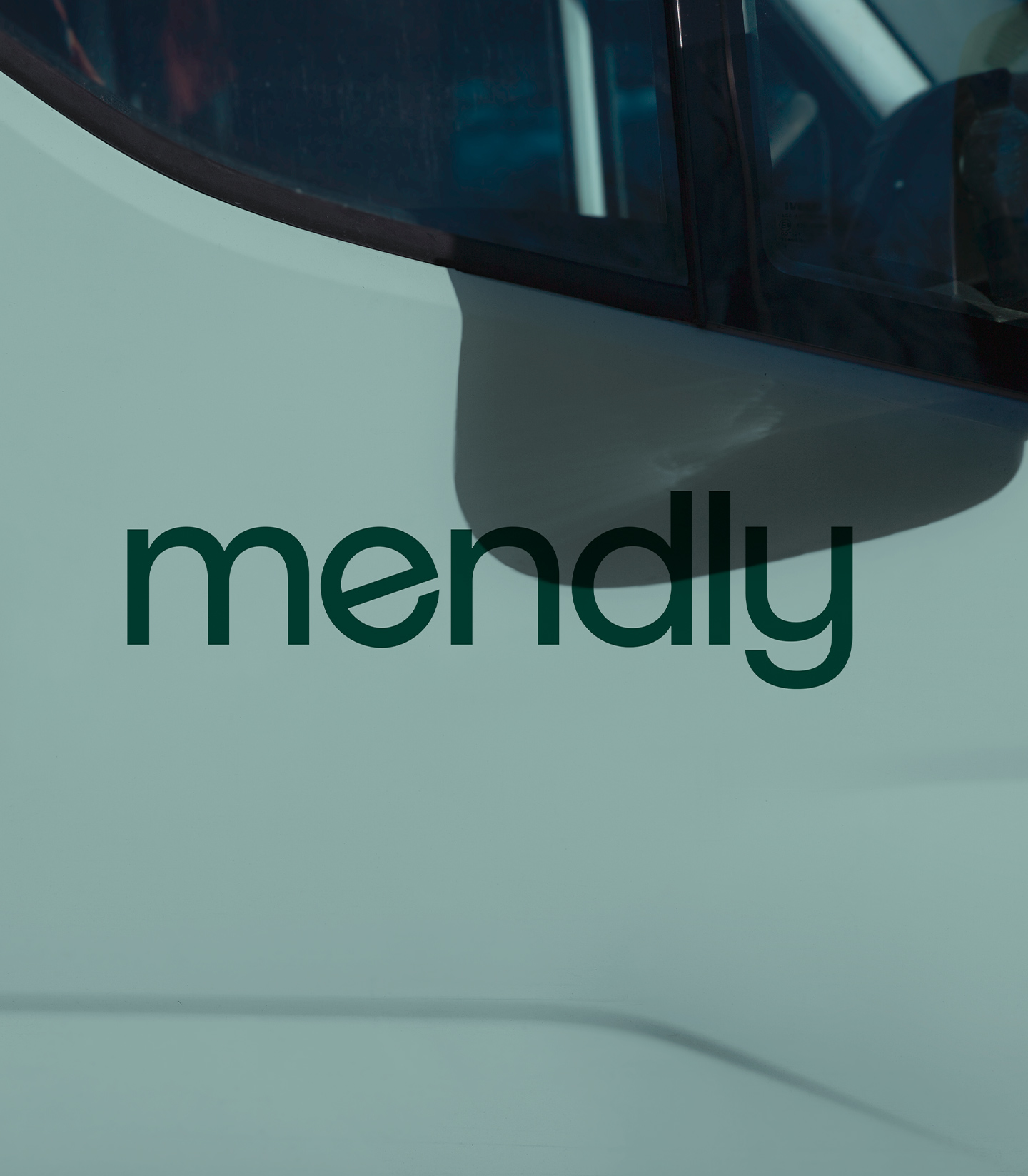

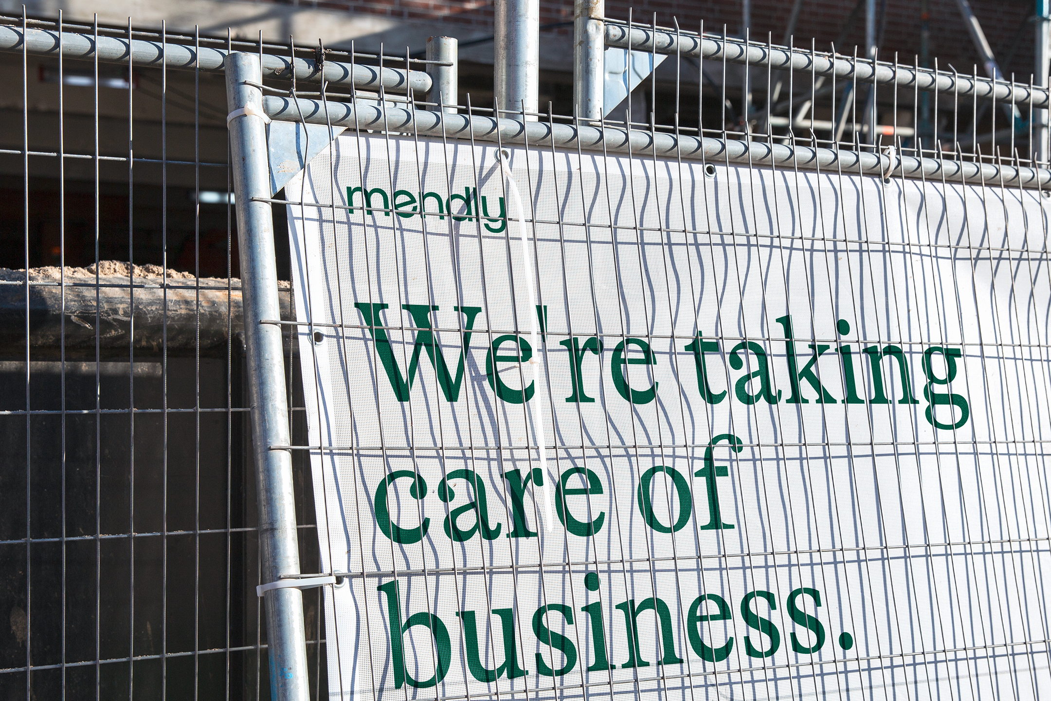
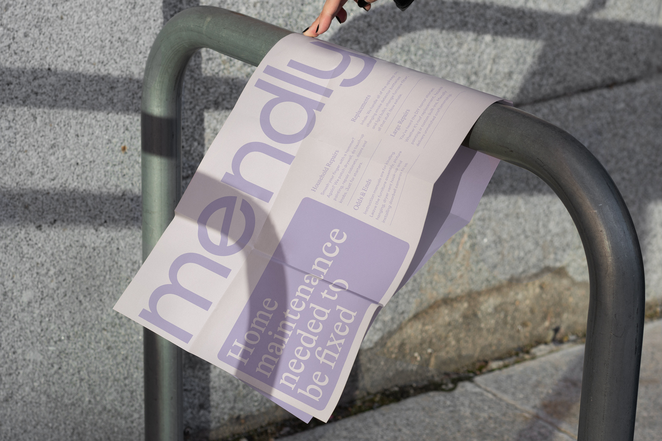
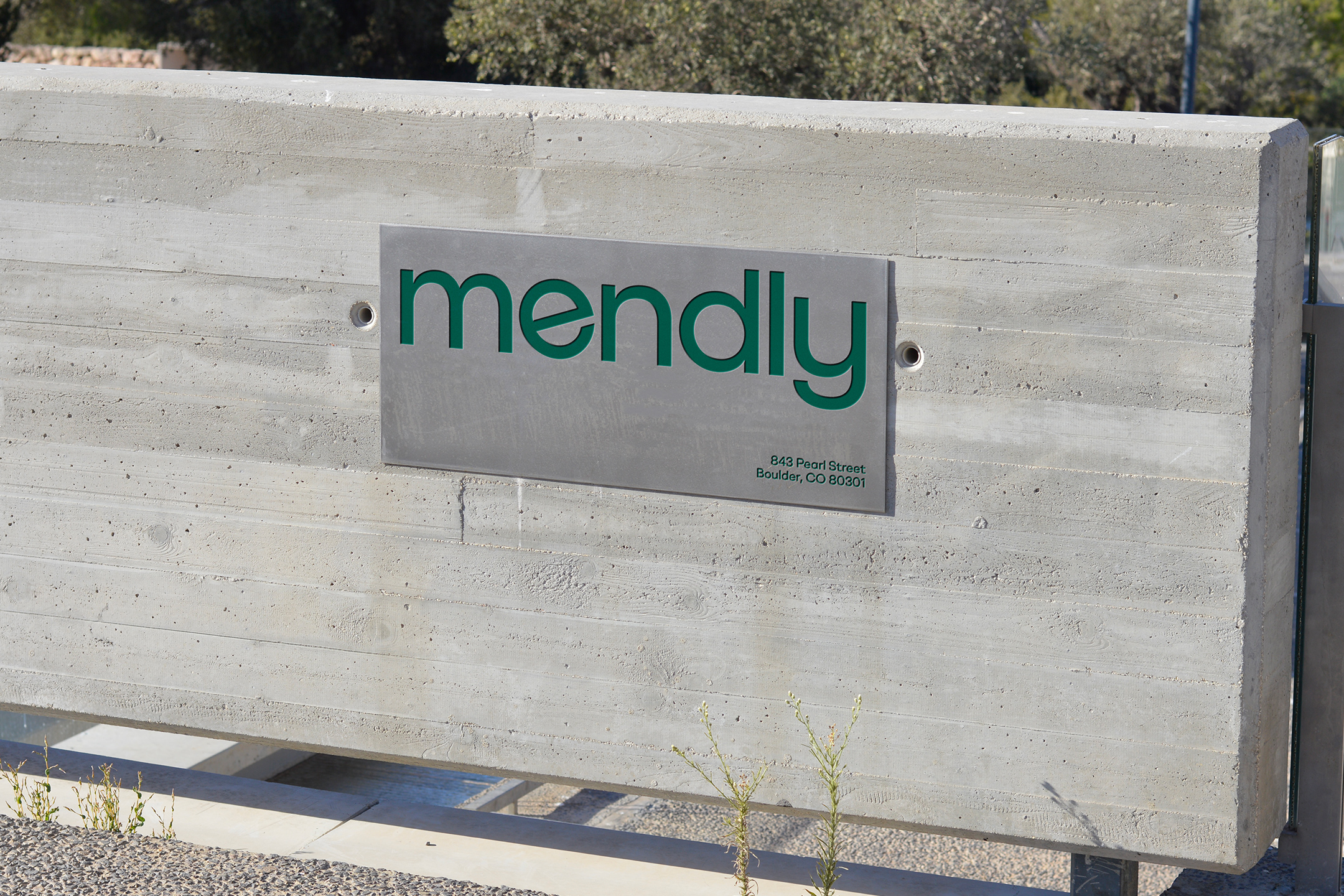
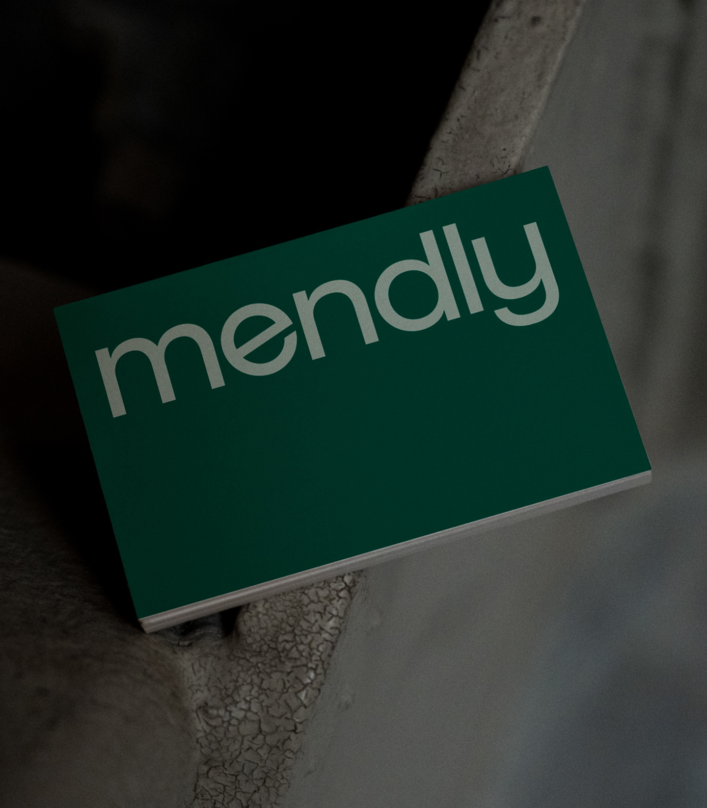
We took a deep dive into the history of the brand, as well as their current and future business goals. We uncovered their current and aspirational target audiences, and repositioned the brand after studying the competitive landscape and the area of the greatest differentiation. With that came a name change. Previously known as Home Strategy Pro, we renamed the brand as Mendly. Mend + Friendly = Mendly. Short, sweet, imaginative, and slightly quirky. Following suit we developed a custom lowercase logotype that screams simplicity, without sacrificing a smidge of personality. The symbol is a rounded “M” that mimics an abstract house, with the center resembling a doorway.
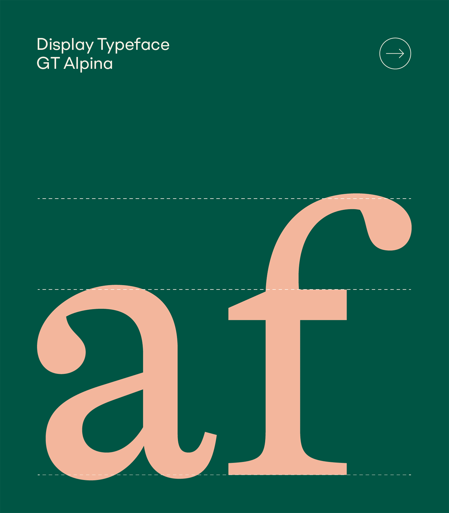
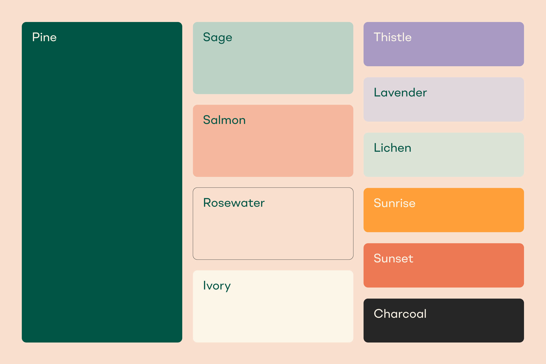
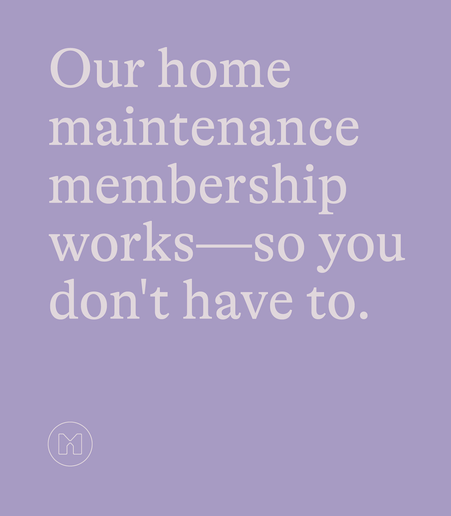
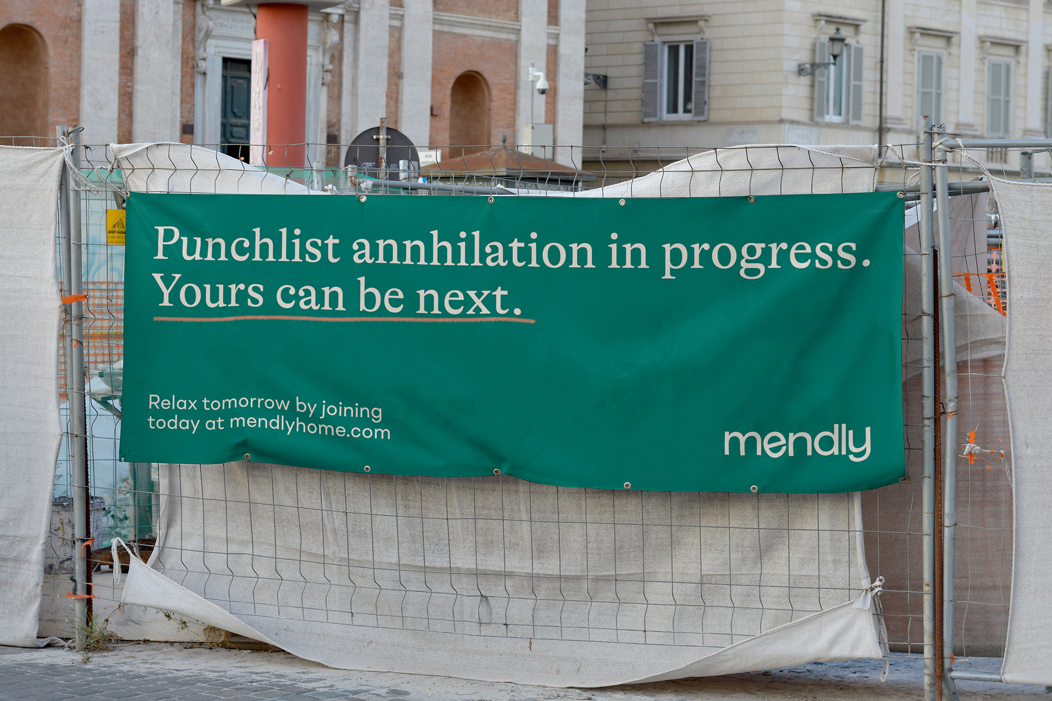
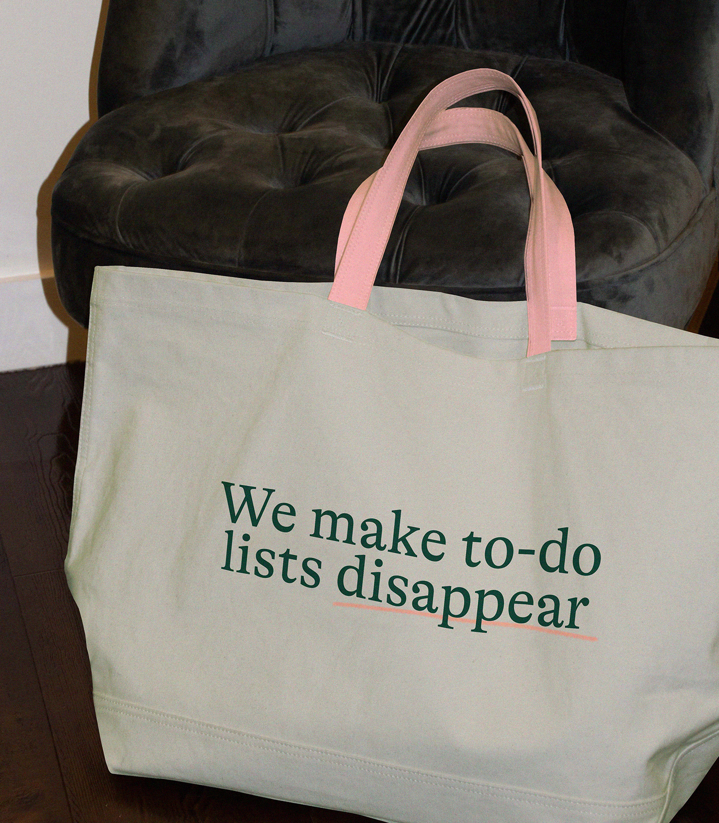
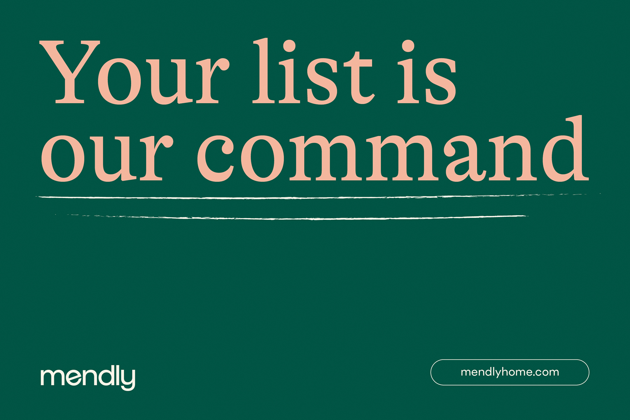
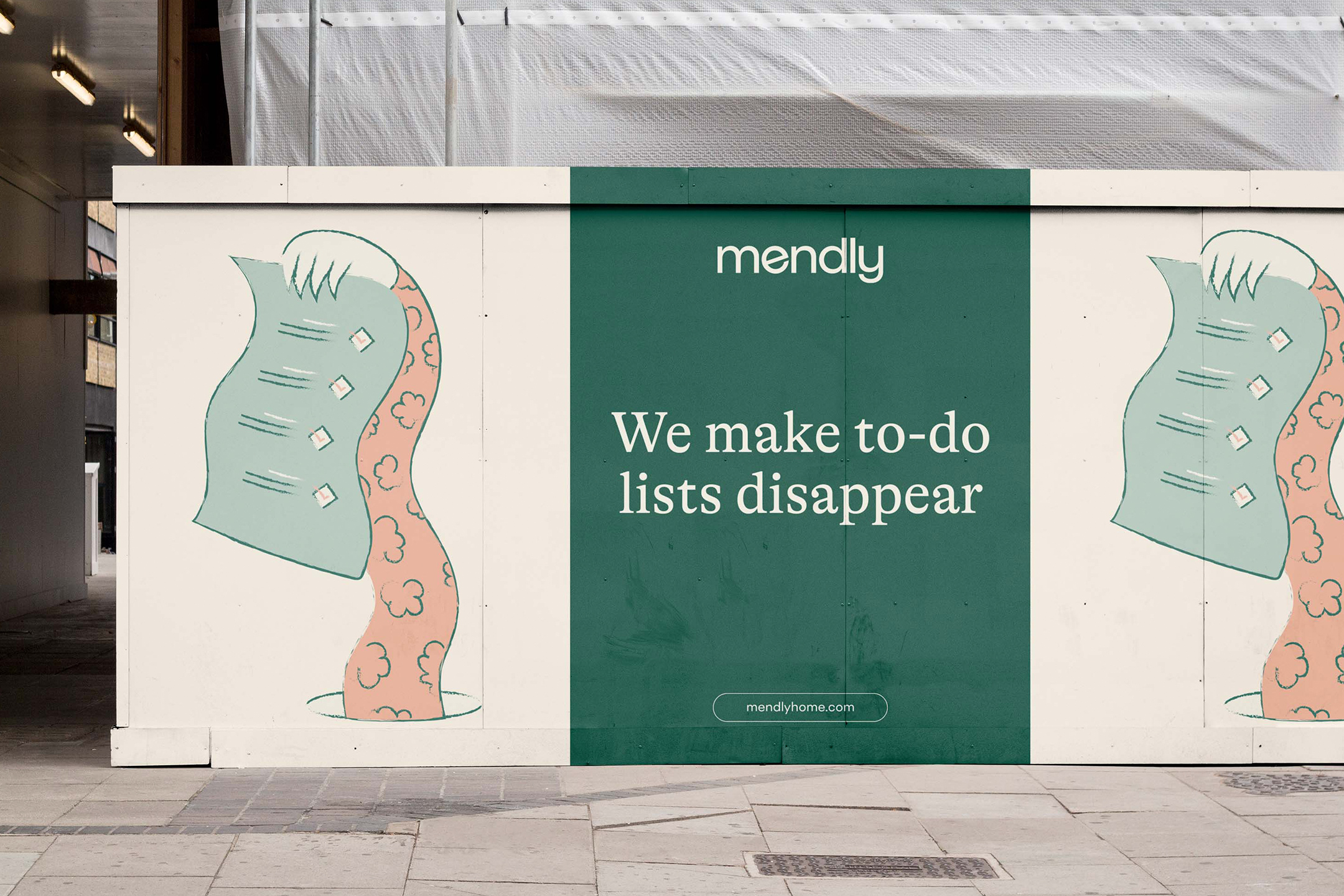
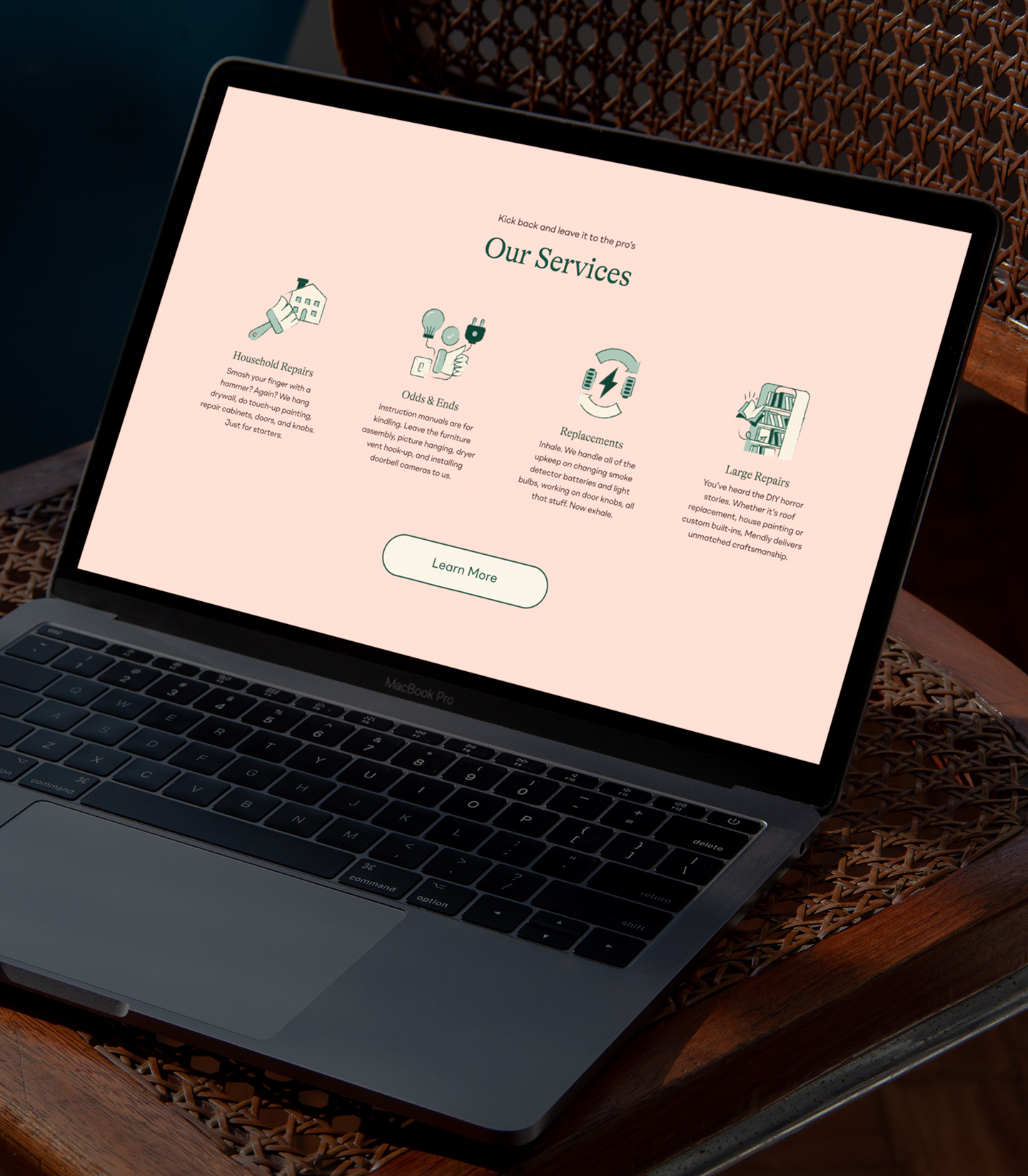
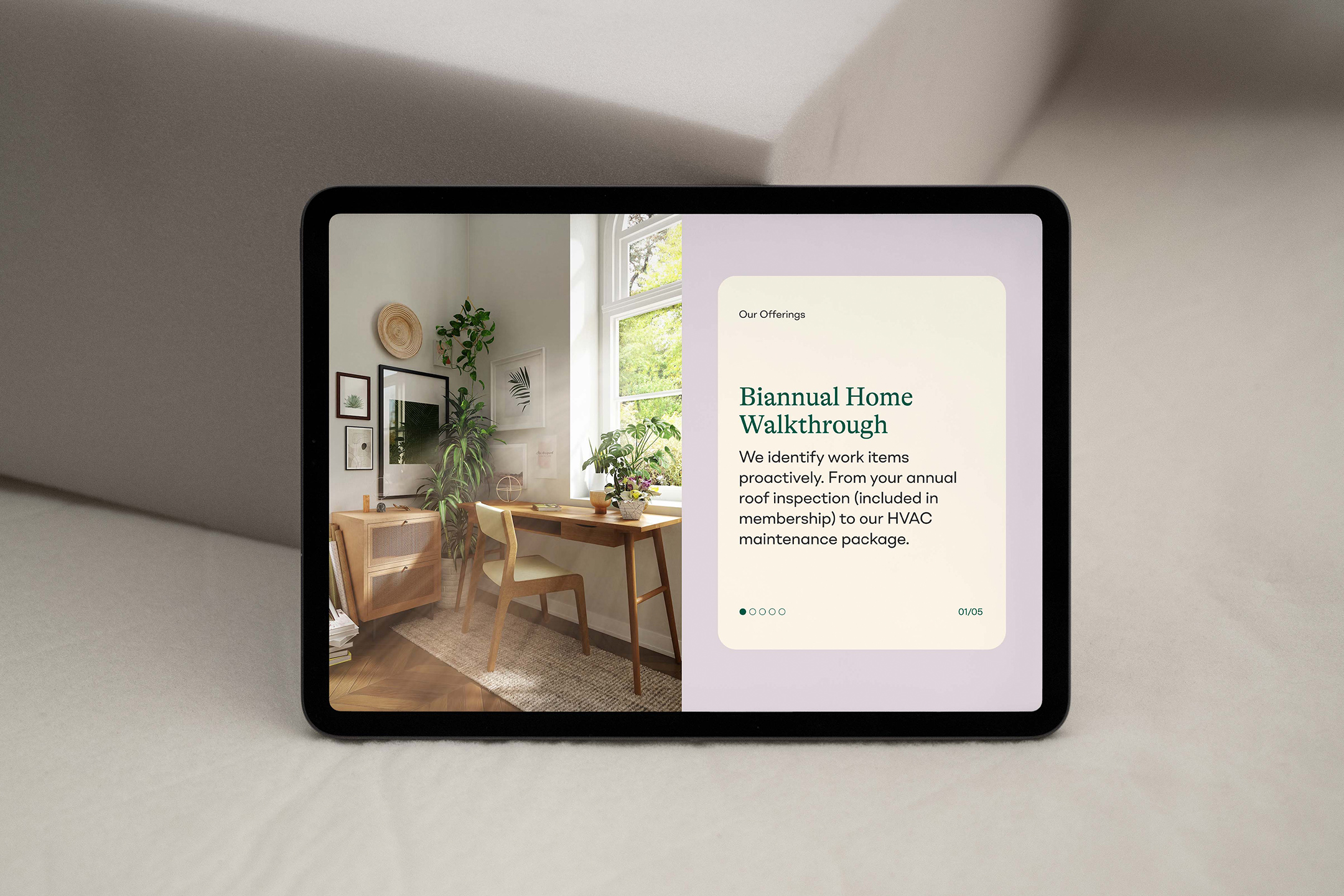
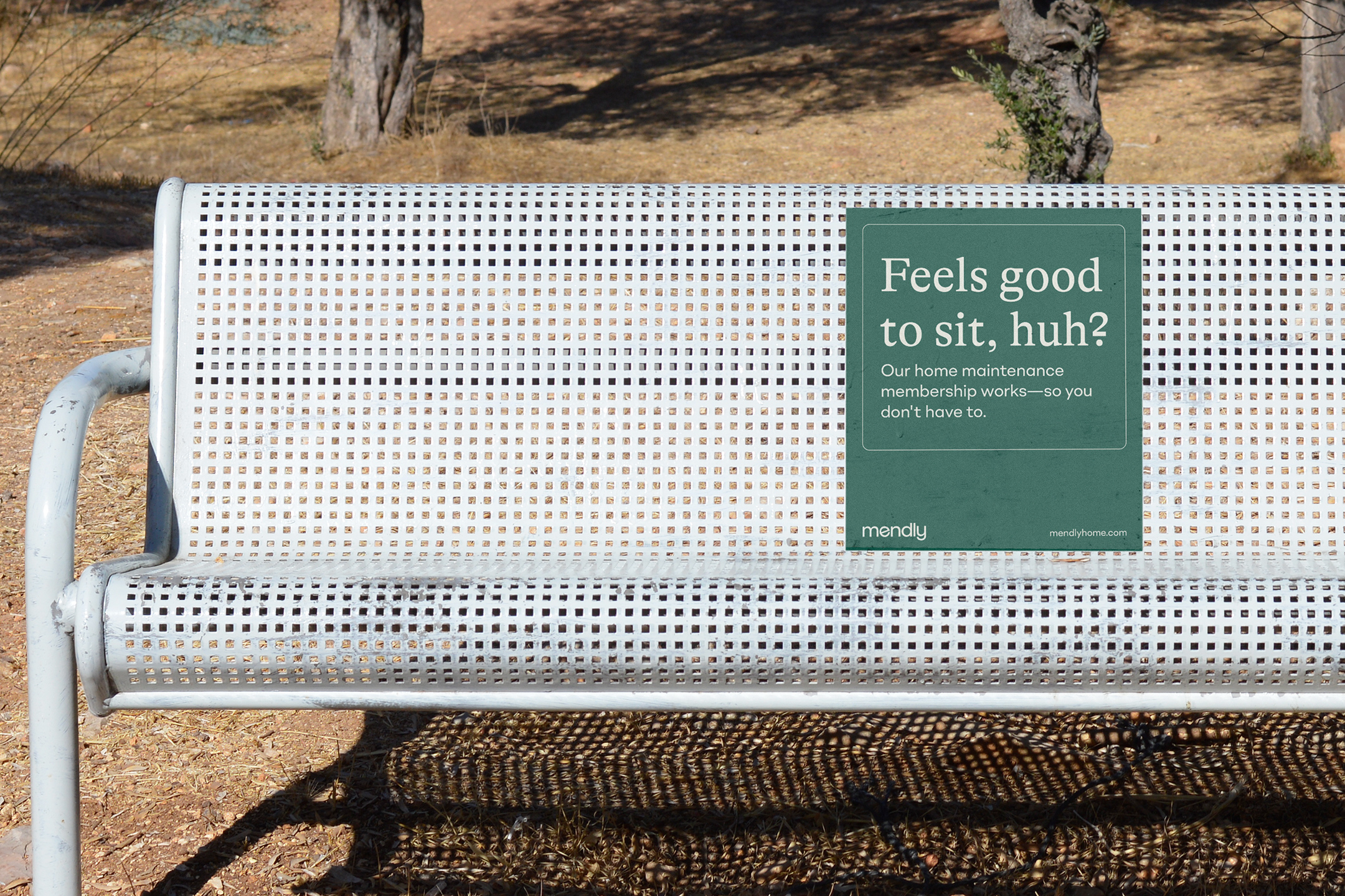
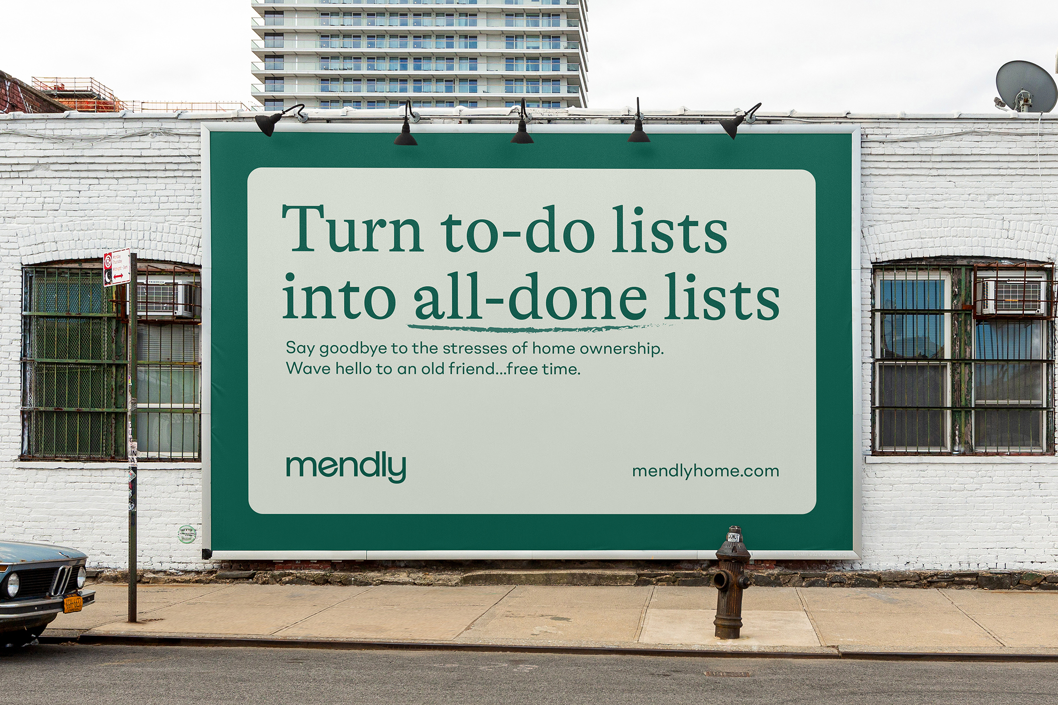
Next we honed in on the color palette which pulls inspiration from natural elements of nature, with pine - a deep green, as the primary brand color. Championing the neighborly aspect of the brand, the typefaces do a ton of heavy lifting for the brand personality. Finally, we implemented a textured hand-drawn illustration style to build a custom set of website illustrations along with an icon set.
Alongside the team at Mendly, we were able to craft a new brand identity unlike anything in the category. The identity is flexible and scalable, and will serve as the foundation of the brand as Mendly grows.
Client testimonial
We worked with Max Hofert Design to completely change the direction of our company, from brand strategy to design. Max worked with us to rename our company, develop our brand strategy and positioning, come up with our visual identity, and design our new website. The experience was satisfying and we feel that Max really took the time to hear our story and created a fantastic product for Mendly. We are completely satisfied with his performance.
Greg Stroh & Ben Moss - Co-Founders
Credits
Logo Design - Joshua Dazeley
Illustration - Ramy Wafaa
Copywriting - Jay Roth
Webflow Development - Francesco Castronuovo