
Rise Against Suicide
Rise Against Suicide helps youth at risk of suicide by removing financial and social barriers to treatment, enabling them to find hope and healing. Youth and teen suicide is increasing at a staggering rate. With such a complex issue, it was imperative to differentiate the messaging and overall brand feel to effectively communicate, connect, and foster relationships with those at risk. It was critical to vocalize the life-saving resources that Rise provides while breaking the stigmas that leave our youth feeling helpless. In collaboration with our good friend Schoenie, Co-Owner of TDA Boulder, we worked alongside the Rise Against Suicide team to flip the brand narrative, planting the seeds for a safe space to foster change.
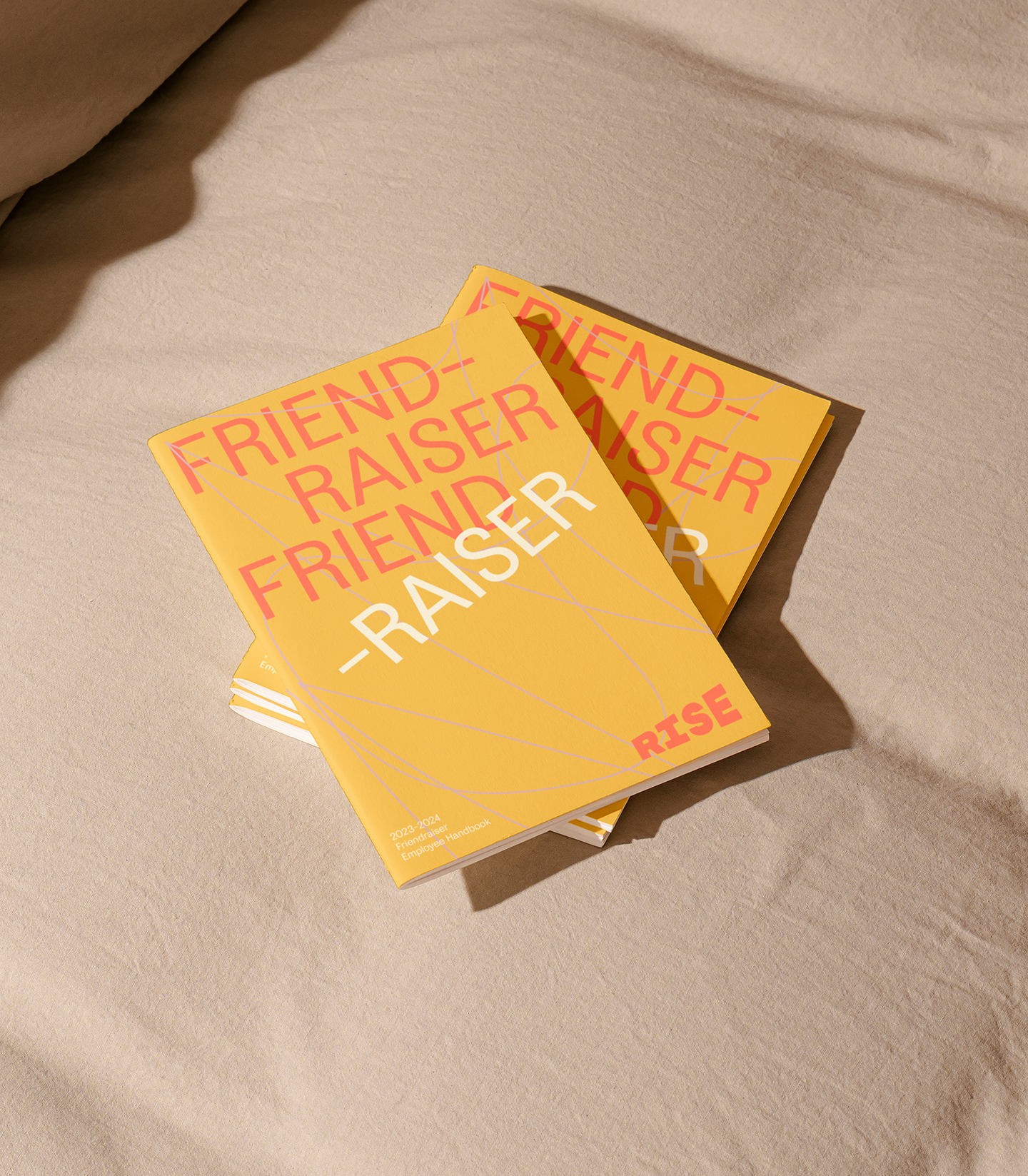
Brand Identity, Art Direction, Collateral Design, UX/UI Design, Web Development
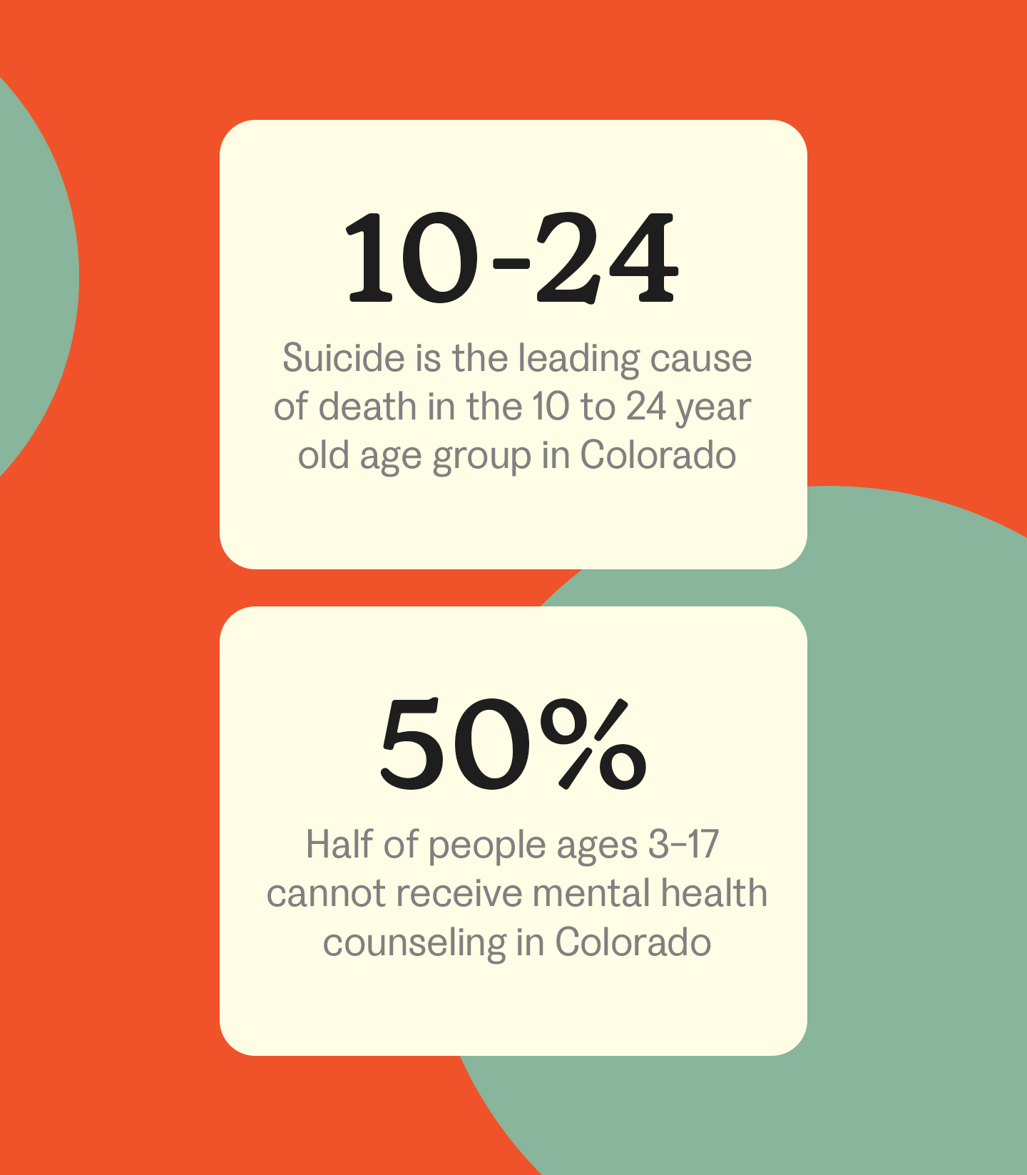
Stigma is one of the greatest hurdles to jump when trying to reach our suicidal youth. Societal and peer stigmas often result in shame and silence, which forces teens to internalize the struggles they are facing. When issues do come to light, parents are often scared, frantic, and lack the tools they need to help their children. More often than not, community resources feel dark and gloomy, void of the relatability needed to connect with teenagers on a deeper level. So naturally, they reject help, creating increasingly complex internal battles for them.
To really make a dent in this complicated issue, we sought out to establish a resource that our youth could get behind. What did we want when we were growing up? We developed a literal and conceptual safe space that would serve as a judgment-free sanctuary for teens struggling with suicidal thought and ideation. Think of Rise Against Suicide as your beloved childhood treehouse that you found a world of comfort in.
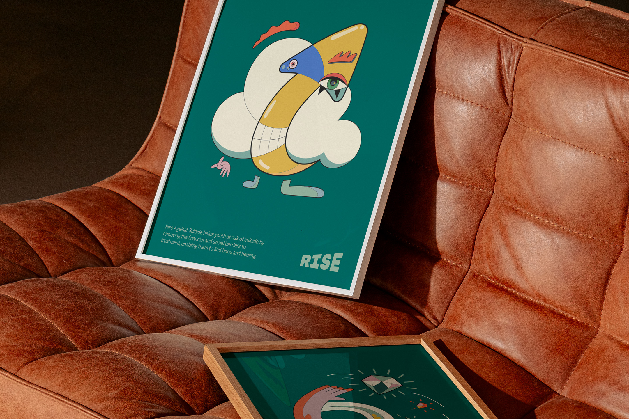
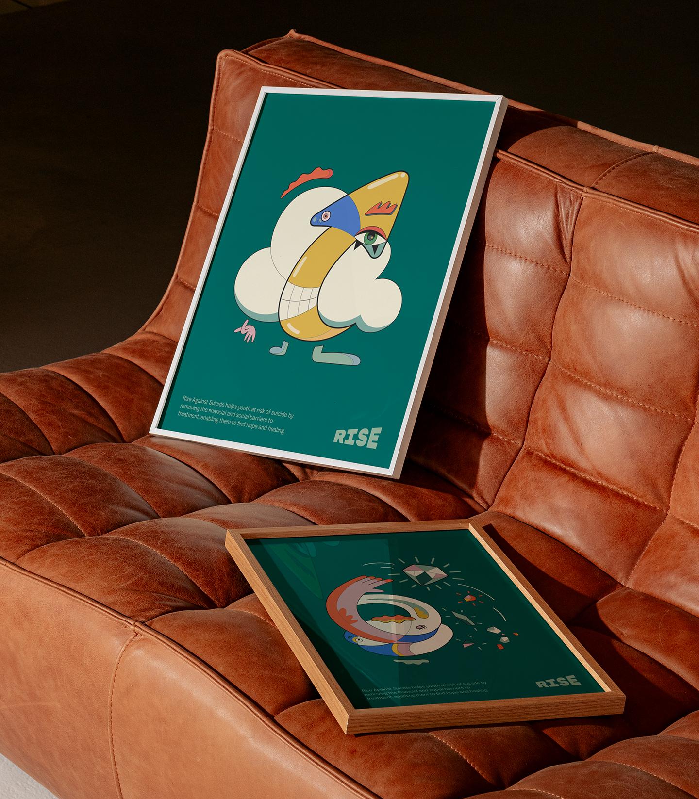
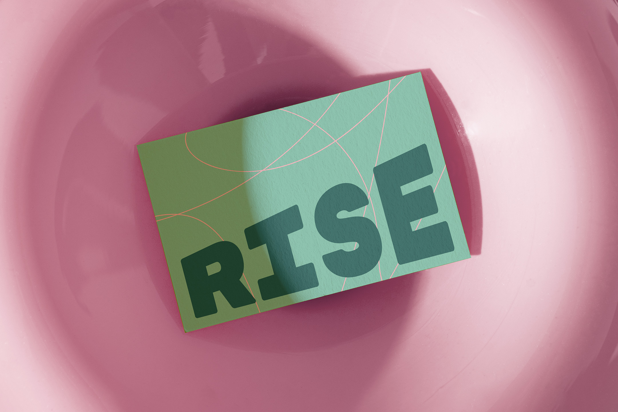
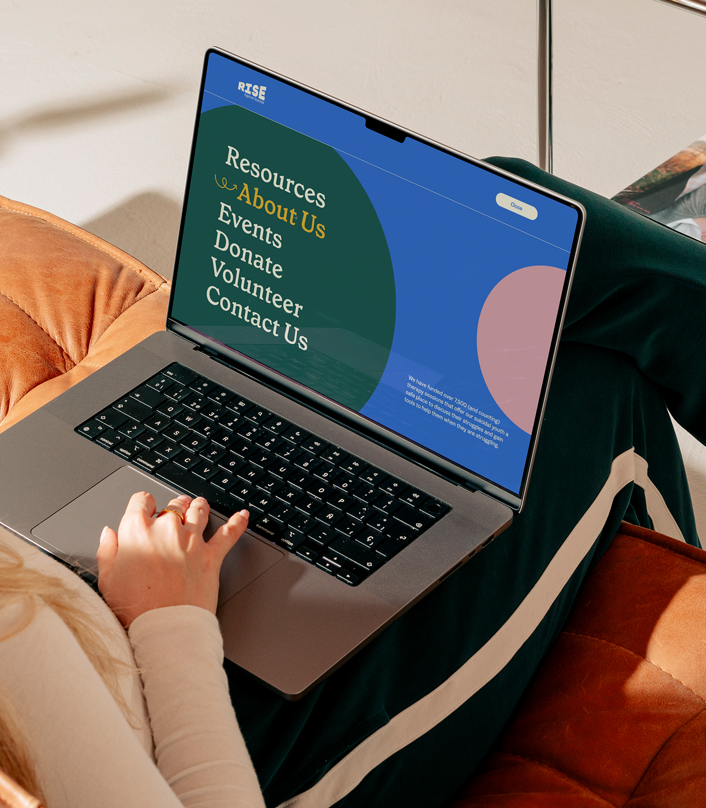
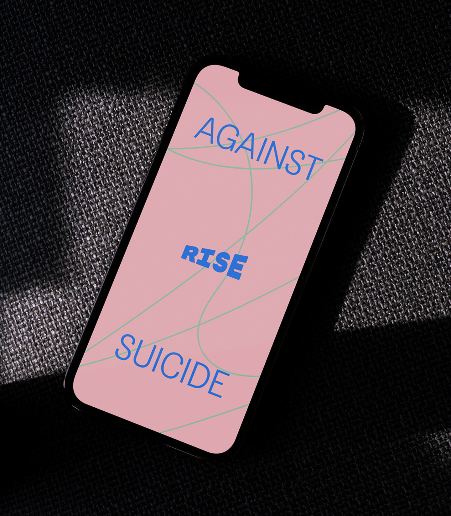
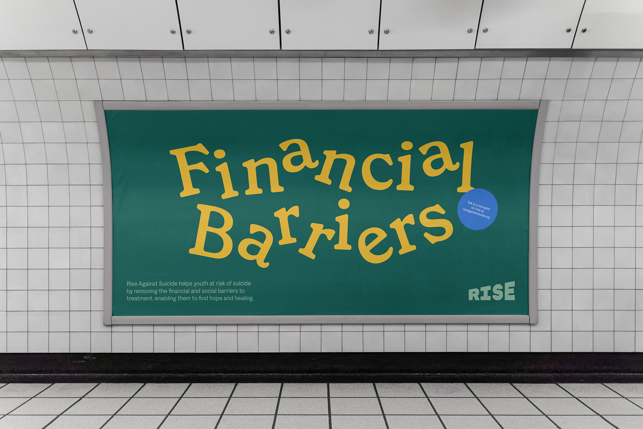
There is enough darkness surrounding this issue, it was our calling to bring hope. We constructed an angular logotype that symbolizes a launch ramp ascending into an optimistic future. Our color system is rich, high-contrast, and inspiring. It was important that our color story lifted up our youth, while remaining professional and accredited as an organization.
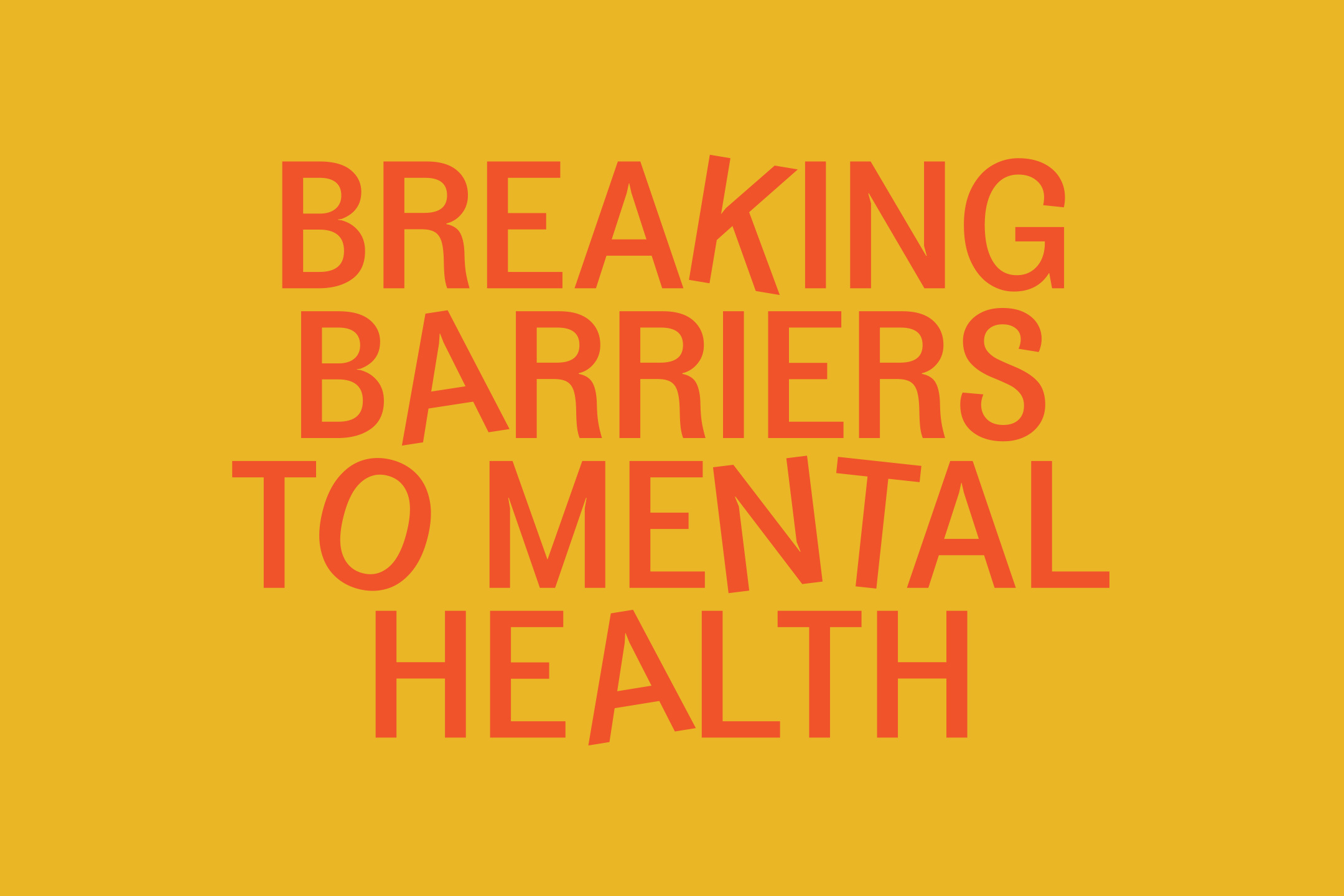
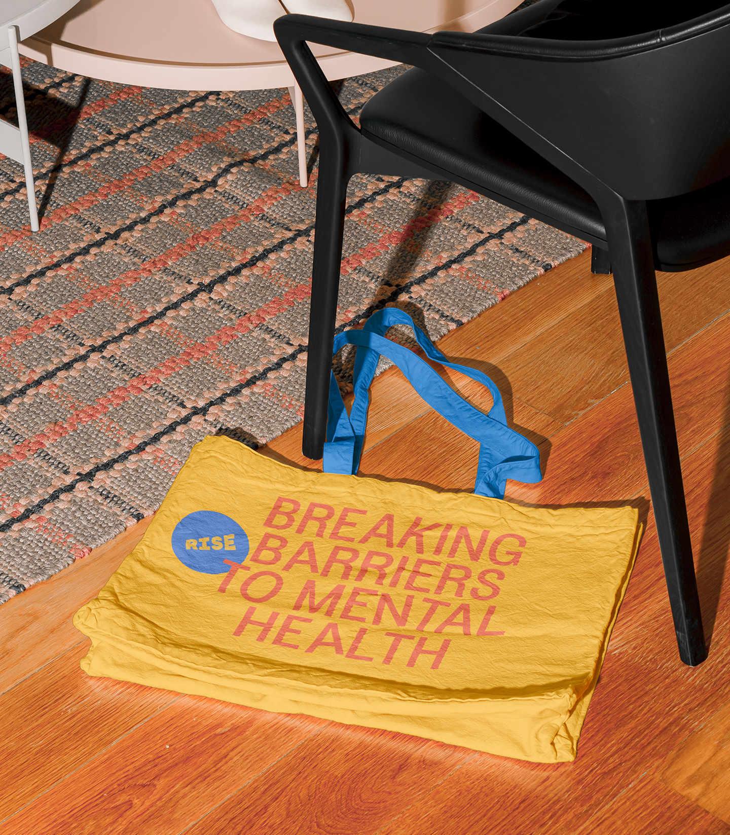
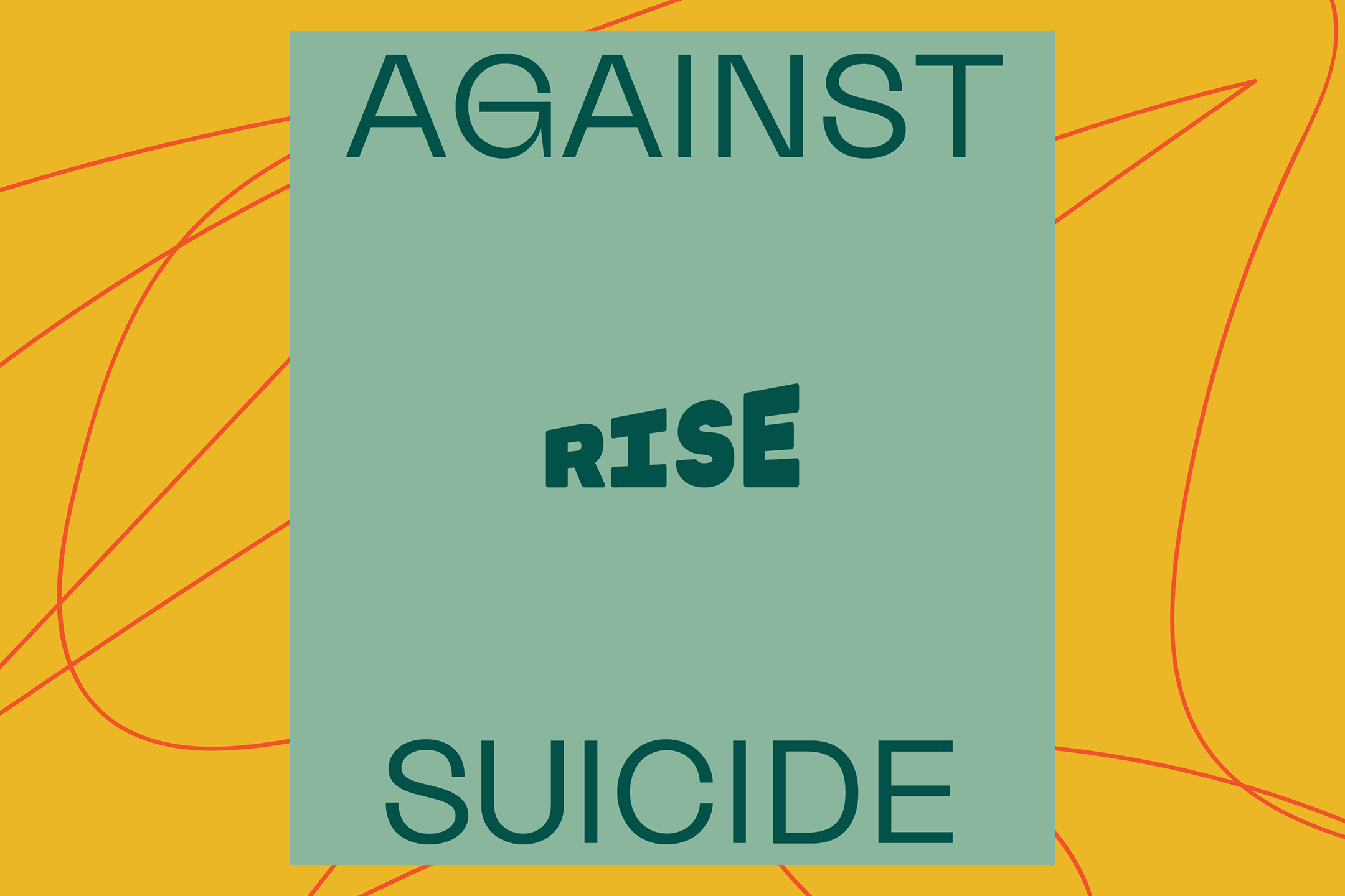
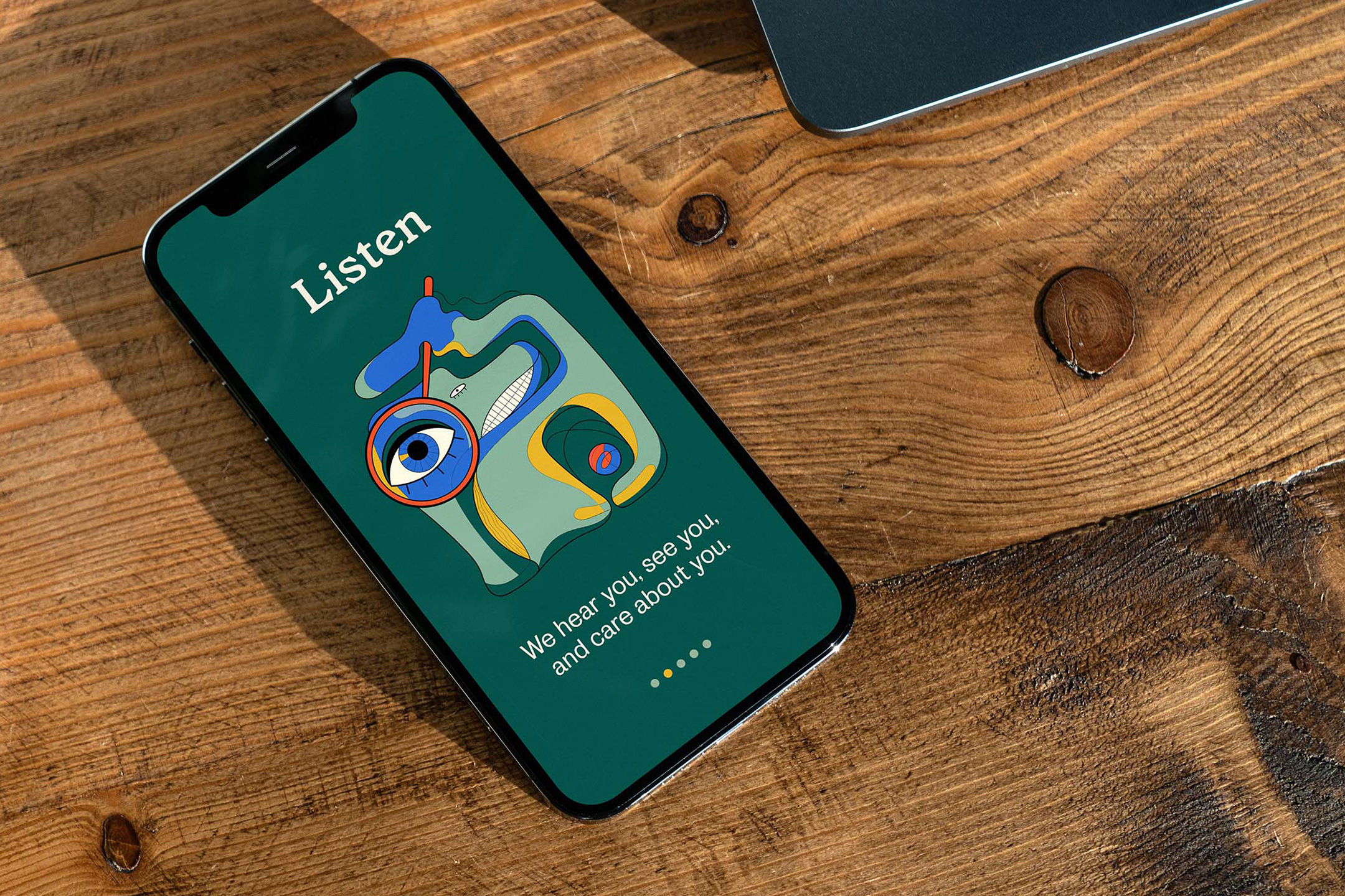
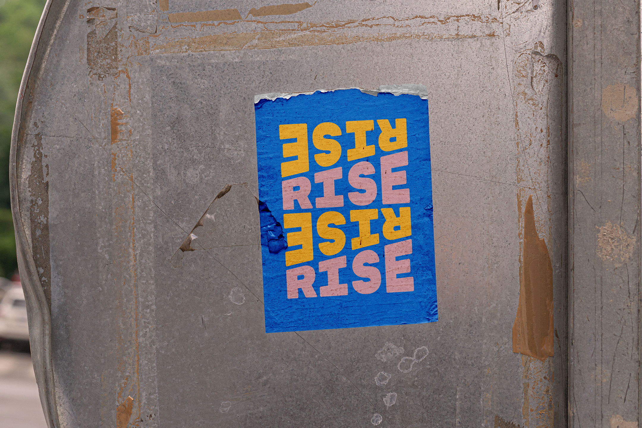
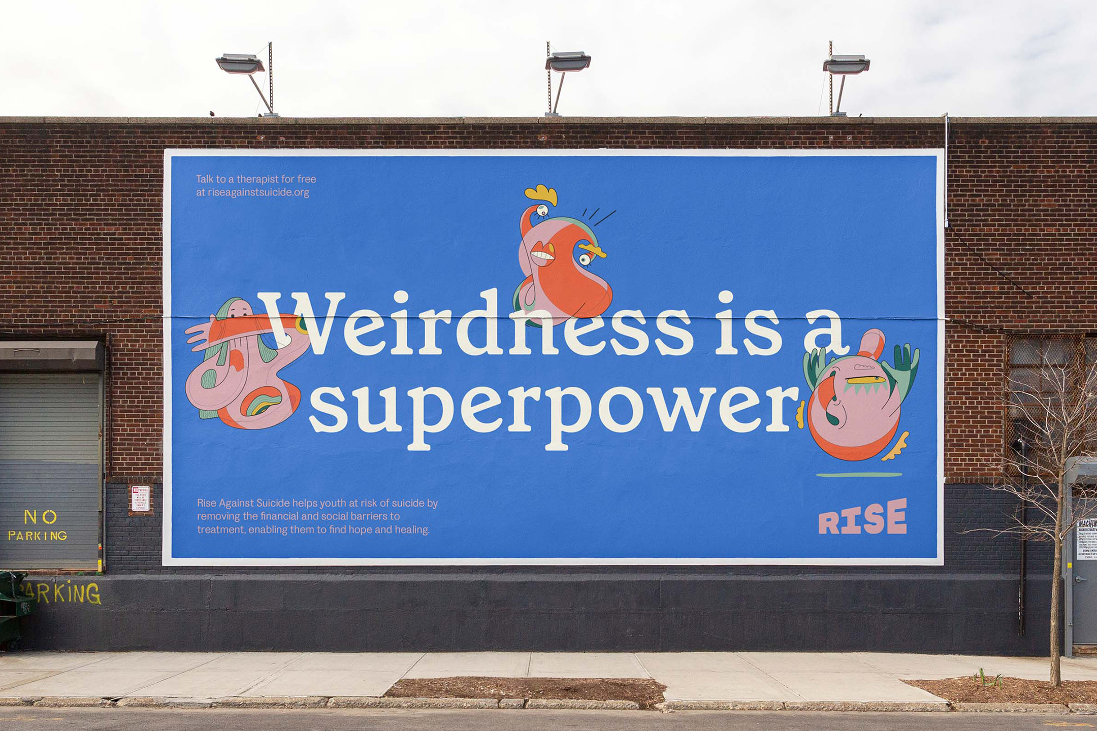
Type talks. The typographic approach uses 'broken' words to conceptually emphasize the mission of Rise Against Suicide, which is "Breaking Barriers to Mental Health". Wacky and abstracted character illustrations interact with layouts, driving home the importance of individuality, and rejecting the institutional normalcy pushed by our society. The Rise brand messaging is anchored in the need for uniqueness and individuality, which is our superpower.
Rise with us.
Client testimonial