
Access
Access is the leading Destination Management Company in the country, with over 50 years of experience. They coined the term “DMC'' and have continued to redefine what it means. Access sought a new identity that reflected the true nature of their business, and prestige in the event industry. An identity that communicated their driving forces and motivated internal teams around the future to come. FRNDS brought us on to build a daring identity that balanced warmth with sophistication, and embodied the strategic and creative powerhouse behind the nation's biggest corporate events.
Brand Strategy, Brand Identity, Tone of Voice, Art Direction, UX/UI Design, Website Development, Experiential Design, and Collateral Design
The corporate events industry is flooded with companies that are all saying, and in general, doing the same things. Access is an exception. For over 50 years they have led the charge and destroyed the status quo. Their previous identity was dated and lacked strategic and visual foundation. They needed an identity that accurately showcased their approach to events. An empathy-based approach that assesses the client's unique goals to develop a solution beyond their wildest expectations.
Uncovering current and future goals, we positioned the brand to be a true statement of their fearless and irreverent organization. Access is the pulse of the industry and the new identity needed to reflect that.
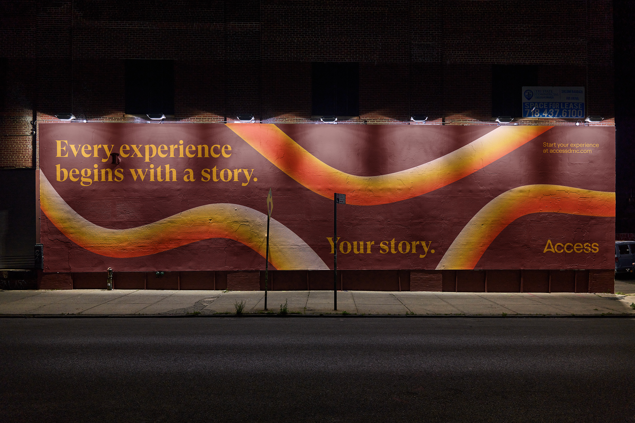
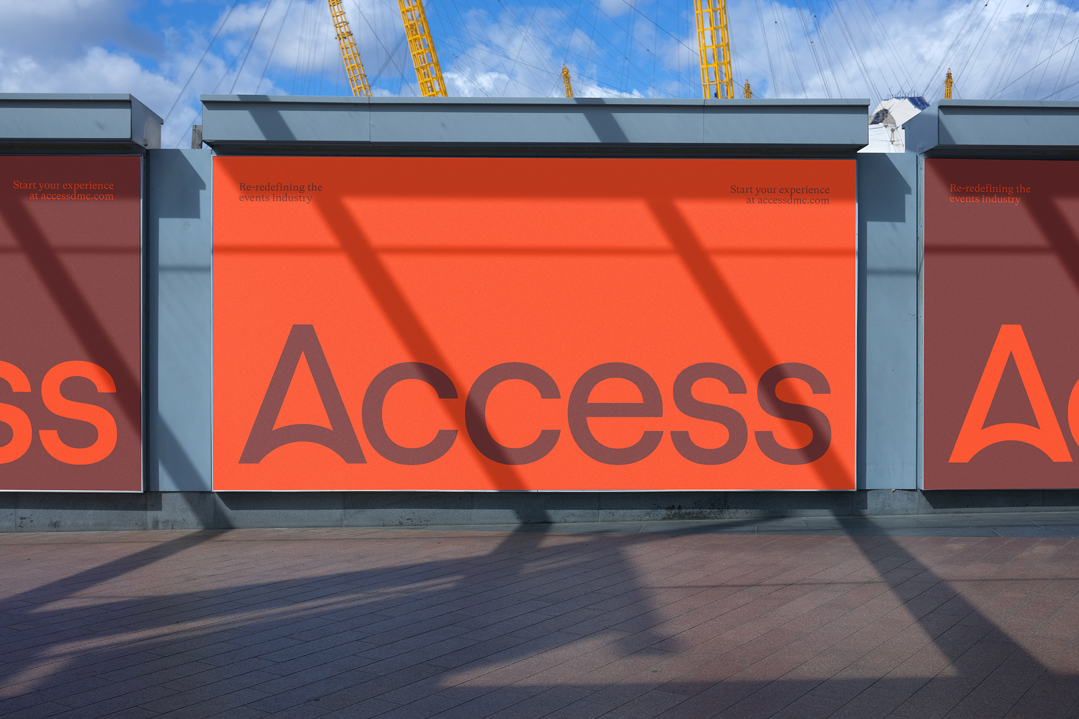
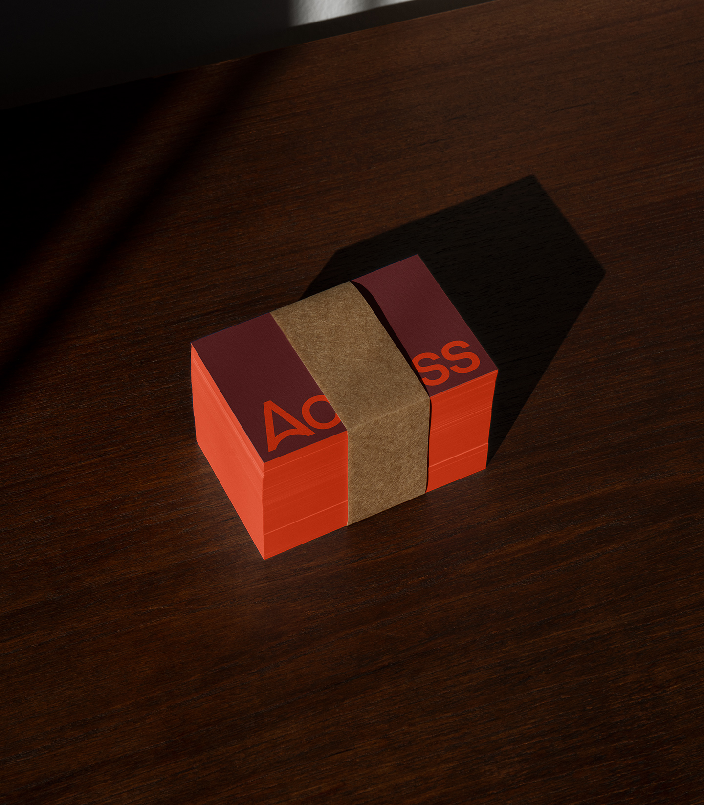
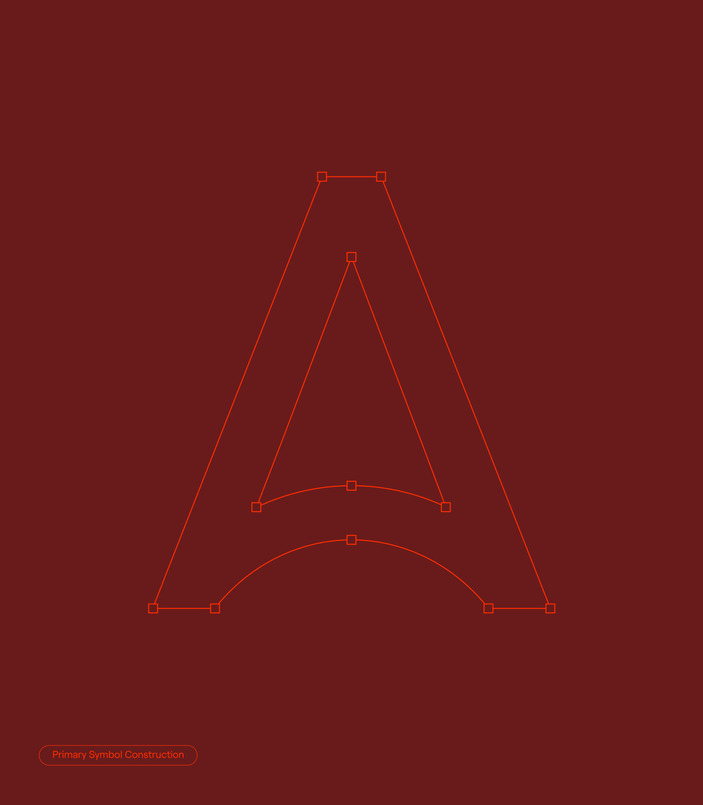
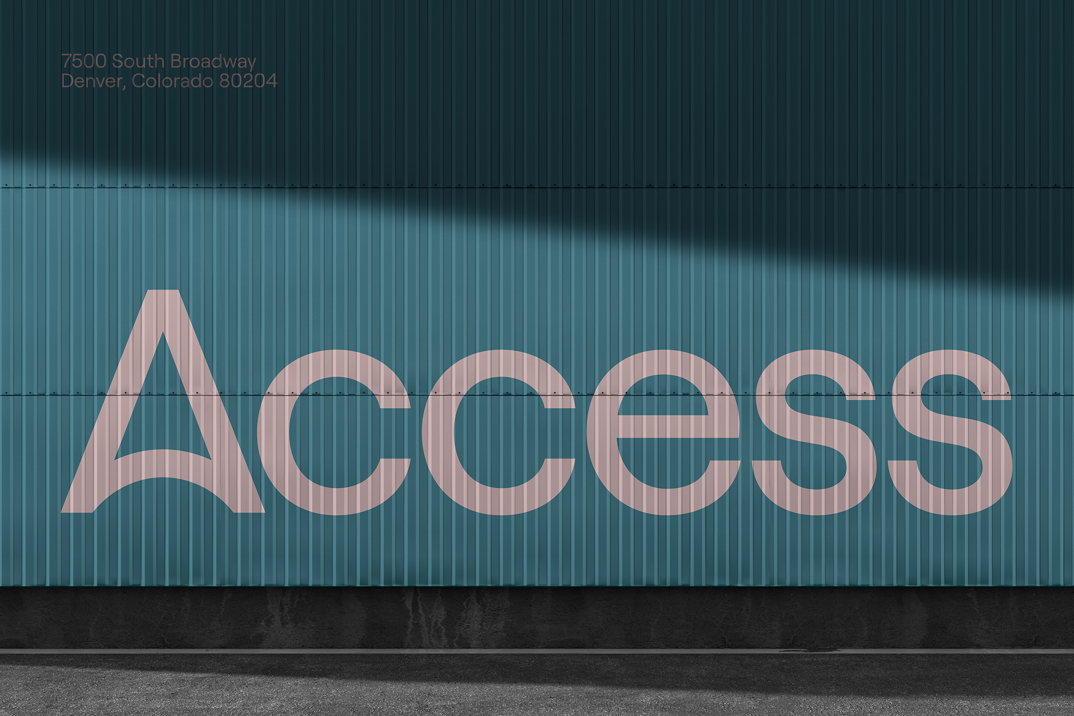
The wordmark we built would serve as the first piece in the sophisticated modernism of their new visual identity. The wordmark champions a custom “A” which represents movement and connection, while being firmly anchored to a sturdy base.
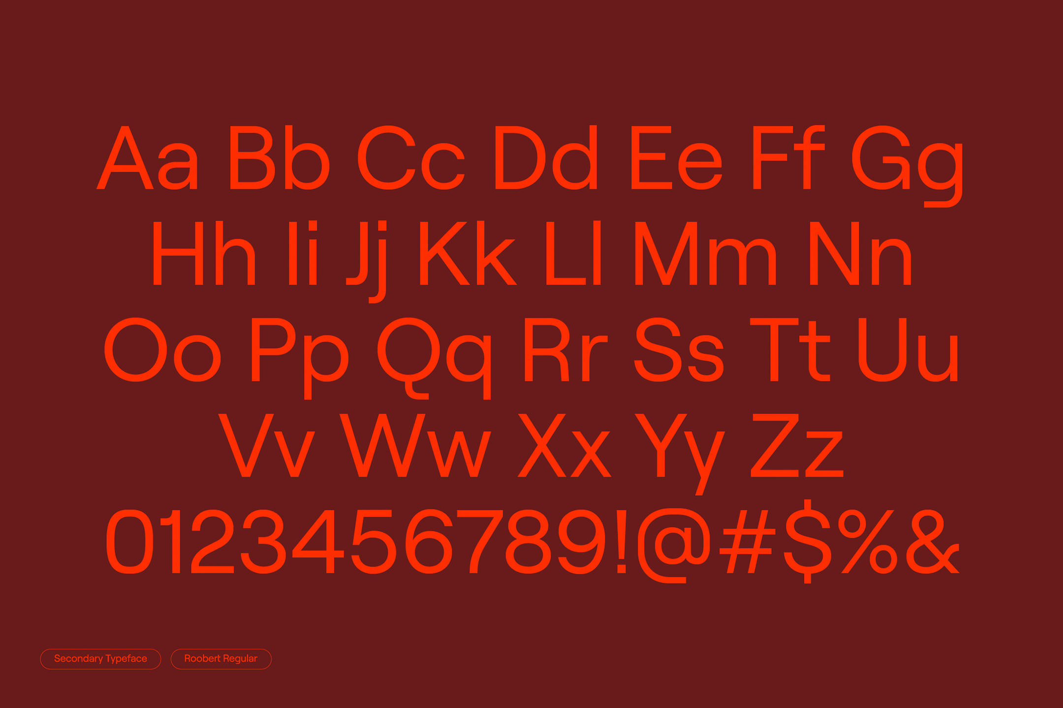
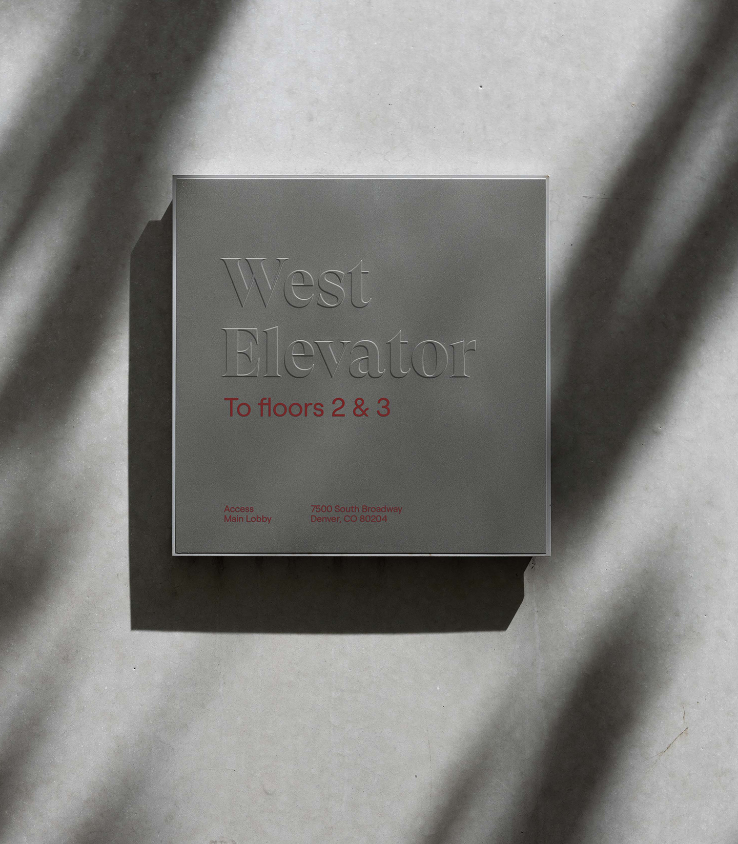
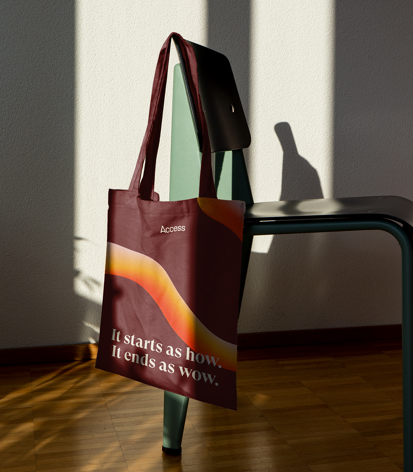
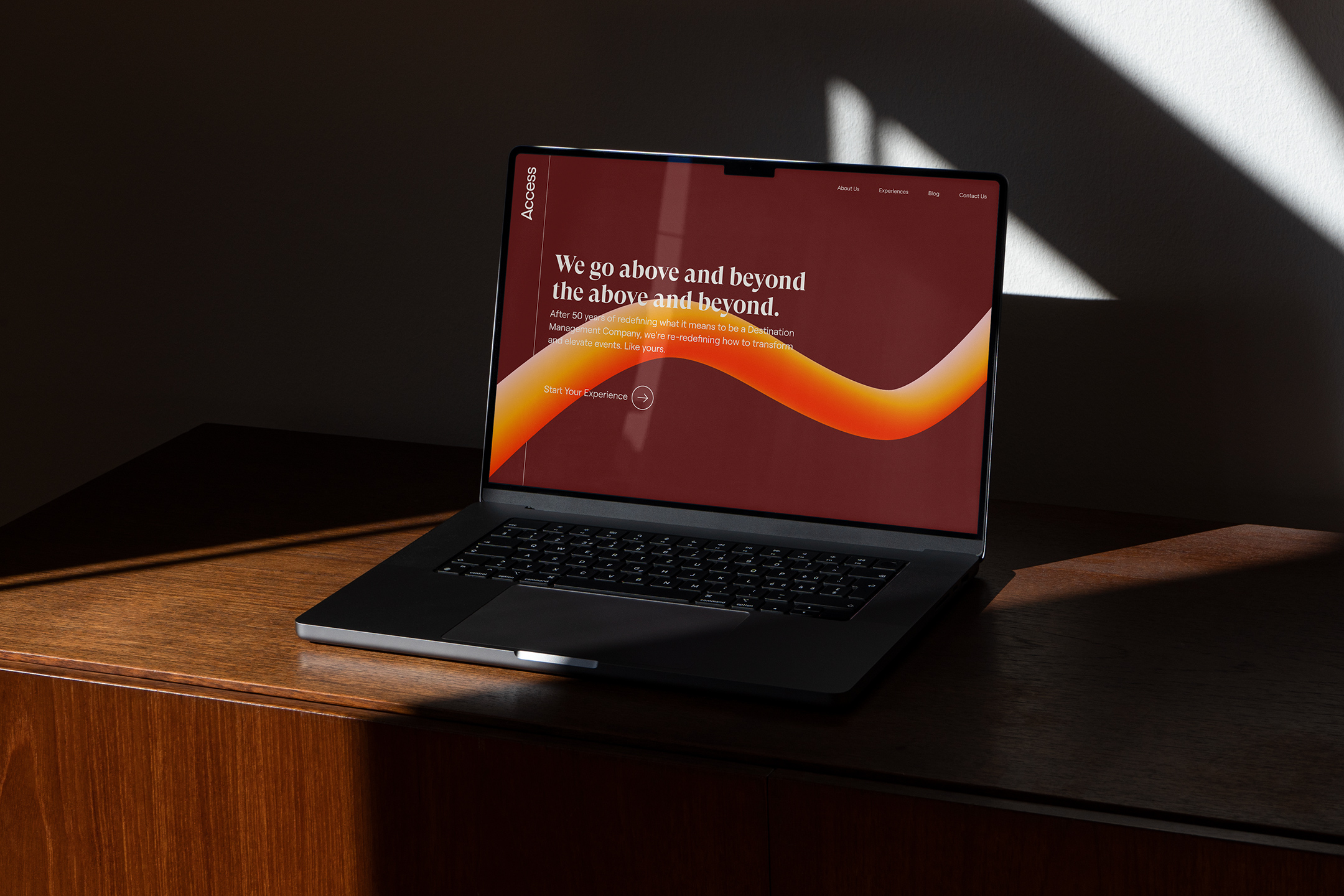
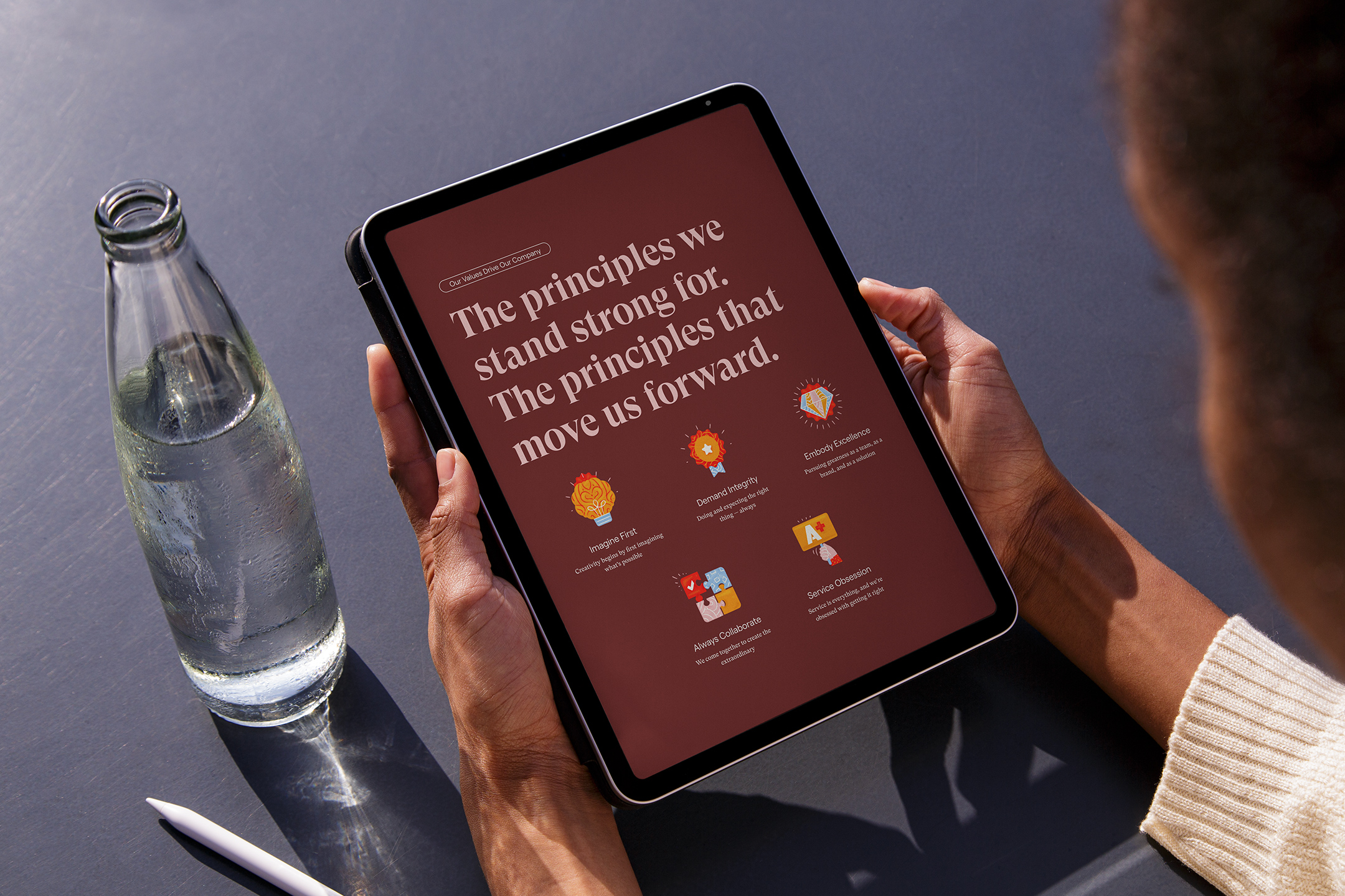
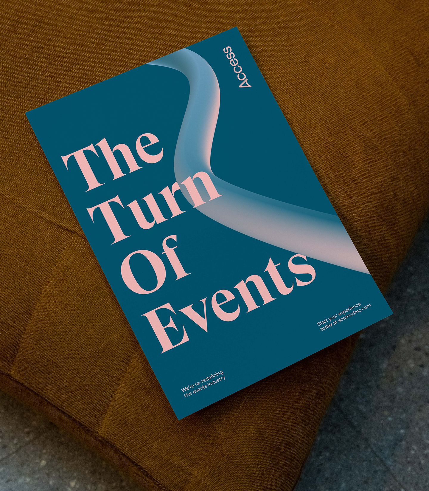
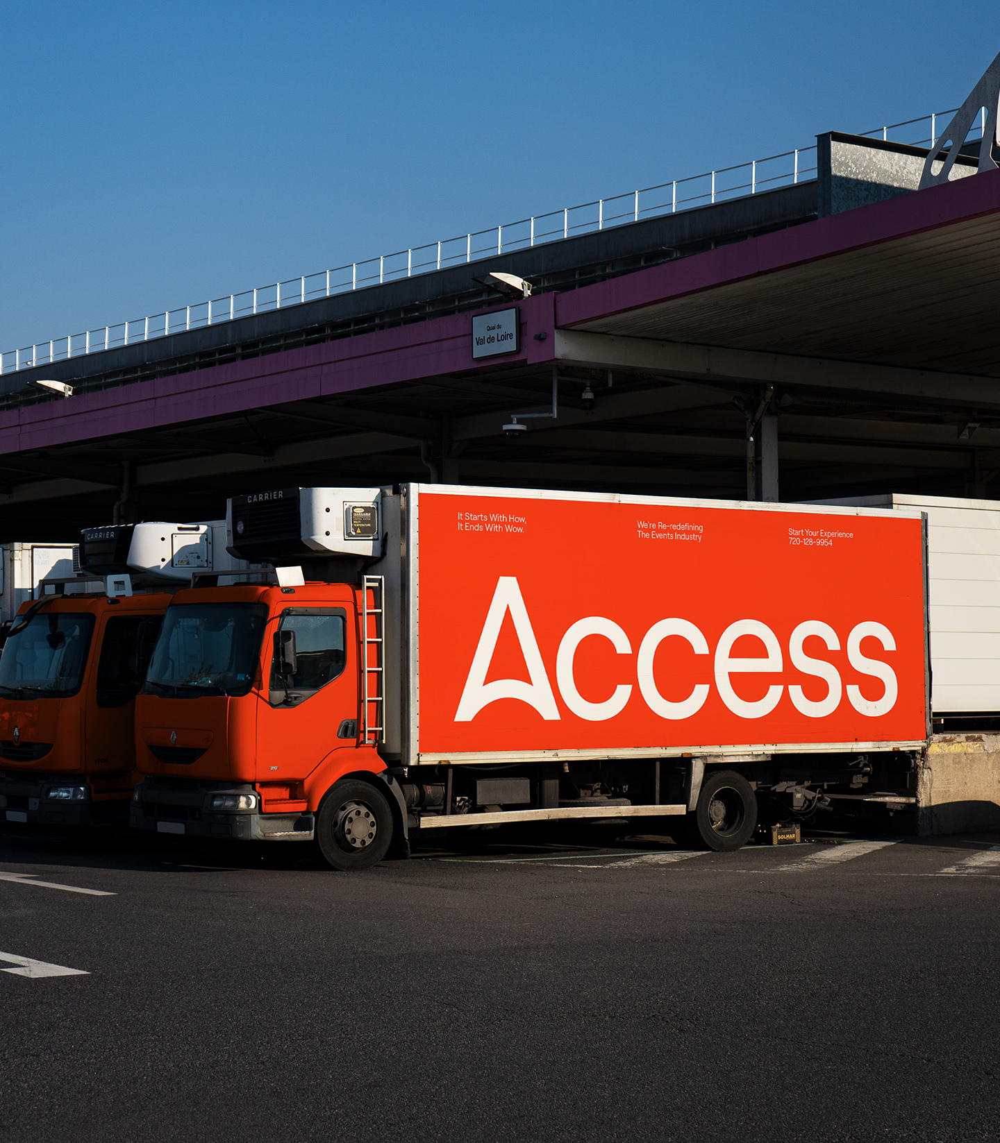
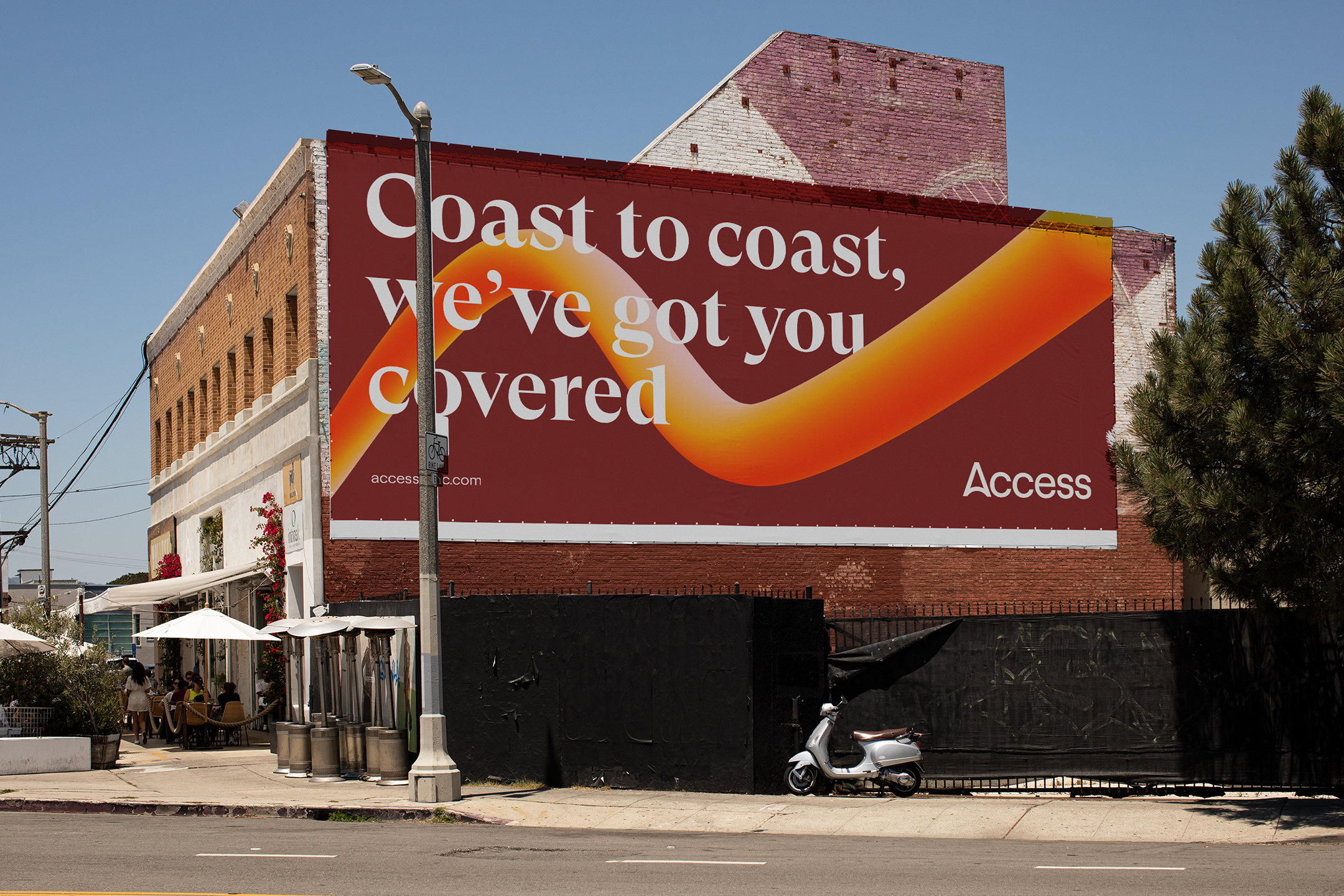
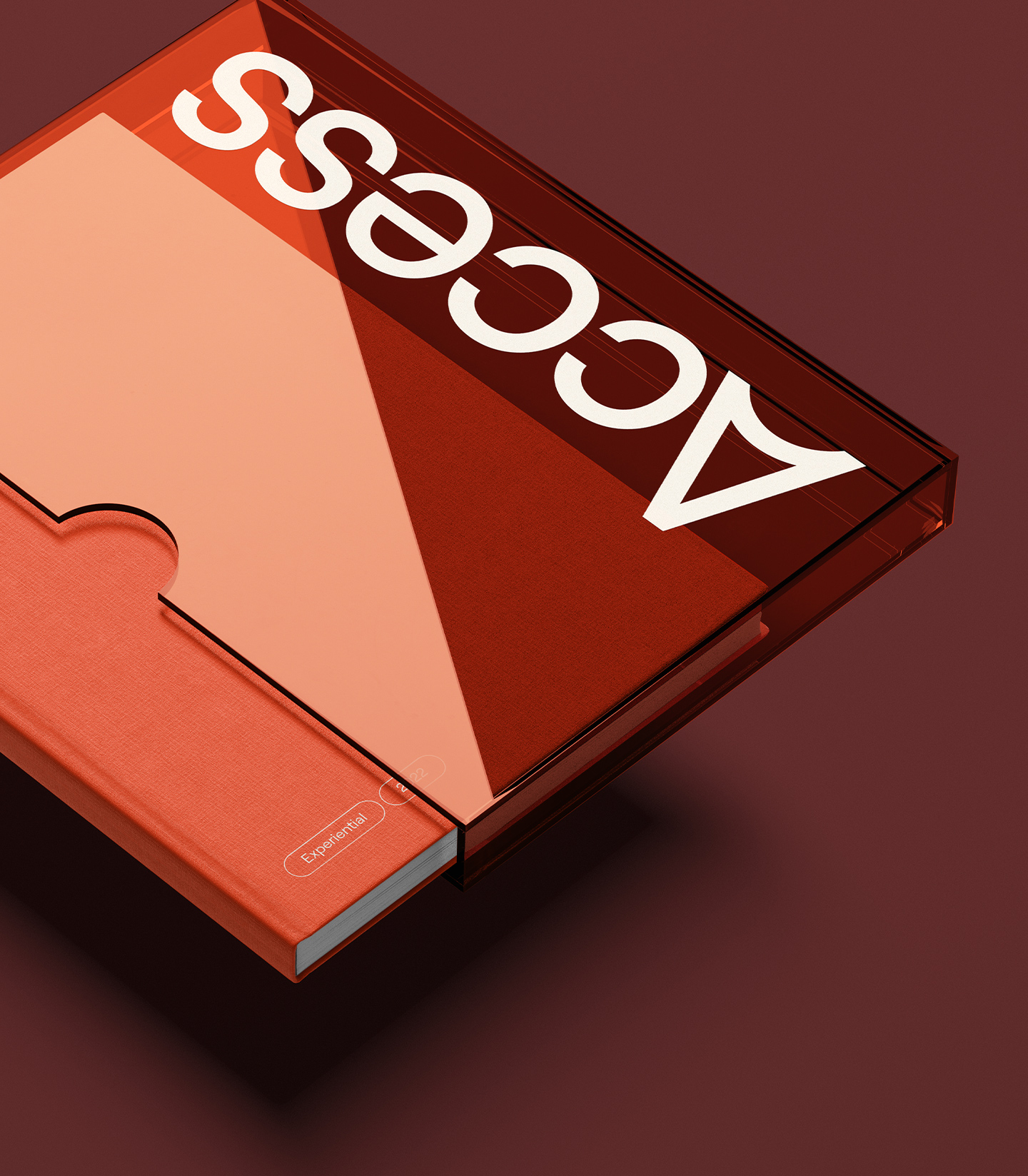
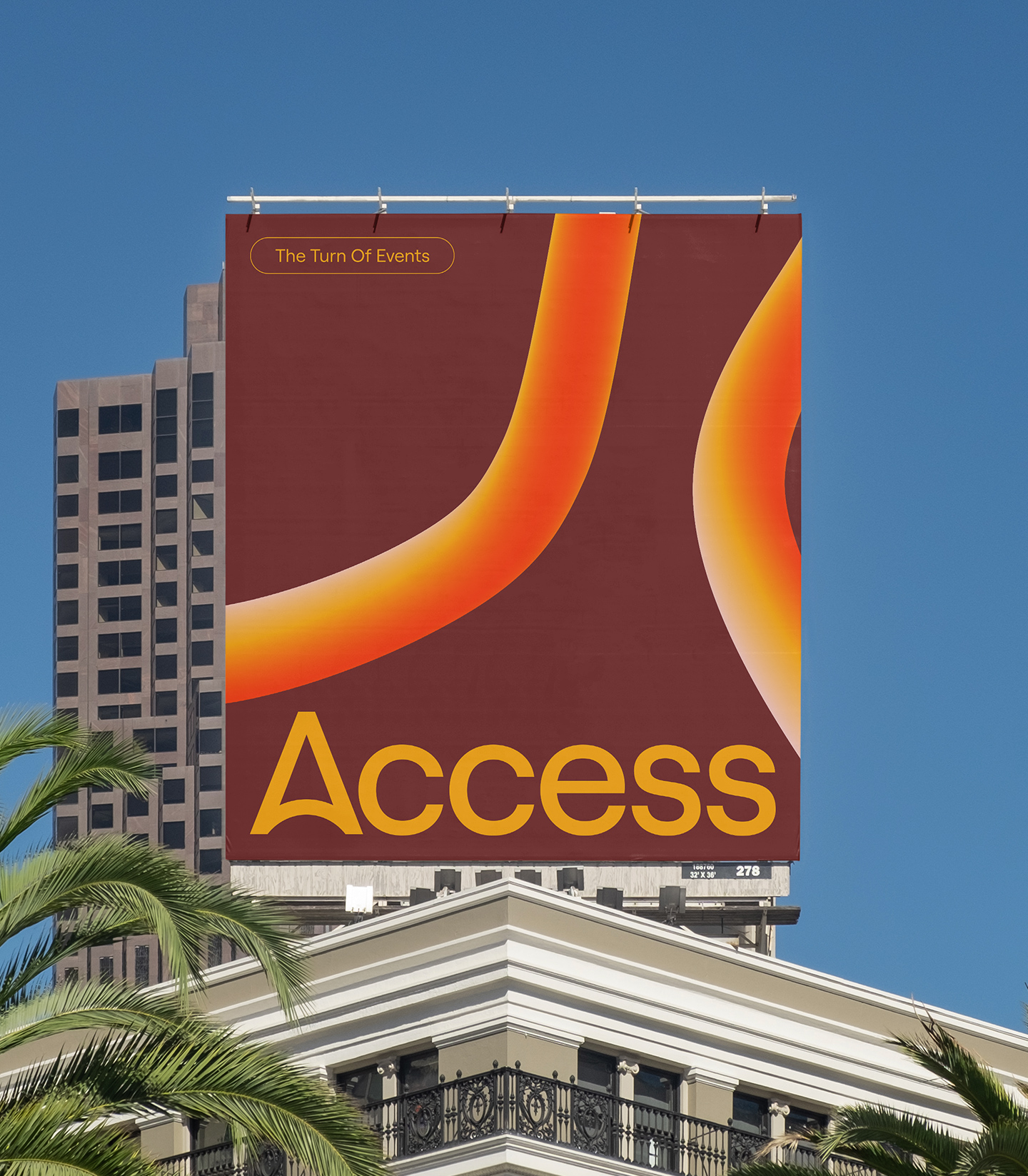
Flowing into the new color system, we developed a palette unlike anything the industry has seen. A mixture of earthy tones and punchy brights - this color palette is striking and expressive. We use a highly-contrasted serif as the display font to push into the neighborly aspect of their new tone and voice. The display font is complemented by a mono-linear geometric sans-serif packed with loads of personality and detail.
We developed an icon and illustration set that leans heavily into textured and hand-drawn qualities. Additionally, we designed a visual language that features 3D tubes that represent portals that carry you one experience to the next. Each unique piece of the identity works in harmony to set forth a one of a kind identity for a one of a kind company.
Client testimonial
We love the brand tone work Max Hofert Design did with us. It's been a huge differentiator for our company, and our competitors definitely feel that we have separated from the pack. We recently won Inc 5000 fastest growing companies, we were awarded Great Places to Work, and just last month we were recognized by Newsweek as Greatest Places to Work for Women. We went from about $40M when we started talking to $175M this year.
Danielle Phippen — CEO
Credits
Agency Partner: FRNDS
Illustration: Ramy Wafaa
Copywriting: Jay Roth
Webflow Development: Francesco Castronuovo