Highside Putters
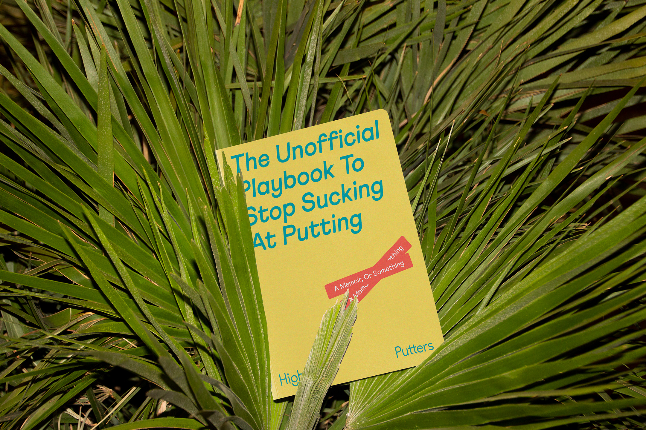
Highside Putters specializes in just that - putters. Their mission is to do away with the snobbiness in golf, making it more approachable and delightful for all skill levels. Golf is hard and it’s okay to suck! Let’s just have some good ol’ fun on the links, free of judgment. That’s what it’s all about. We stepped outside of what is considered “the norm” in golf and golf visual cues to put forth an identity system that will not go unnoticed.
Brand Identity, Tone & Voice, Art Direction, Product Development, Packaging Design, Collateral Design


The Challenge
The golf industry is flooded with overly pompous country club folks and brands that cater to them. But what is often forgotten is the other half of the golf industry that just wants to have fun out on the course, sip some coldies, and catch a sunburn. By now we’ve all seen the array of brands that use the same rounded monoscript logo and lean heavily into black, white, and more traditional colors. We wanted to be anything but that.
Easygoing and affordable, without compromising on the quality of putters and hardgoods they provide — that's Highside. Golf should invite people in, not scare them away. We sought to capture the essence of the emotion to empower the golfers who feel intimidated by the golf pro crowd.
The Solution
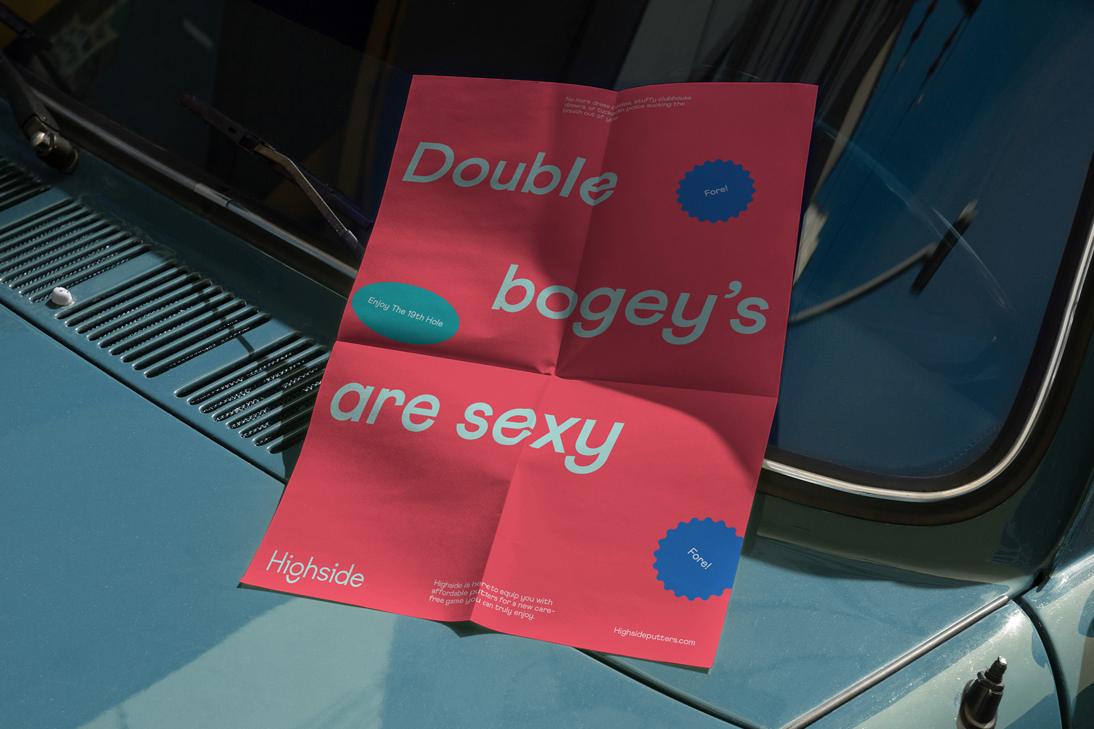
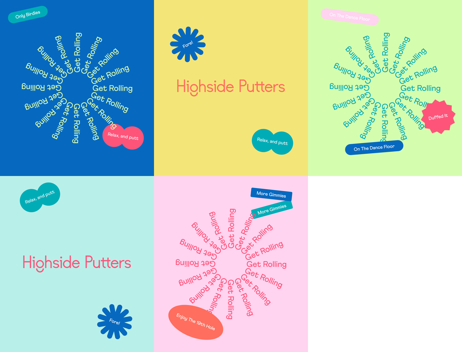
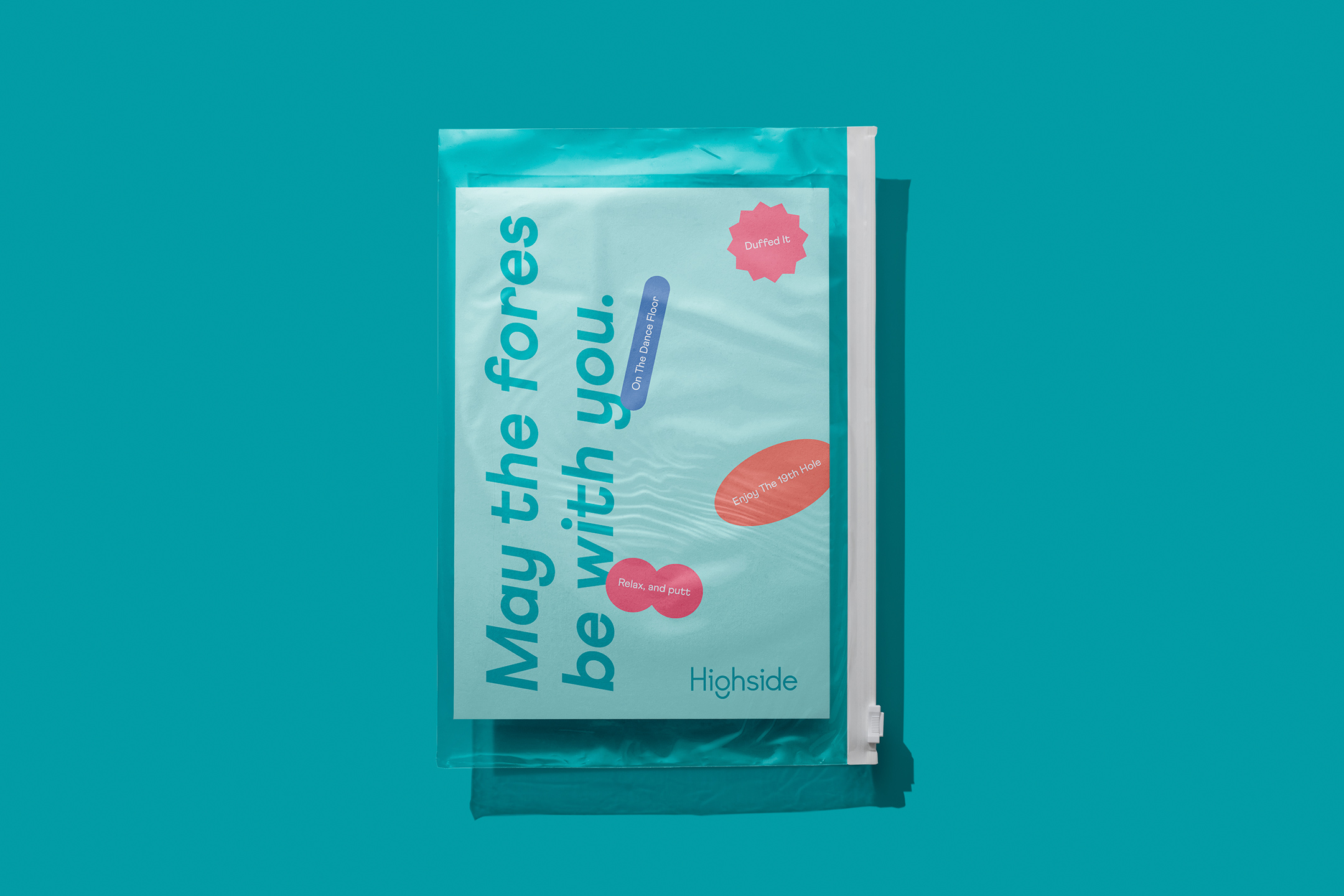
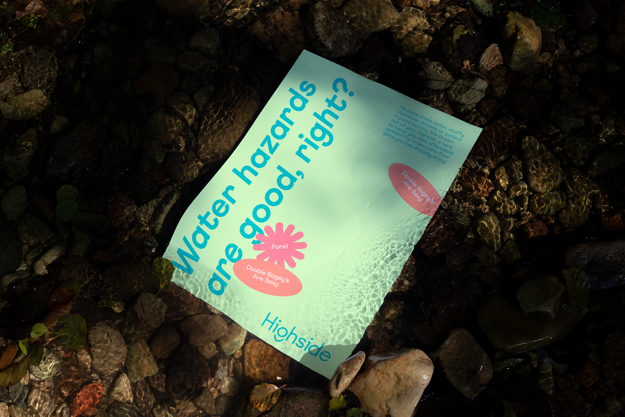
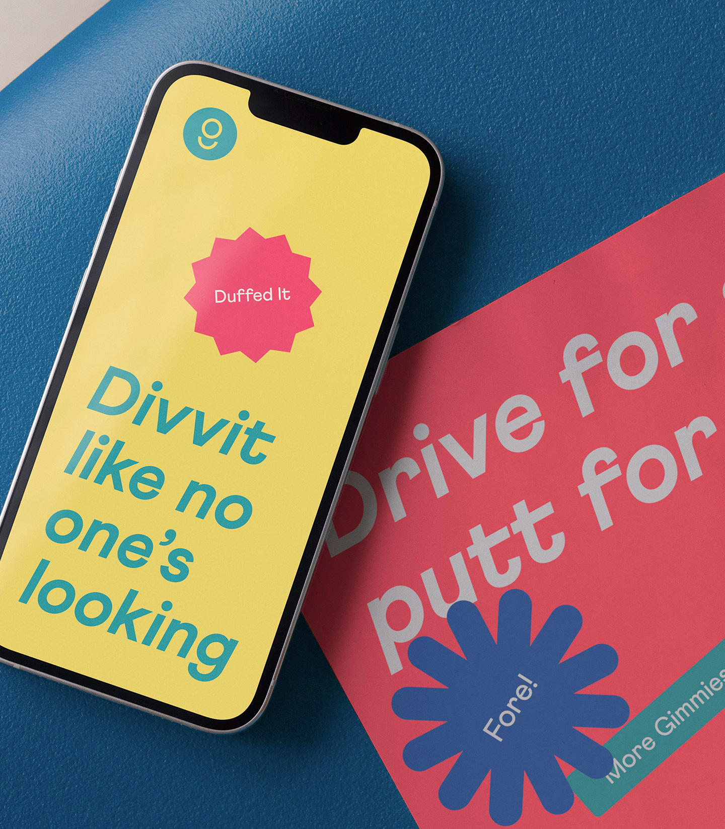
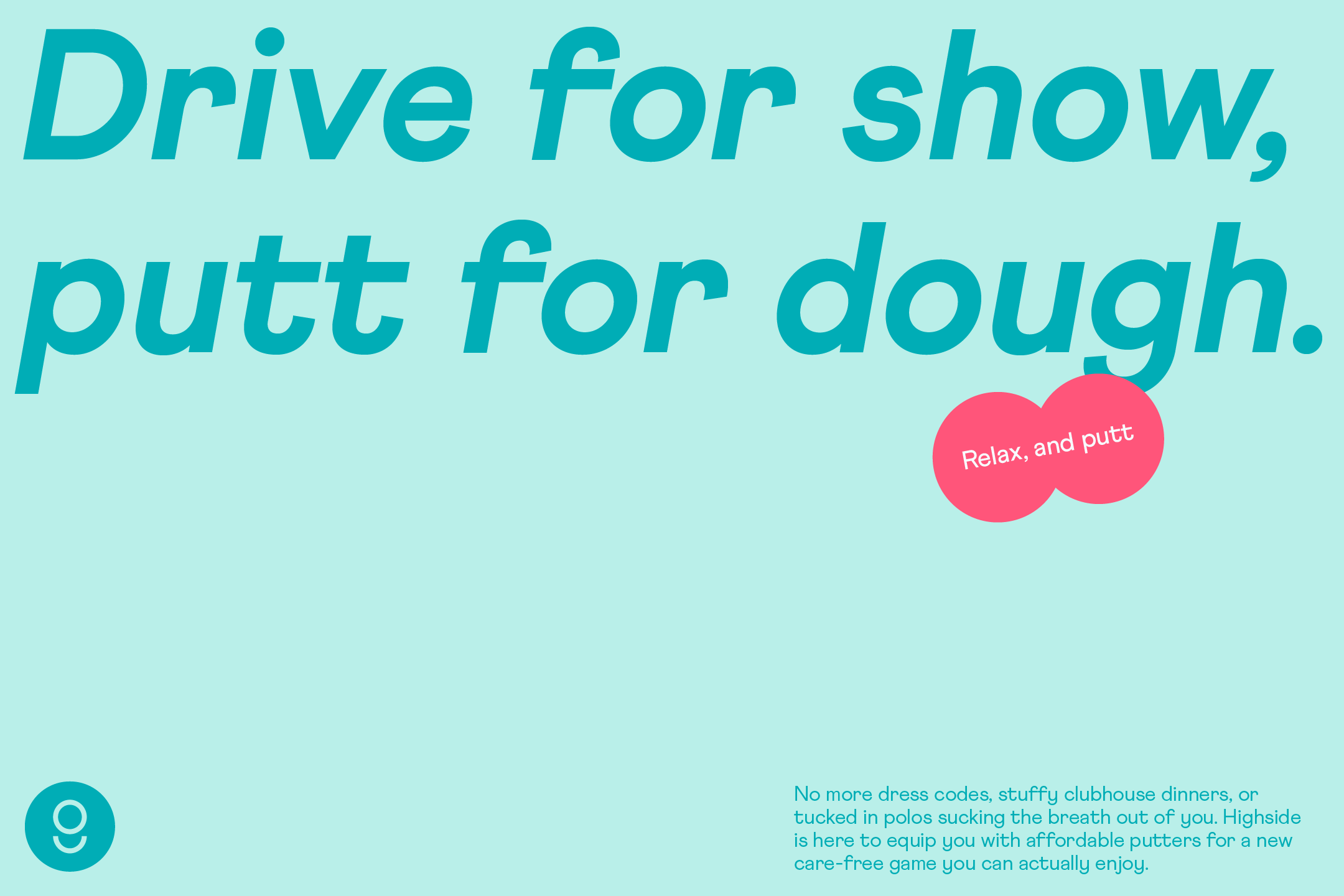
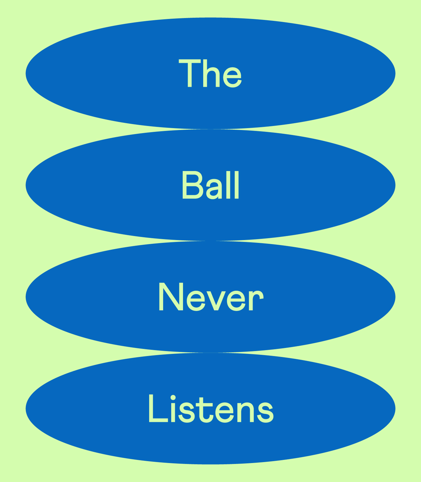
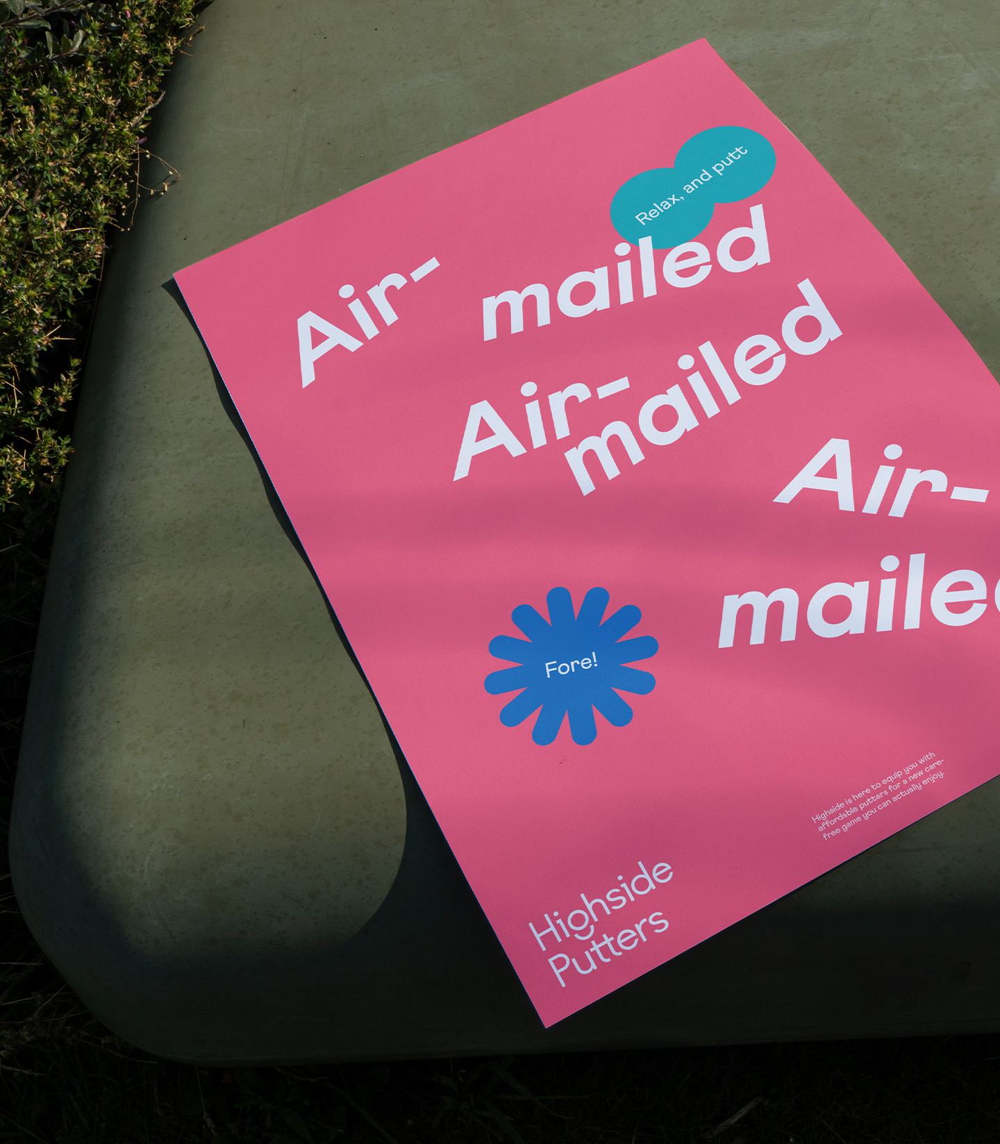
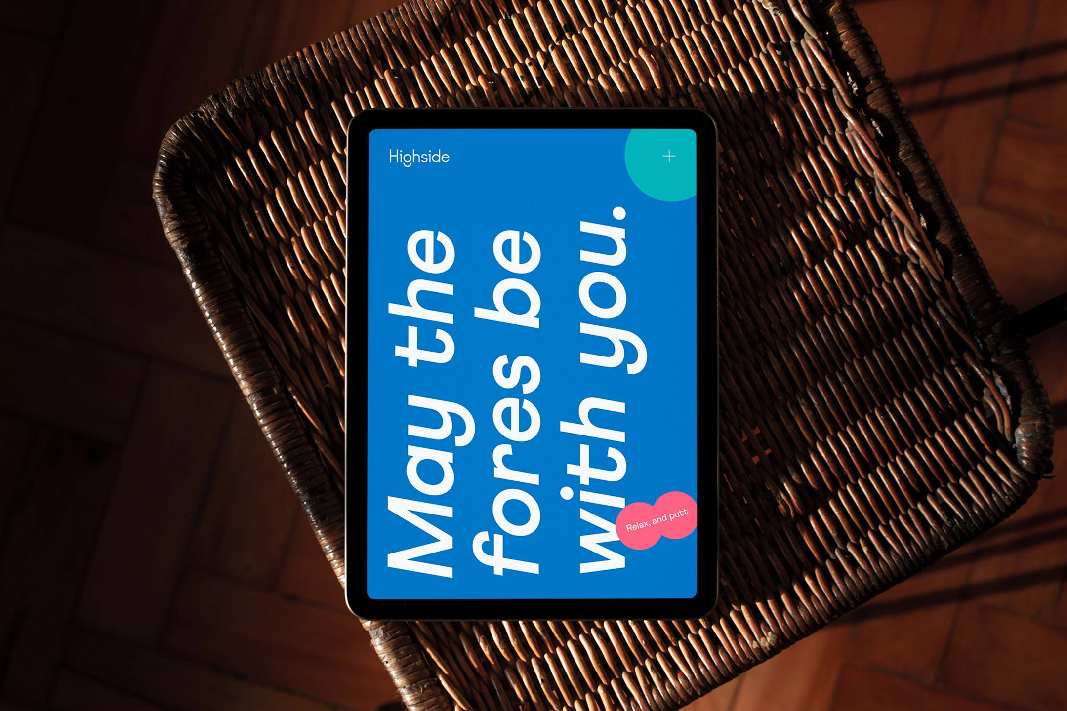
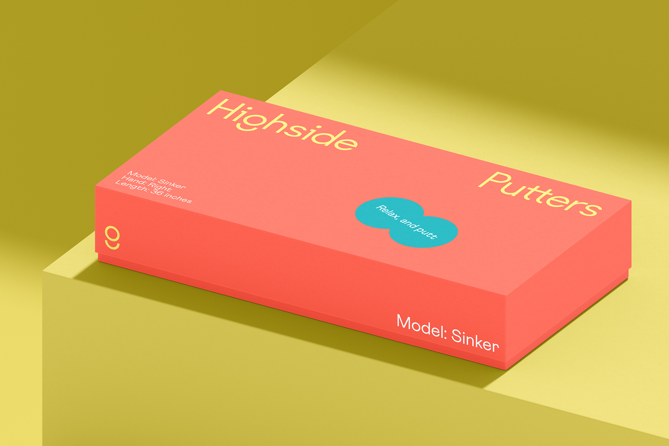
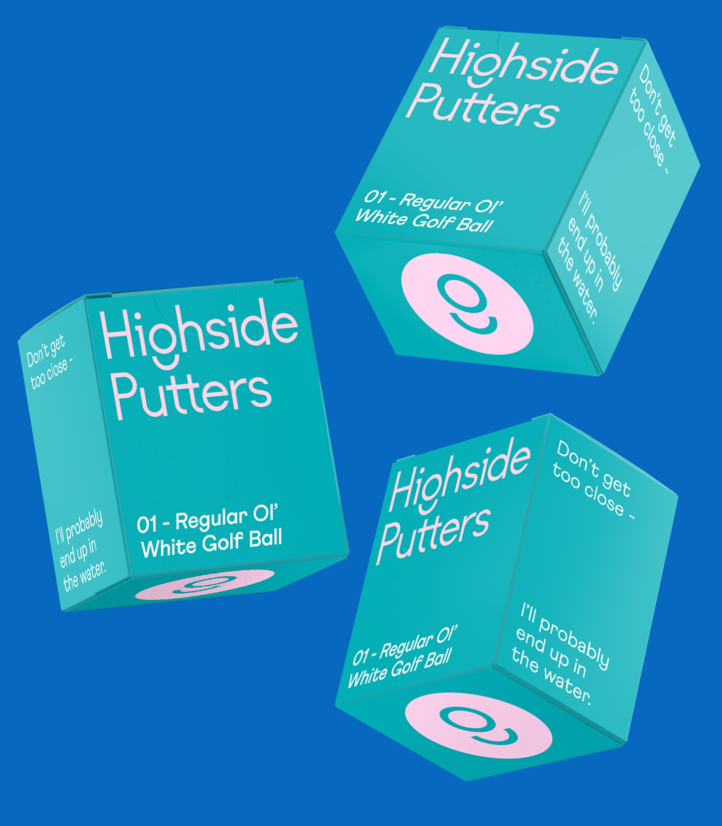
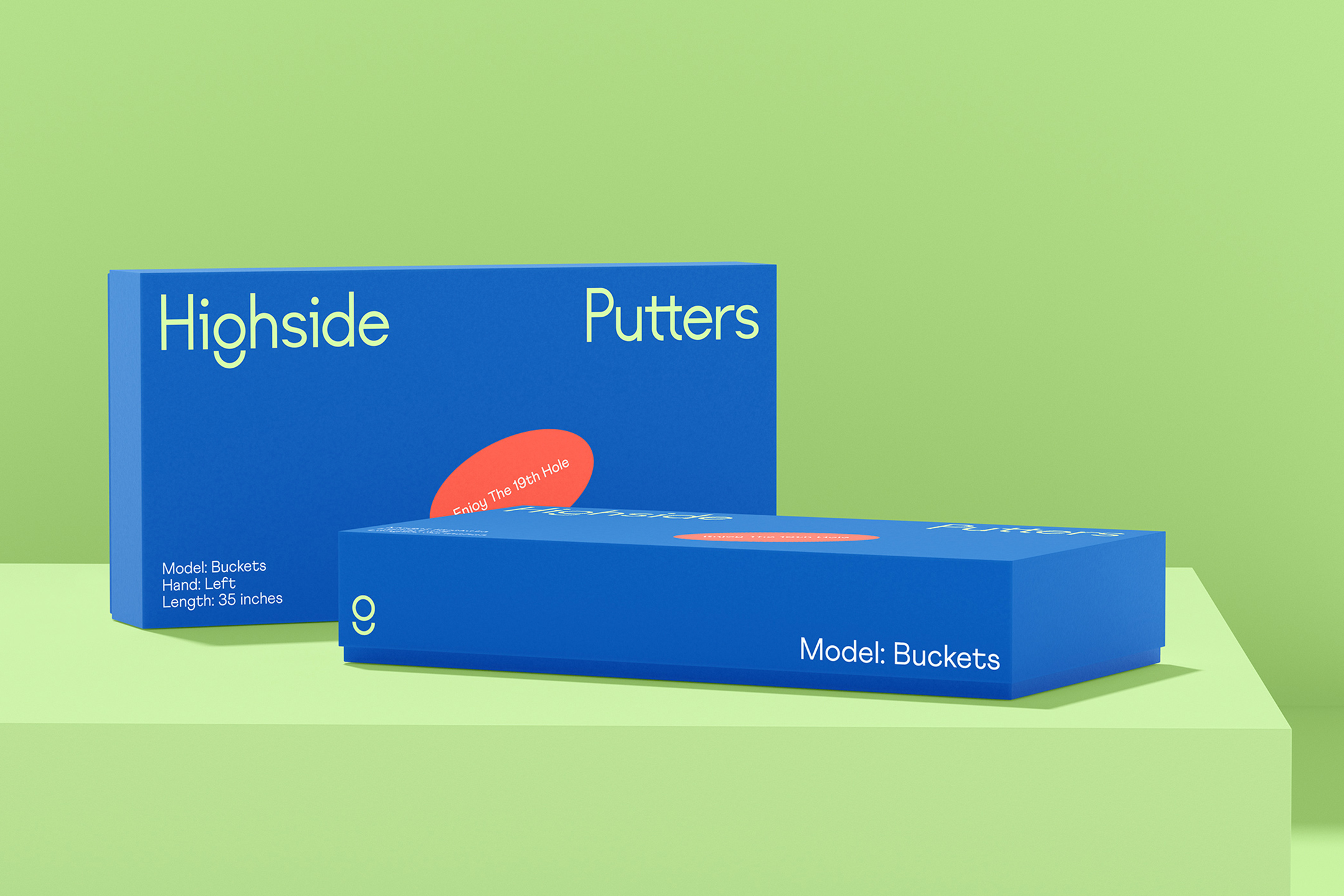
We used classic golf tropes and lingo to poke fun at the seriousness often associated with the sport. The visual language features a digital sticker set that we built out with a library of classic and satirical golf sayings. The stickers are used to break up the clean grid structures used in layouts while adding depth and humor.
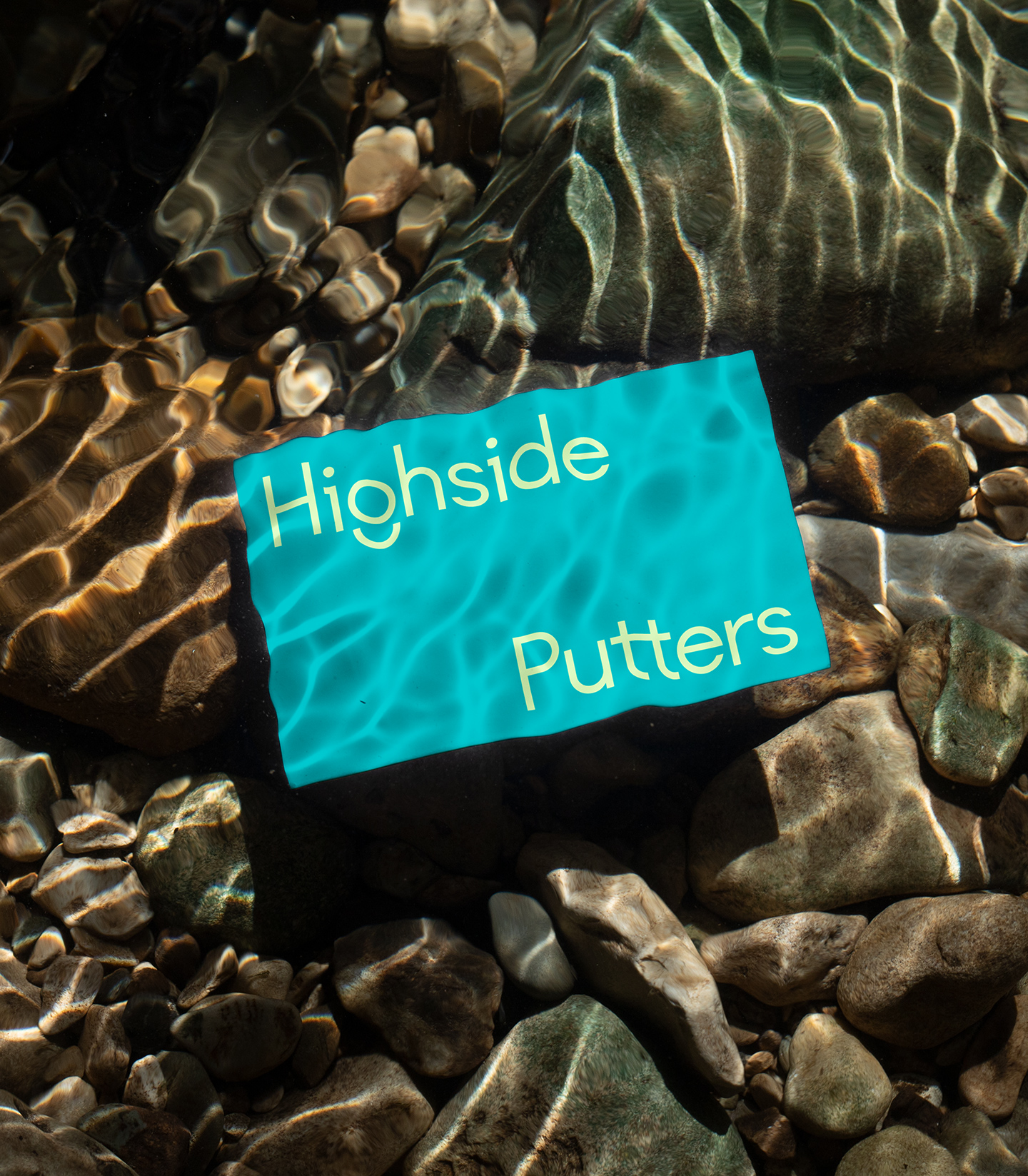
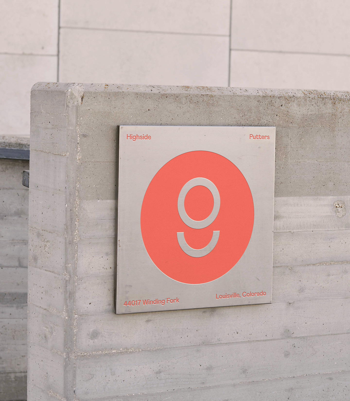
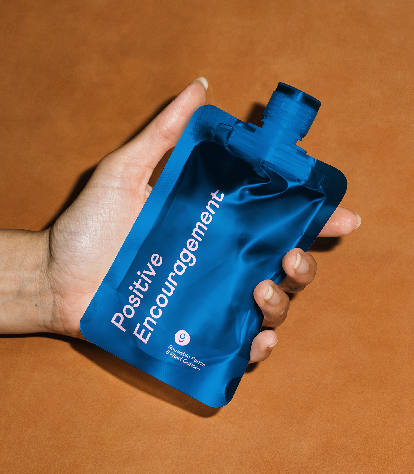
The logotype we constructed features a custom “g” that abstractly resembles a ball rolling into the cup. Matched with a vibrant set of warm and cool colors, the identity boasts a dynamic italicized typeface with loads of quirky features. The packaging system and club designs were crafted to allow for expansive product offerings, including clothing.


Client testimonial
