Yogo
Yogo is a sustainability-focused yoga company with the view that the objects in your life should be simple, beautiful, long-lasting, and made from the best materials Earth has to offer. This follows the yogic concept of Aparigraha (non-hoarding) use only what you need. That means economy of design, as well as not using more of Earth’s resources than necessary.
Visual Identity, Art Direction, Packaging, Illustration, Collateral Design


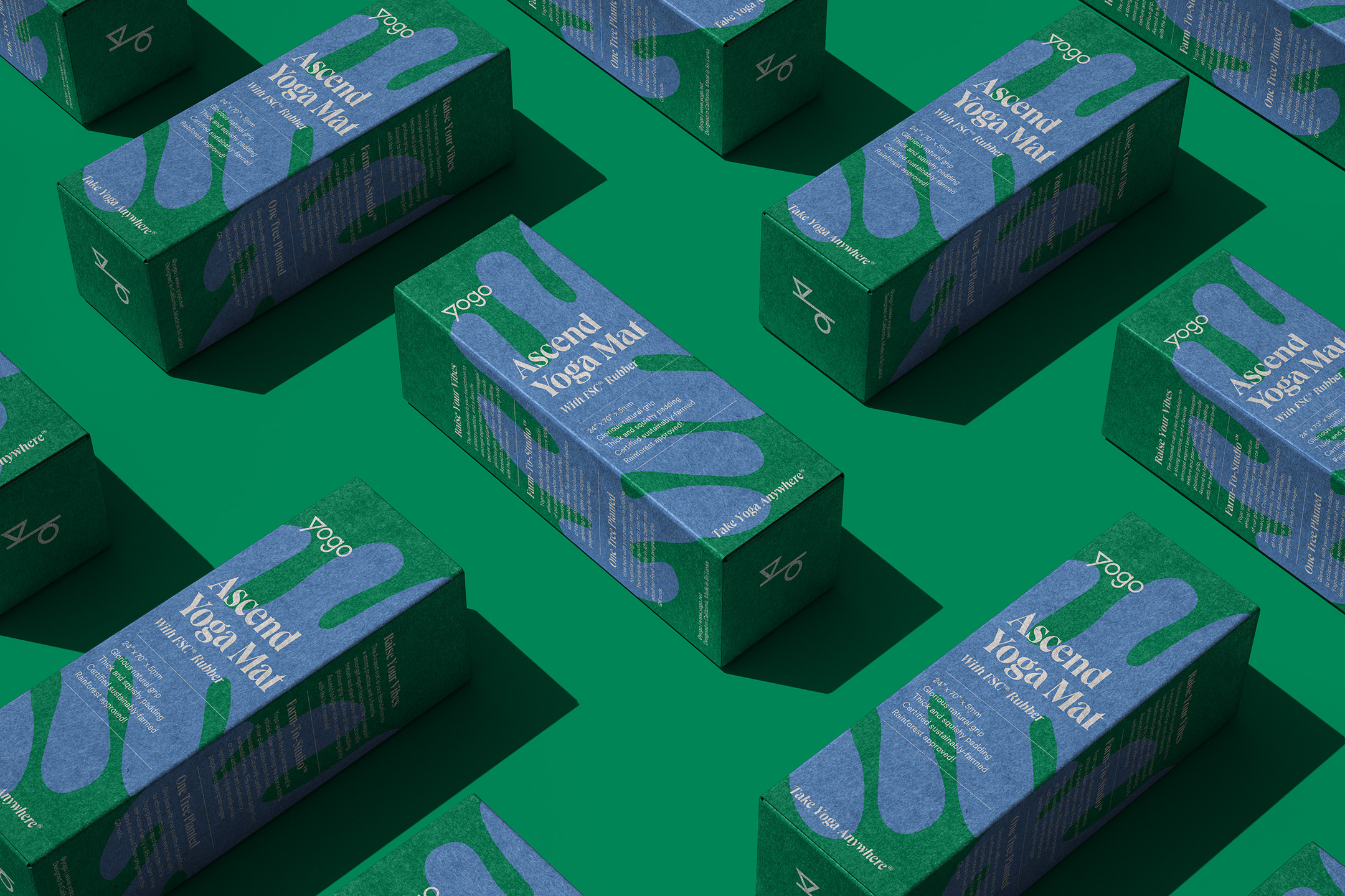
Historically, yoga brands and products follow the same safe expected playbook. Natural washed out color palettes, script fonts, stock icons — you know the drill. Yogo isn’t into the typical corporate green-washing — they are the first yoga mat company to commit to sourcing 100% of its natural rubber from FSC®-certified sustainable farms. Their entire supply chain down to the yoga mat is certified and traceable. This rigorous standard ensures that farms protect the rainforest, use strict eco-friendly farming methods, uphold indigenous rights, pay fair wages, and meet other important requirements. With a mission of this stature, the brand needed to visual set the bar high, flipping the category on its head.


We leaned into a deep rainforest green as the cornerstone for the Yogo color palette. Stacked on top of that, we use a series of organic hand-drawn plant illustrations that represent unique elements of each product. Our typographic system is loaded with personality, taking cues from utilitarian design for information organization. The final visual identity and packaging system is highly differentiated from other offerings within the category. We built a premium experience from the shelf to the studio, which will serve as the storytelling and community-building vessel for Yogo, for many years to come.


Client testimonial


